cf-plot user guide
Introduction
cf-plot is a set of Python routines for making the common contour, vector and line plots that climate researchers use. cf-plot generally uses cf-python to present the data and CF attributes for plotting as two-dimensional data fields. To run the following examples in the Met department at the University of Reading setup the Python path with
setup canopy
Outside of the Meteorology department you’ll need to follow the cf-plot installation instructions
Using cf-plot
The data to make a contour plot can be read in and passed to cf-plot using cf-python as per the following example.
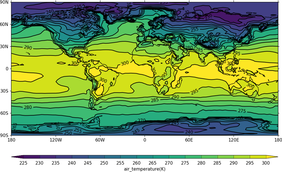
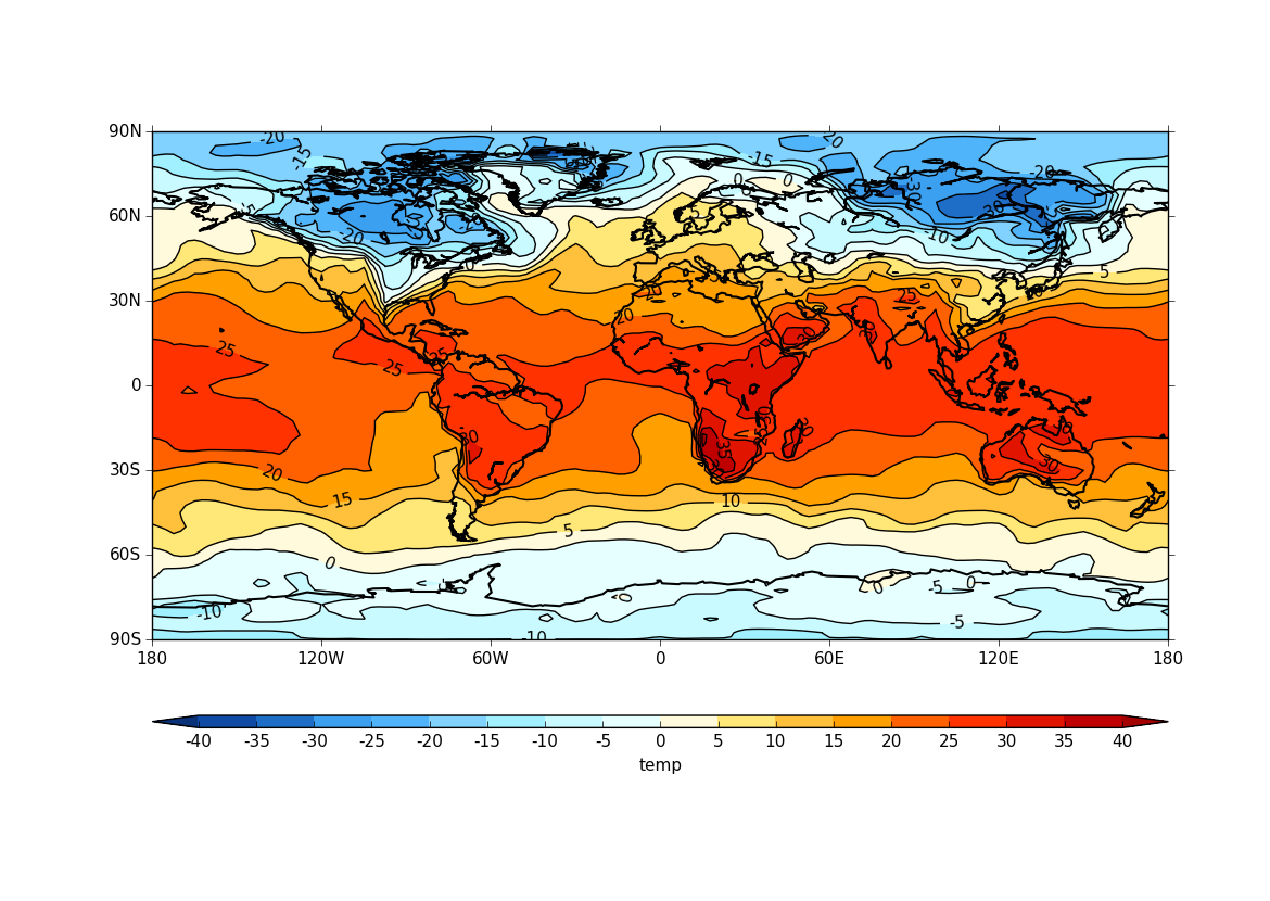
Cylindrical projection
import cf, cfplot as cfp
f=cf.read('cfplot_data/tas_A1.nc')[0]
cfp.con(f.subspace(time=15))
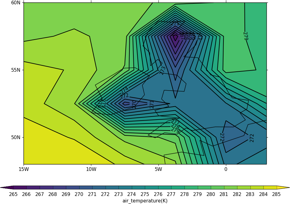
The mapset routine is used to change the map area and projection. cfp.mapset(lonmin=-15, lonmax=3, latmin=48, latmax=60) sets the map to a view over the British Isles. Further plots will use the same map projection and limits. The levels are taken from the whole field so in this example we specify the levels explicitly with the levs command.
import cf, cfplot as cfp
f=cf.read('cfplot_data/tas_A1.nc')[0]
cfp.mapset(lonmin=-15, lonmax=3, latmin=48, latmax=60)
cfp.levs(min=265, max=285, step=1)
cfp.con(f.subspace(time=15))
The default settings are for colour fill and contour lines. These can be changed with the fill=0 and lines=0 flags to con.
To reset the mapping to the default cylindrical projection -180 to 180 in longitude and -90 to 90 in latitude use cfp.mapset().
Blockfill plots
Blockfill plots in the cylindrical projection are made using the blockfill=True flag to the con routine.
import cf, cfplot as cfp
f=cf.read('cfplot_data/tas_A1.nc')[0]
cfp.con(f.subspace(time=15), blockfill=True, lines=False)
Blockfill is only supported in the cylindrical projection and non-map plots at present.
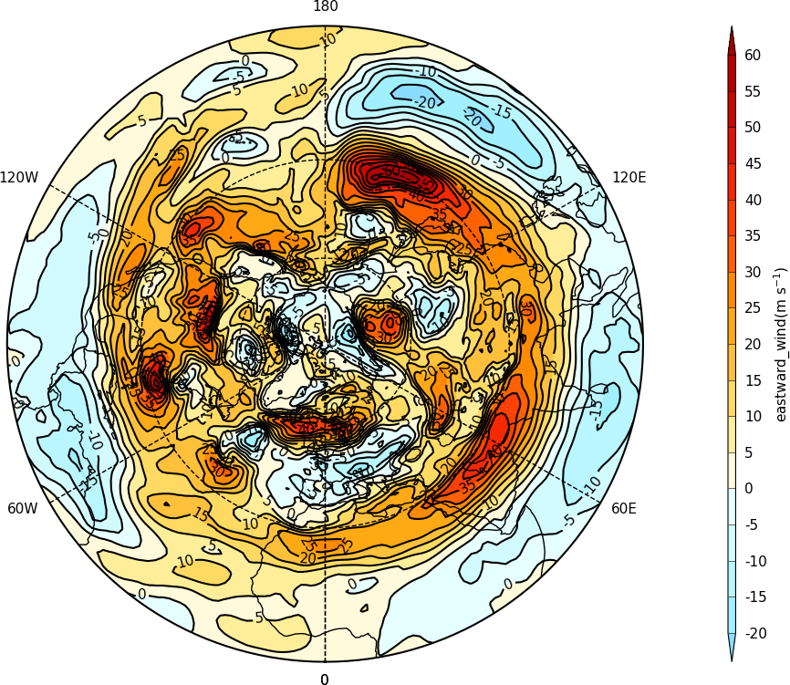
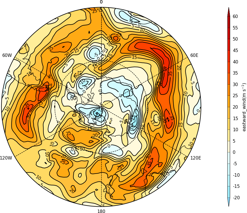
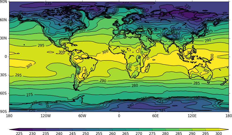
Polar stereographic plots
Polar Stereographic plots are set using proj=’npstere’ or proj=’spstere’ in the call to mapset.
import cf, cfplot as cfp
f=cf.read('cfplot_data/ggap.nc')[1]
cfp.mapset(proj='npstere')
cfp.con(f.subspace(pressure=500))
The mapset bounding_lat and lon_0 parameters are used to set the latitude limit of the plot and the orientation of the plot. Generally for the southern hemisphere the Greenwich Meridian (zero degrees longitude) is plotted at the top of the plot and is set with lon_0=0.
import cf, cfplot as cfp
f=cf.read('cfplot_data/ggap.nc')[1]
cfp.mapset(proj='spstere', boundinglat=-30, lon_0=0)
cfp.con(f.subspace(pressure=500))
Passing data to cf-plot
Using cf-python - CF compliant data
Data is generally passed to cf-plot for ploting via cf-python. Contour and vector plots require a 2-dimensional field. cf-python is very flexible and can be used to select fields, levels, times, means for both CF and non-CF compliant data. CF data is data that follows the NetCDF Climate and Forecast (CF) Metadata Conventions. The conventions define metadata that provide a definitive description of what the data in each variable represents, and of the spatial and temporal properties of the data.
import cf, cfplot as cfp
f=cf.read('cfplot_data/ggap.nc')
f is now an list of 4 fields.
To see what levels are available in the data use f[0].item(‘pressure’).array
In the case below we select the 500mb temperature with the cf subspace method.
f[0].subspace(pressure=500)
and contour the data
cfp.con(f[0].subspace(pressure=500))
To mean the field use the cf collapse function:
f[0].collapse('mean','longitude')
cfp.con(f[0].collapse('mean','longitude'))
Using cf-plot with non-cf compliant data
Although newer model and reanalyis products are generally cf compliant there is a considerable amount of data being used that is of varying degrees of cf compliance.
In this locally processed ERA40 reanalysis field there is a distinct lack of standard names. Even the long names are somewhat terse - p for pressure for example.
f=cf.read('cfplot_data/ggap.nc')[2]
f
We can still slice and plot the data by inspecting the dimensions of the field:
f.items()
We see that dim1 is the pressure coordinate and can select the 700mb level and contour that.
f.item('dim1').array
f.subspace(dim1=700)
cfp.con(f.subspace(dim1=700))
In the following dataset there are neither standard nor long names to identify the data.
f=cf.read('cfplot_data/gdata.nc')[0]
We can still slice and plot the data as below.
f.items()
f.item('dim0').array
So to plot the 1000mb temperature we would use:
cfp.con(f.subspace(dim0=1000))
Passing data via arrays
cf-plot can also make contour and vector plots by passing data arrays. In this example we read in a temperature field from a netCDF file and pass it to cf-plot for plotting.
import cfplot as cfp
from netCDF4 import Dataset as ncfile
nc = ncfile('cfplot_data/tas_A1.nc')
lons=nc.variables['lon'][:]
lats=nc.variables['lat'][:]
temp=nc.variables['tas'][0,:,:]
cfp.con(f=temp, x=lons, y=lats)
The contouring routine doesn’t know that the data passed is a map plot as the only information passed is data arrays. This can be explicitly set with the ptype flag to con.
cfp.con(f=temp, x=lons, y=lats, ptype=1)
Other types of plot are:
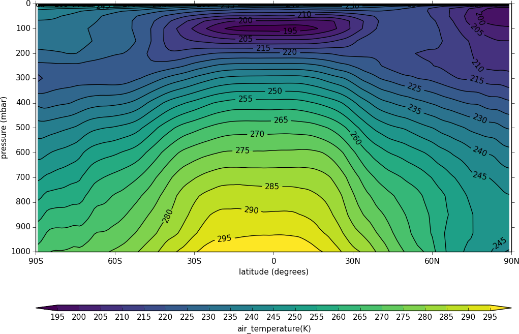
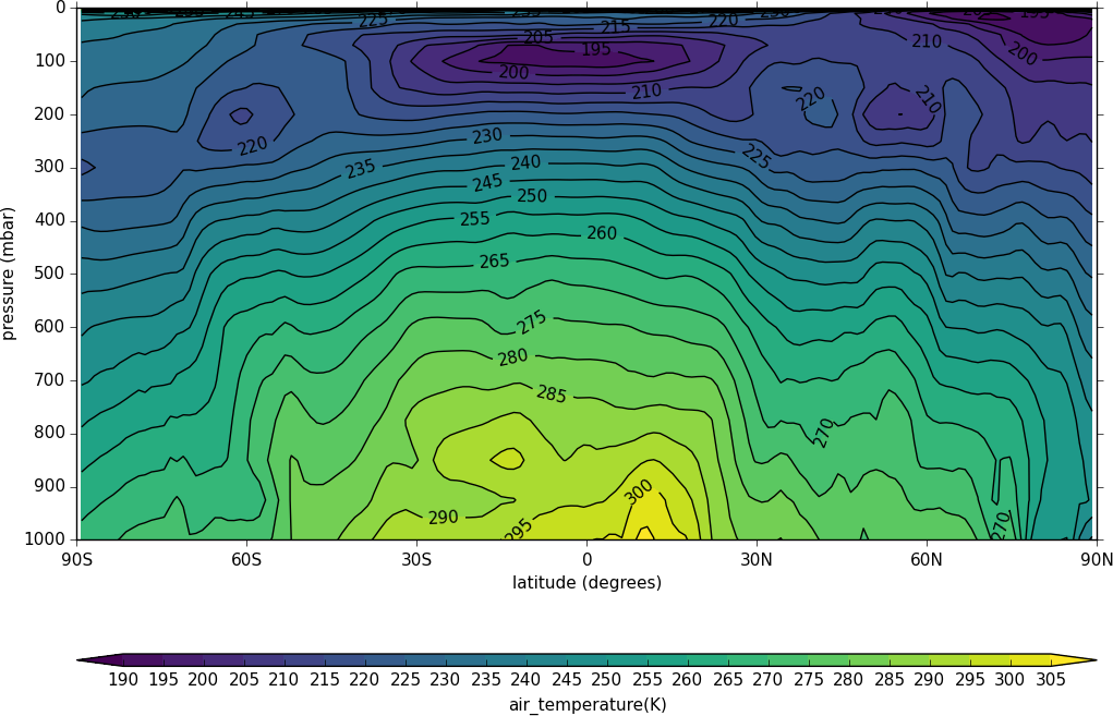
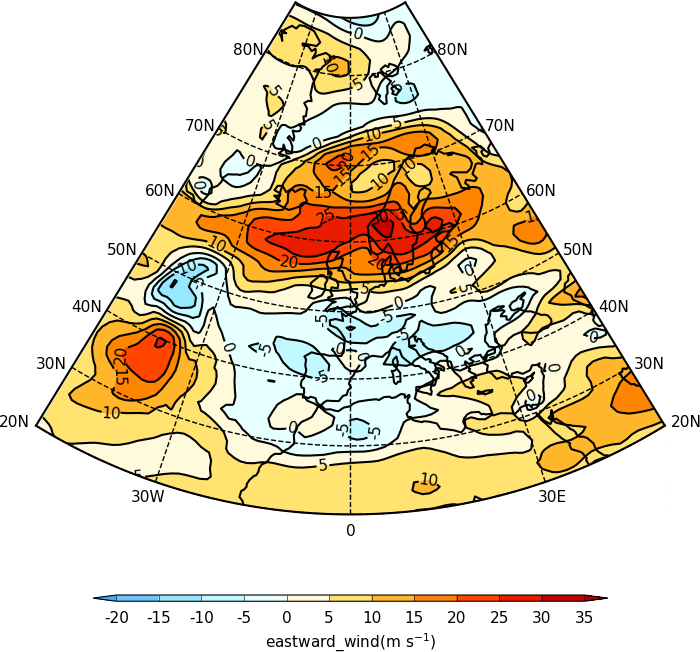
Latitude - Pressure Plots
The latitude-pressure plot below is made by using the cf subspace method to select the temperature at longitude=0 degrees.
import cf, cfplot as cfp
f=cf.read('cfplot_data/ggap.nc')[0]
cfp.con(f.subspace(longitude=0))
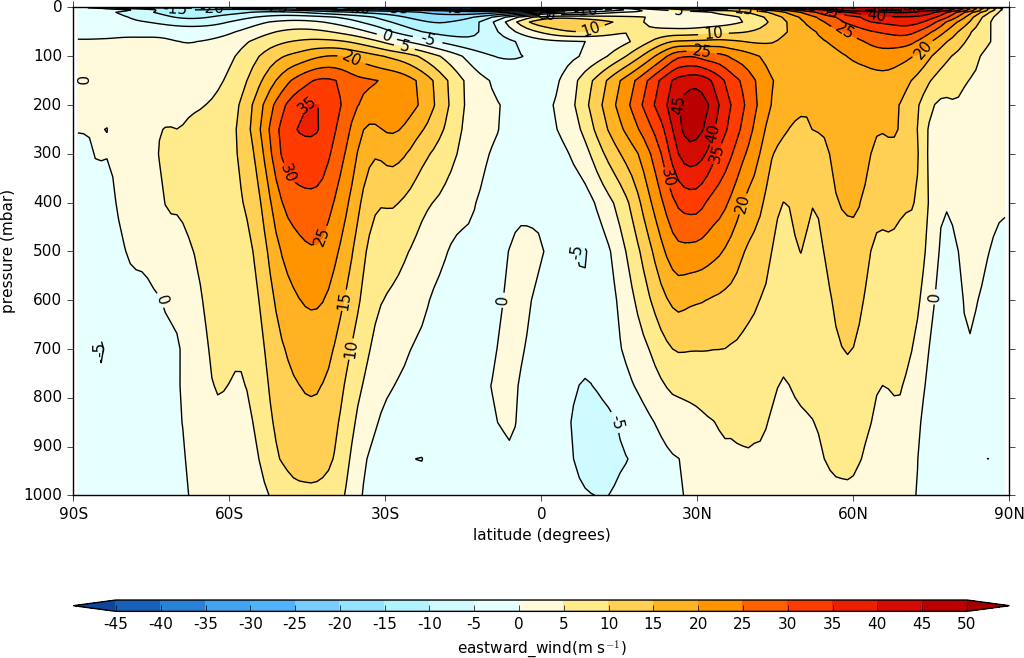
A mean of the data along the longitude (zonal mean) is made using the cf.collapse method.
import cf, cfplot as cfp
f=cf.read('cfplot_data/ggap.nc')[1]
cfp.con(f.collapse('mean','longitude'))
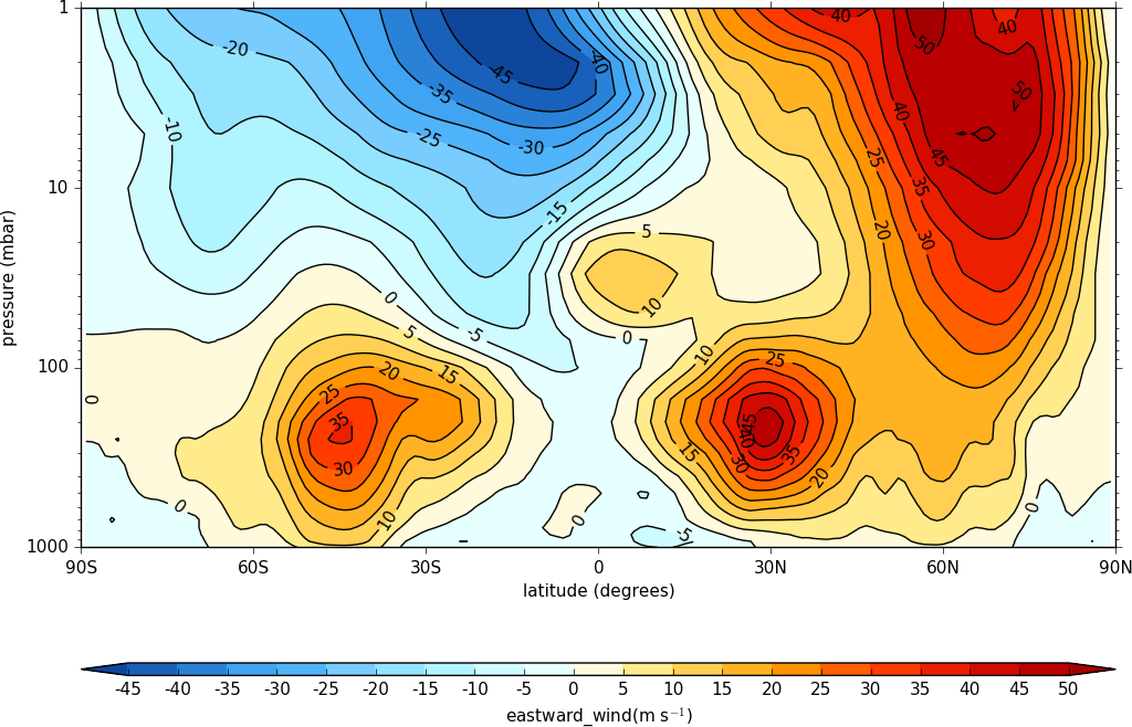
To make a log pressure on the y axis use the ylog=True flag to the con routine.
import cf, cfplot as cfp
f=cf.read('cfplot_data/ggap.nc')[1]
cfp.con(f.collapse('mean','longitude'), ylog=True)
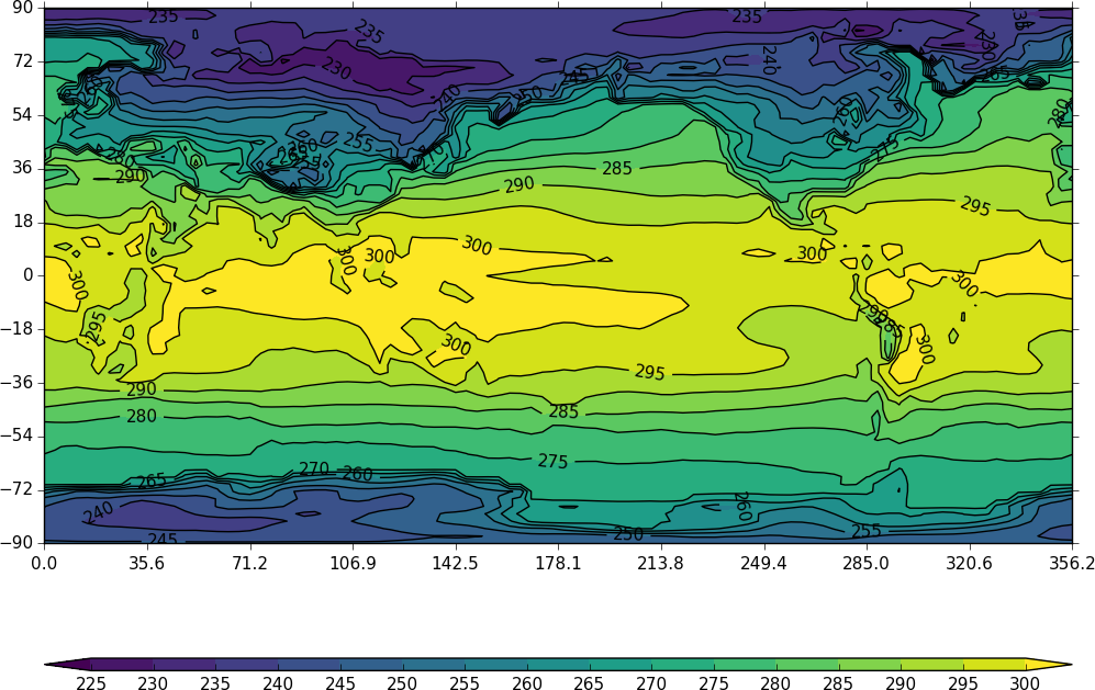
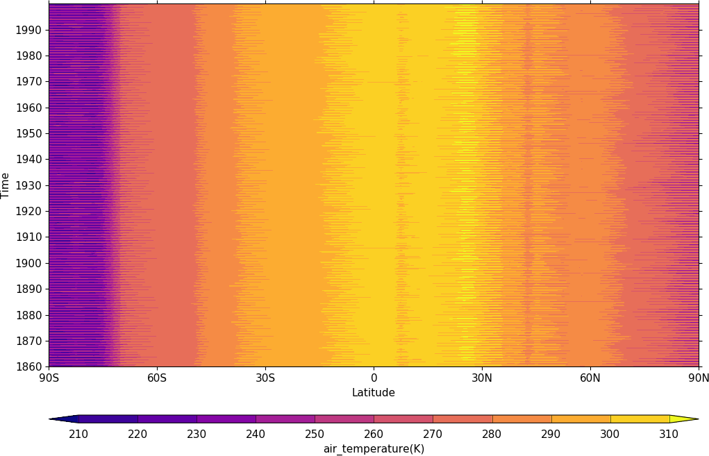
Hovmuller plots
A Hovmuller plot is one of longitude or latitude versus time as per the following examples.
import cf, cfplot as cfp
f=cf.read('cfplot_data/tas_A1.nc')[0]
cfp.cscale('plasma')
cfp.con(f.subspace(longitude=0), lines=0)
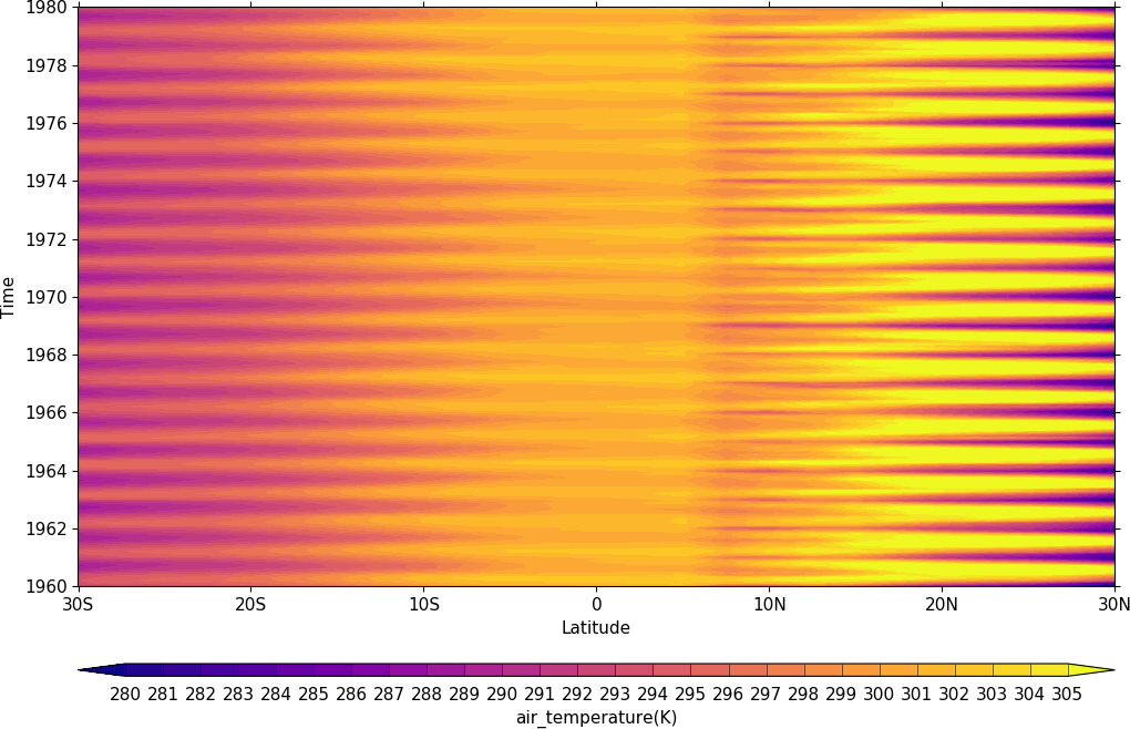
import cf, cfplot as cfp
f=cf.read('cfplot_data/tas_A1.nc')[0]
cfp.gset(-30, 30, '1960-1-1', '1980-1-1')
cfp.levs(min=280, max=305, step=1)
cfp.cscale('plasma')
cfp.con(f.subspace(longitude=0), lines=0)
Vector Plots
Vector plots are made using the vect routine.
import cf, cfplot as cfp
f=cf.read('cfplot_data/ggap.nc')
u=f[1].subspace(pressure=500)
v=f[3].subspace(pressure=500)
cfp.vect(u=u, v=v, key_length=10, scale=100, stride=5)
In this example vectors are overlaid on a contour plot.
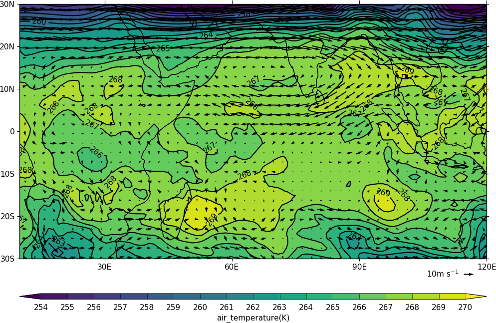
import cf, cfplot as cfp
f=cf.read('cfplot_data/ggap.nc')
u=f[1].subspace(pressure=500)
v=f[3].subspace(pressure=500)
t=f[0].subspace(pressure=500)
cfp.gopen()
cfp.mapset(lonmin=10, lonmax=120, latmin=-30, latmax=30)
cfp.levs(min=254, max=270, step=1)
cfp.con(t)
cfp.vect(u=u, v=v, key_length=10, scale=50, stride=2)
cfp.gclose()
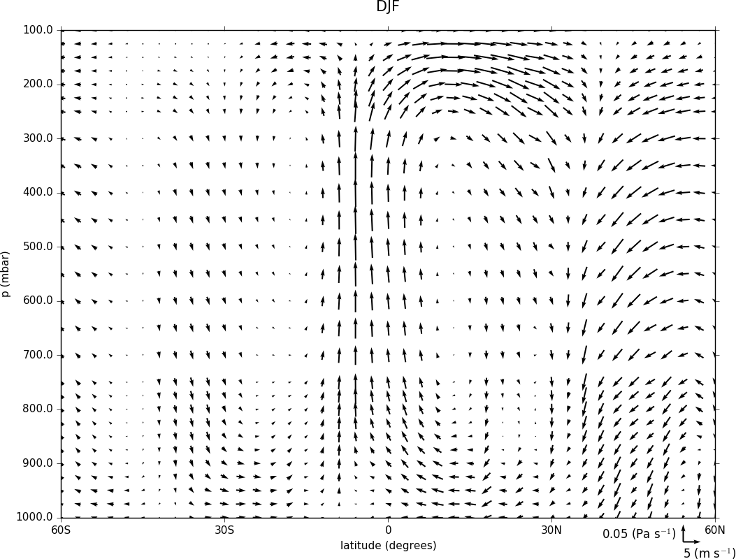
Here we make a zonal mean vector plot with different vector keys and scaling factors for the X and Y directions.
import cf, cfplot as cfp

c=cf.read('cfplot_data/vaAMIPlcd_DJF.nc')
c=c.subspace(Y=cf.wi(-60,60))
c=c.subspace(X=cf.wi(80,160))
c=c.collapse('T: mean X: mean')

g=cf.read('cfplot_data/wapAMIPlcd_DJF.nc')
g=g.subspace(Y=cf.wi(-60,60))
g=g.subspace(X=cf.wi(80,160))
g=g.collapse('T: mean X: mean')

cfp.vect(u=c, v=-g, key_length=[4, 0.2], scale=[20.0, 0.2], stride=[2,1], width=0.02, headwidth=6,
         headlength=6, headaxislength=5, pivot='middle', title='DJF', key_location=[0.95, -0.05])
Multiple Plots on a Page
To make multiple plots on the page open a graphic file with the gopen command and pass the rows and columns parameters. Make each plot in turn first selecting the position with the gpos command. The first position is the top left plot and increases by one for one plot to the right until the final plot is made in the bottom right. When all the plots have been made close the plot with the gclose() command. A combined colrbar is also made helping to reduce the plot complexity.
import cf, cfplot as cfp
f=cf.read('cfplot_data/ggap.nc')[1]

cfp.gopen(rows=2, columns=2, bottom=0.2)
cfp.gpos(1)
cfp.con(f.subspace(pressure=500), colorbar=None)
cfp.gpos(2)
cfp.mapset(proj='moll')
cfp.con(f.subspace(pressure=500), colorbar=None)
cfp.gpos(3)
cfp.mapset(proj='npstere', boundinglat=30, lon_0=180)
cfp.con(f.subspace(pressure=500), colorbar=None)
cfp.gpos(4)
cfp.mapset(proj='spstere', boundinglat=-30, lon_0=0)
cfp.con(f.subspace(pressure=500), colorbar_position=[0.1, 0.1, 0.8, 0.02], colorbar_orientation='horizontal')
cfp.gclose()
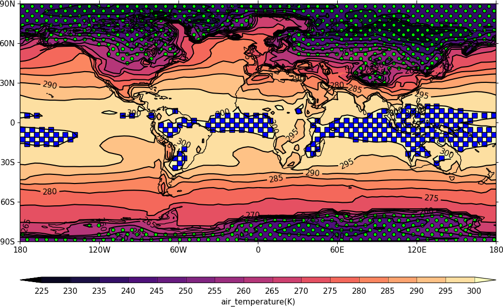
Stipple plots
A stipple plot is usually used to show areas of significance. These plots use the overlay technique as used in the previous contour/vector plot.
import cf, cfplot as cfp
f=cf.read('cfplot_data/tas_A1.nc')[0]
g=f.subspace(time=15)
cfp.gopen()
cfp.cscale('magma')
cfp.con(g)
cfp.stipple(f=g, min=220, max=260, size=100, color='#00ff00')
cfp.stipple(f=g, min=300, max=330, size=50, color='#0000ff', marker='s')
cfp.gclose()
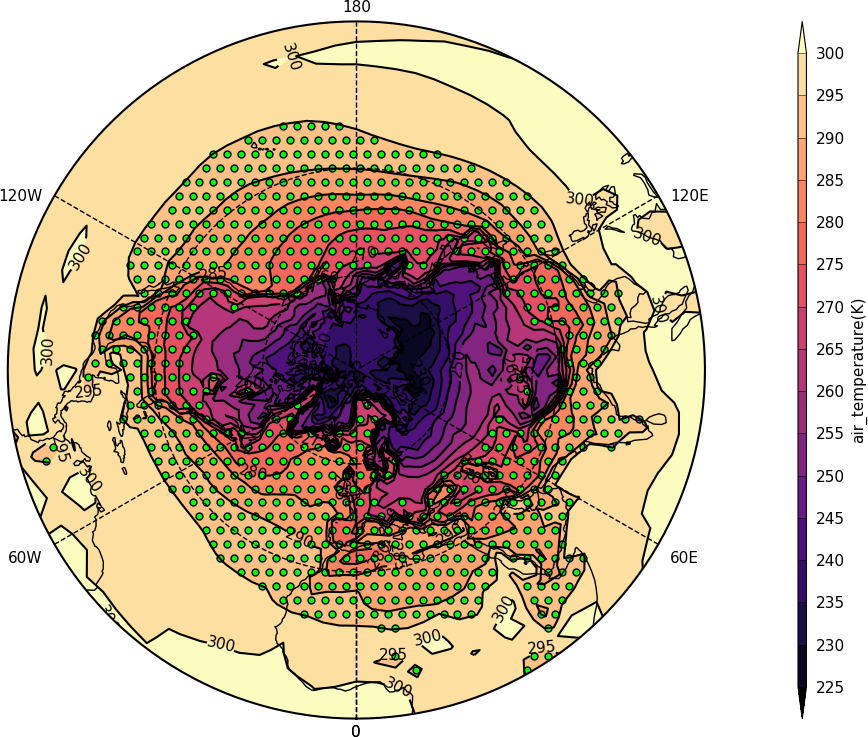
import cf, cfplot as cfp
f=cf.read('cfplot_data/tas_A1.nc')[0]
g=f.subspace(time=15)
cfp.gopen()
cfp.mapset(proj='npstere')
cfp.cscale('magma')
cfp.con(g)
cfp.stipple(f=g, min=265, max=295, size=100, color='#00ff00')
cfp.gclose()
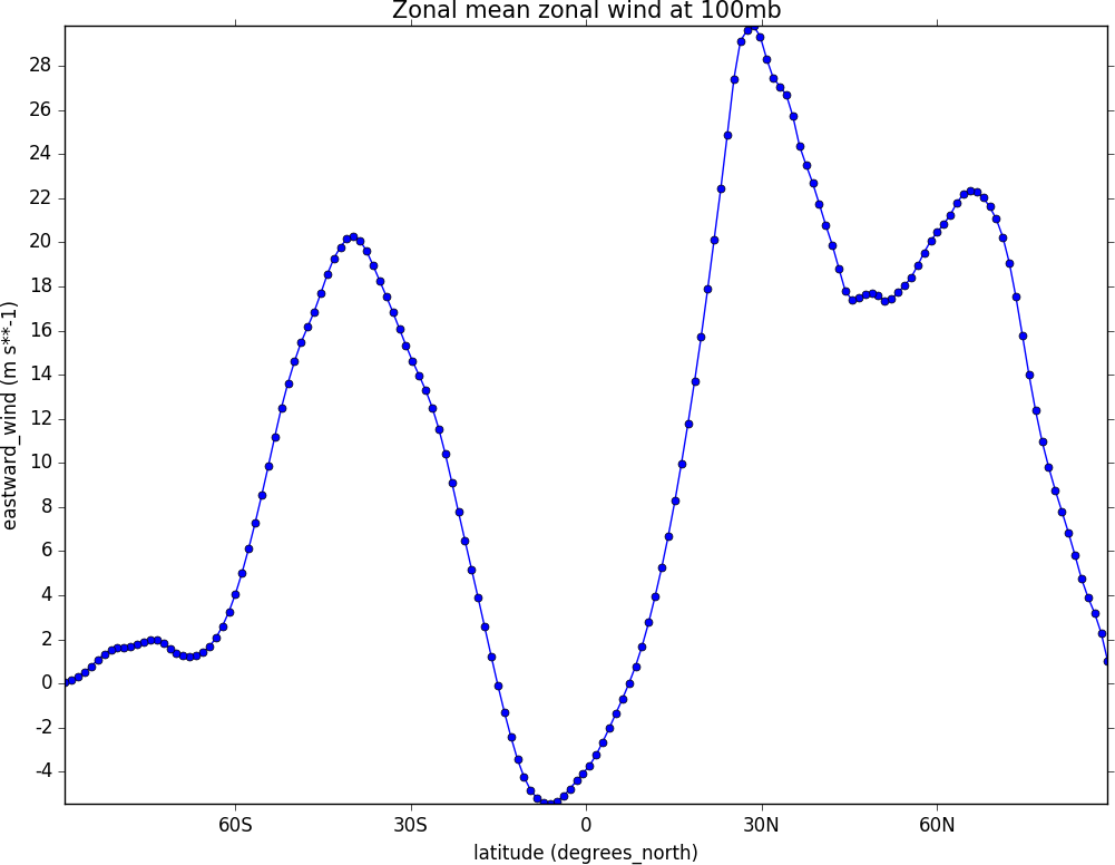
Graph plots
To make a graph plot use the cf-plot lineplot function as below on a single line of data in a field.
import cf, cfplot as cfp
f=cf.read('cfplot_data/ggap.nc')[1]
g=f.collapse('X: mean')
cfp.lineplot(g.subspace(pressure=100), marker='o', color='blue',\
             title='Zonal mean zonal wind at 100mb')
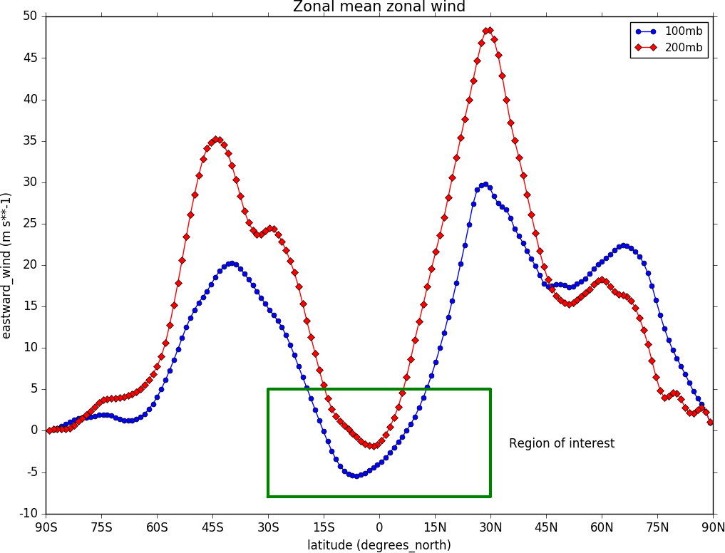
To make a multiple line plot use the gopen, gclose commands to enclose the plotting commands as in the example below.
import cf, cfplot as cfp
f=cf.read('cfplot_data/ggap.nc')[1]
g=f.collapse('X: mean')
xticks=[-90,-75,-60,-45,-30,-15,0,15,30,45,60,75,90]
xticklabels=['90S','75S','60S','45S','30S','15S','0','15N','30N','45N','60N','75N','90N']
xpts=[-30, 30, 30, -30, -30]
ypts=[-8, -8, 5, 5, -8]

cfp.gset(xmin=-90, xmax=90, ymin=-10, ymax=50)
cfp.gopen()
cfp.lineplot(g.subspace(pressure=100), marker='o', color='blue',\
          title='Zonal mean zonal wind', label='100mb')
cfp.lineplot(g.subspace(pressure=200), marker='D', color='red',\
             label='200mb', xticks=xticks, xticklabels=xticklabels,\
             legend_location='upper right')
cfp.plotvars.plot.plot(xpts,ypts, linewidth=3.0, color='green')
cfp.plotvars.plot.text(35, -2, 'Region of interest', horizontalalignment='left')
cfp.gclose()
Setting Contour Levels
cf-plot generally does a reasonable job of setting appropriate contour levels. In the cases where it doesn’t do this or you need a consistent set of levels between plots for comparison purposes use the levs routine. The levs command manually sets the contour levels.
Use the levs command when a predefined set of levels is required. The min, max and step parameters are all needed to define a set of levels. These can take integer or floating point numbers. If colour filled contours are plotted then the default is to extend the minimum and maximum contours coloured for out of range values - extend=’both’. Use the manual option to define a set of uneven contours i.e.
cfp.levs(manual=[-10, -5, -4, -3, -2, -1, 1, 2, 3, 4, 5, 10])
Once a user call is made to levs the levels are persistent. i.e. the next plot will use the same set of levels. Use levs() to reset to undefined levels i.e. let cf-plot generate the levels again. Once the levs command is used you’ll need to think about the associated colour scale.
Colour scales
There are around 140 colour scales included with cf-plot. Colour scales are set with the cscale command. There are two default colour scales that suit differing types of data.
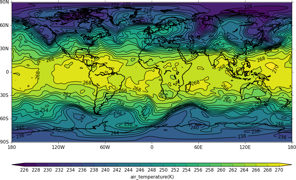
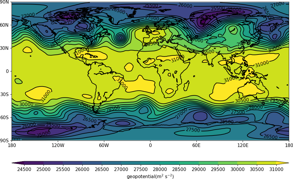
A continuous scale (‘viridis’) that goes from blue to green and then yellow and suits data that has no zero in it. For example air temperature in Kelvin or geopotential height - see example 1.
A diverging scale (‘scale1’) that goes from blue to red and suits data with a zero in it. For example temperature in Celsius or zonal wind - see example 4.
cfp.levs(min=-80, max=80, step=10)
cfp.cscale('scale1')

If no call has been made to adjust the colour scale then continuous and diverging colour scales are self adjusting to fit the number of levels automatically generated by cf-plot or specified by the user with the levs command. This behaviour is also followed for a simple call to cscale specifying a different colour scale - for example cfp.cscale(‘radar’) to select the radar colour scheme.
If a call to cscale specifies additional parameters to the colour scale, then the automatic colour adjustment is turned off giving the user fine tuning of colours as below.
To change the number of colours in a scale use the ncols parameters.
cfp.cscale('scale1', ncols=12)
cfp.levs(min=-5, max=5, step=1)

To change the number of colours above and below the mid-point of the scale use the above and below parameters. This is useful for fields where you have differing extents of data above and below the zero line.
cfp.cscale('scale1', below=4, above=7)
cfp.levs(min=-30, max=60, step=10)

For data where you need white to indicate that this data region is insignificant use the white=white parameter. This can take single or multiple values.
cfp.cscale('scale1', ncols=11, white=5)
cfp.levs(manual=[-10,-8, -6, -4, -2, 2, 4, 6, 8, 10])

To reverse a colour scale use the reverse=True option to cscale and specify the number of colours required.
cfp.cscale(‘viridis’, reverse=True, ncols=17)
Producing a ‘uniform’ colour scale
The uniform parameter may be of use when using a set of contour levels where there is wide mismatch between the above and below numbers.
uniform = False - produce a uniform colour scale. For example: if below=3 and above=10 are specified then initially below=10 and above=10 are used. The colour scale is then cropped to use scale colours 6 to 19. This produces a more uniform intensity colour scale than one where all the blues are compressed into 3 colours.
User defined colour scales
Colour scales are stored as red green blue values on a scale of 0 to 255. Put these in a file with one red green blue value per line. i.e.
will give a red white blue colour scale. If the file is saved as /home/swsheaps/rwb.txt it is read in using
cfp.cscale('/home/swsheaps/rwb.txt')
If the colour scale selected has too few colours for the number of contour levels then the colours will be used cyclically.
Changing colours in a colour scale
The simplest way to do this without writing any code is to modify the internal colour scale before plotting. The colours most people work with are stored as red green blue intensities on a scale of 0 to 255, with 0 being no intesity and 255 full intensity.
White will be represented as 255 255 255 and black as 0 0 0
The internal colour scale is stored in cfp.plotvars.cs as hexadecimal code. To convert from decimal to hexadecimal use hex i.e. hex(255)[2:] ‘ff’
The [2:] is to get rid of the preceding 0x in the hex output.
for example to make one of the colours in the viridis colour scale grey use:
import cf, cfplot as cfp
f=cf.read('cfplot_data/tas_A1.nc')[0]
cfp.cscale('viridis', ncols=17)
cfp.plotvars.cs[14]='#a6a6a6'
cfp.con(f.subspace(time=15))
Predefined colour scales
A lot of the following colour maps were downloaded from the NCAR Command Language web site. Users of the IDL guide colour maps can see these maps at the end of the colour scales.
Perceptually uniform colour scales
A selection of perceptually uniform colour scales for contouring data without a zero in. See The end of the rainbow and Matplotlib colour maps for a good discussion on colour scales, colour blindness and uniform colour scales.
| Name | Scale |
|---|---|
| viridis | 
|
| magma | 
|
| inferno | 
|
| plasma | 
|
| parula | 
|
| gray | 
|
NCAR Command Language - MeteoSwiss colour maps
| Name | Scale |
|---|---|
| hotcold_18lev | 
|
| hotcolr_19lev | 
|
| mch_default | 
|
| perc2_9lev | 
|
| percent_11lev | 
|
| precip2_15lev | 
|
| precip2_17lev | 
|
| precip3_16lev | 
|
| precip4_11lev | 
|
| precip4_diff_19lev | 
|
| precip_11lev | 
|
| precip_diff_12lev | 
|
| precip_diff_1lev | 
|
| rh_19lev | 
|
| spread_15lev | 
|
NCAR Command Language - small color maps (<50 colours)
| Name | Scale |
|---|---|
| amwg | 
|
| amwg_blueyellowred | 
|
| BlueDarkRed18 | 
|
| BlueDarkOrange18 | 
|
| BlueGreen14 | 
|
| BrownBlue12 | 
|
| Cat12 | 
|
| cmp_flux | 
|
| cosam12 | 
|
| cosam | 
|
| GHRSST_anomaly | 
|
| GreenMagenta16 | 
|
| hotcold_18lev |
|
| hotcolr_19lev |
|
| mch_default |
|
| nrl_sirkes | 
|
| nrl_sirkes_nowhite | 
|
| perc2_9lev |
|
| percent_11lev |
|
| posneg_2 | 
|
| prcp_1 | 
|
| prcp_2 | 
|
| prcp_3 | 
|
| precip_11lev |
|
| precip_diff_12lev |
|
| precip_diff_1lev |
|
| precip2_15lev |
|
| precip2_17lev |
|
| precip3_16lev |
|
| precip4_11lev |
|
| precip4_diff_19lev |
|
| radar | 
|
| radar_1 | 
|
| rh_19lev |
|
| seaice_1 | 
|
| seaice_2 | 
|
| so4_21 | 
|
| spread_15lev |
|
| StepSeq25 | 
|
| sunshine_9lev | 
|
| sunshine_diff_12lev | 
|
| temp_19lev | 
|
| temp_diff_18lev | 
|
| temp_diff_1lev | 
|
| topo_15lev | 
|
| wgne15 | 
|
| wind_17lev | 
|
NCAR Command Language - large colour maps (>50 colours)
| Name | Scale |
|---|---|
| amwg256 | 
|
| BkBlAqGrYeOrReViWh200 | 
|
| BlAqGrYeOrRe | 
|
| BlAqGrYeOrReVi200 | 
|
| BlGrYeOrReVi200 | 
|
| BlRe | 
|
| BlueRed | 
|
| BlueRedGray | 
|
| BlueWhiteOrangeRed | 
|
| BlueYellowRed | 
|
| BlWhRe | 
|
| cmp_b2r | 
|
| cmp_haxby | 
|
| detail | 
|
| extrema | 
|
| GrayWhiteGray | 
|
| GreenYellow | 
|
| helix | 
|
| helix1 | 
|
| hotres | 
|
| matlab_hot | 
|
| matlab_hsv | 
|
| matlab_jet | 
|
| matlab_lines | 
|
| ncl_default | 
|
| ncview_default | 
|
| OceanLakeLandSnow | 
|
| rainbow | 
|
| rainbow_white_gray | 
|
| rainbow_white | 
|
| rainbow_gray | 
|
| tbr_240_300 | 
|
| tbr_stdev_0_30 | 
|
| tbr_var_0_500 | 
|
| tbrAvg1 | 
|
| tbrStd1 | 
|
| tbrVar1 | 
|
| thelix | 
|
| ViBlGrWhYeOrRe | 
|
| wh_bl_gr_ye_re | 
|
| WhBlGrYeRe | 
|
| WhBlReWh | 
|
| WhiteBlue | 
|
| WhiteBlueGreenYellowRed | 
|
| WhiteGreen | 
|
| WhiteYellowOrangeRed | 
|
| WhViBlGrYeOrRe | 
|
| WhViBlGrYeOrReWh | 
|
| wxpEnIR | 
|
| 3gauss | 
|
| 3saw | 
|
| BrBG | 
|
NCAR Command Language - Enhanced to help with colour blindness
| Name | Scale |
|---|---|
| StepSeq25 |
|
| posneg_2 |
|
| posneg_1 | 
|
| BlueDarkOrange18 |
|
| BlueDarkRed18 |
|
| GreenMagenta16 |
|
| BlueGreen14 |
|
| BrownBlue12 |
|
| Cat12 |
|
IDL guide scales
| Name | Scale |
|---|---|
| scale1 | 
|
| scale2 | 
|
| scale3 | 
|
| scale4 | 
|
| scale5 | 
|
| scale6 | 
|
| scale7 | 
|
| scale8 | 
|
| scale9 | 
|
| scale10 | 
|
| scale11 | 
|
| scale12 | 
|
| scale13 | 
|
| scale14 | 
|
| scale15 | 
|
| scale16 | 
|
| scale17 | 
|
| scale18 | 
|
| scale19 | 
|
| scale20 | 
|
| scale21 | 
|
| scale22 | 
|
| scale23 | 
|
| scale24 | 
|
| scale25 | 
|
| scale26 | 
|
| scale27 | 
|
| scale28 | 
|
| scale29 | 
|
| scale30 | 
|
| scale31 | 
|
| scale32 | 
|
| scale33 | 
|
| scale34 | 
|
| scale35 | 
|
| scale36 | 
|
| scale37 | 
|
| scale38 | 
|
| scale39 | 
|
| scale40 | 
|
| scale41 | 
|
| scale42 | 
|
| scale43 | 
|
| scale44 | 
|
Labelling time axes
The default time axis labelling in cf-plot might not be acceptable and here is some information on using cf-python to extract values for yourself.
The time strings are stored in dtarray and the time values in array:
Likewise the years and months are in year.array and month.array:
To find the time value for to the tick position for January 1st 1980 00:00hrs:
With this technique arrays of custom tick label and positions can be constructed and passed to the cfp.lineplot or to the cfp.con routines.
Note the correct date format is ‘YYYY-MM-DD’ or ‘YYYY-MM-DD HH:MM:SS’ - anything else will give unexpected results.
Selecting data that has a lot of decimal places in the axis values
Axes with a lot of decimal places can cause issues with numeric representation and rounding, In one case
>>> cfp.lineplot(f.subspace(latitude=50.17530806))
caused an error as the latitude with 50.17530806 wasn’t found.
In cf-python the tolerance for equivalence is
>>> cf.RTOL()
2.220446049250313e-16
To set to a lower tolerance use
>>> g=cf.RTOL(1e-5)
>>> cf.RTOL()
1e-05
To swap back use
>>> cf.RTOL(g)
After swapping the tolerance to 1e-5 the following finds the latitide as expected.
>>> cfp.lineplot(f.subspace(latitude=50.17530806))
We could have worked around this with
>>> cfp.lineplot(f.subspace(latitude=cf.wi(50, 50.2)))
Map options
The default map plotting projection is the cyclindrical equidistant projection from -180 to 180 in longitude and -90 to 90 in latitude. To change the map view in this projection to over the United Kingdom, for example, you would use mapset(lonmin=-6, lonmax=3, latmin=50, latmax=60) or mapset(-6, 3, 50, 60)
The limits are -360 to 720 in longitude so to look at the equatorial Pacific you could use mapset(lonmin=90, lonmax=300, latmin=-30, latmax=30) or mapset(lonmin=-270, lonmax=-60, latmin=-30, latmax=30)
The proj parameter accepts ‘npstere’ and ‘spstere’ for northern hemisphere or southern hemisphere polar stereographic projections. In addition to these the boundinglat parameter sets the edge of the viewable latitudes and lat_0 sets the centre of desired map domain.
Additional map projections via proj are: ortho, merc, moll, robin and lcc These are abreviations for orthographic, mercator, mollweide, robinson and lambert conformal projections
Cropped area on map lcc projections Lambert conformal projections can now be cropped as in the following code:
import cf, cfplot as cfp
f=cf.read('cfplot_data/ggap.nc')[1]
cfp.mapset(proj='lcc', lonmin=-50, lonmax=50, latmin=20, latmax=85)
cfp.con(f.subspace(pressure=700))
Axis labelling
The priority order of axis labeling in order of preference is: | 1) user passed to routine | 2) user defined by axes command | 3) labels generated internally
For 1 and 2 the available options are
When specifying the xticklabels or yticklabels the supplied values must be a string or list of strings and match the number of corresponding tick marks.
Blockfill plots
Blockfill plots used to use the pcolormesh method but this had the advantage of being fast but gave incorrect results with masked data or when the data range wasn’t extended in both ‘min’ and ‘max’ directions. The blockfill method now uses PolyCollection from matplotlib.collections to draw the polygons for each colour interval specified by the contour levels. This also has the advantage that blockfill is now available in other projections such as polar stereographic. When doing blockfill plots of larger numbers of points the new method is slower so trim down the data to the area being shown before passing to cfp.con to speed it up.
Making postscript or PNG pictures
There are various methods of producing a figure for use in an external package such as a web document or LaTeX, Word etc.
To reset to viewing the picture on the screen again use cfp.setvars().
Another method is to use gopen as when used in making multiple plots.
cfp.gopen, file='zonal.ps'
cfp.con(f.subspace(time=15))
cfp.gclose()
Making non-blocking plots
Using the Python prompt cf-plot will try to use the ImageMagick display command to show the plots. This is done with subprocess and plots will remain on the screen even if the user exits the Python session. If the display command isn’t installed then cf-plot will use the Matplotlib picture viewer which will block the command prompt until it is quit. Use cfp.setvars(viewer=’matplotlib’) to set this to be the defaul for a session even if the display command is available.
Using cf-plot in batch mode
The following method works in the Reading Meteorology department. In the file /home/swsheaps/ajh.sh:
#!/bin/sh
/home/opt-user/Enthought/Canopy_64bit/User/bin/python /home/swsheaps/ajh.py
In the file /home/swsheaps/ajh.py:
import cf
import cfplot as cfp
f=cf.read('cfplot_data/tas_A1.nc')[0]
cfp.setvars(file='/home/swsheaps/ll.png')
cfp.con(f.subspace(time=15))
run the batch job today at 16:33:
at -f /home/swsheaps/ajh.sh 16:33
Changing defaults via the ~/.cfplot_defaults file
A ~/.cfplot_defaults default overide file in the user home directory may contain three values affecting contour plots initially. Please contact me if you would like any more defaults changed in this manner.
This changes the default cfplot con options from contour fill with contour lines on top to blockfill with no contour lines on top. The blockfill, fill and line options to the con routine override any of these preset values. The delimter beween the option and the value must be a space.
Plotting data with different time units
When plotting data with different time units users need to move their data to using a common set of units as below.
This is because when making a contour or line plot the axes are defined in terms of a linear scale of numbers. Having two different linear scales breaks the connection between the data.