Current work
Stationary convective band of 27 August 2011
Here are some recent plots regarding my current work and a brief description of their significance. Click on any figure to view a larger version.
Figure 1: NIMROD radar rain accumulations 15-18UTC | |
| Rainfall accumulations for the 3 hours where the band is most persistent are shown. The band (located in the centre of the figure) produces up to 32 mm of rain in 3 hours, with a large area receiving in excess of 8 mm, whilst nearby regions experience little or no rain. | 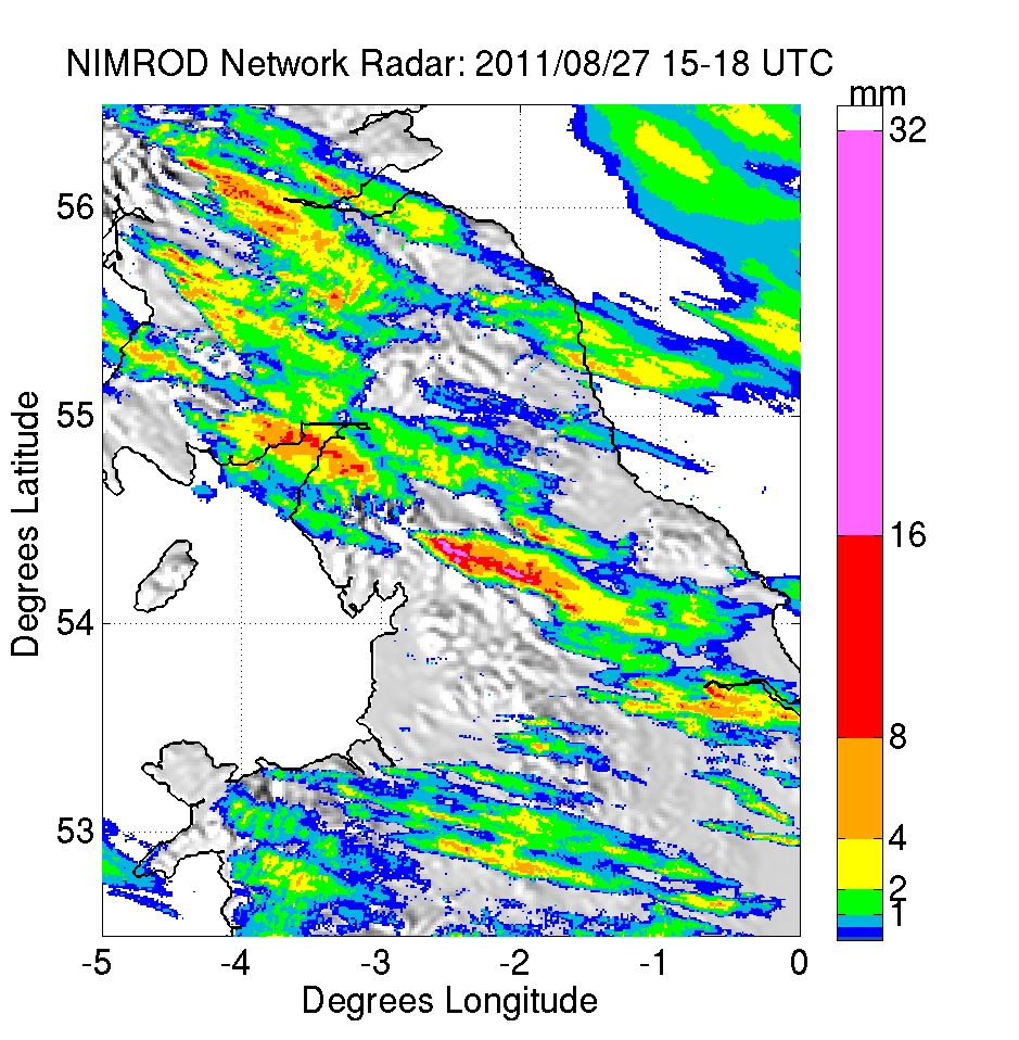 |
Figure 2: Defining 'banded rainfall' | |
| Here we try to determine the amount of rainfall falling from banded precipitation in the area of the observed bands. It is not satisfactory to take a simple measure of the rainfall, such as the area average in a certain time period, as some of the ensemble members produce large rainfall amounts in this area from entirely different precipitation structures (such as large areas of relatively light rain). We define 'banded rainfall' here as rainfall which falls in rain events of 45 minutes or longer, and at pixels within the orange area shaded. I.e. any pixel where it rains continuously for 45 minutes, the total rainfall is included and any rain which is continuous at a pixel for 40 minutes or less is discounted. 45 minutes was chosen subjectively as this left most of the banded rainfall in the rainfall totals and removed much of the other rain types - although this is not a perfect method and still needs refining. References to banded rainfall below refer to this definition, although no requirement of the rain object to be a band is made. | 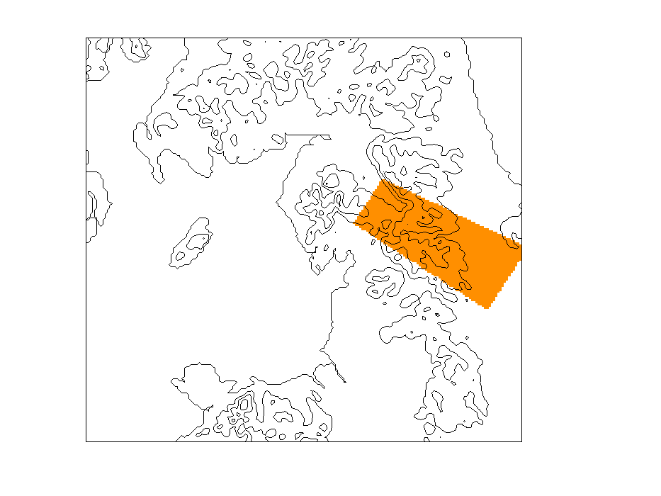 |
Figure 3: Sensitivity to v-wind | |
| Ensemble sensitivity analysis based on Torn & Hamik (2007) is used to explore which variables are related to high model precipitation in the area of the observed bands. The method is simple, and involves calculating a linear regression between some predictor at each grid-point, with a response function, in this case the average banded rainfall of each ensemble member. This linear regression is then scaled down in area where the correlation coefficient between predictor and response function is low (below 0.5) and is scaled by multiplying by the standard deviation of the predictor to make comparisons of multiple predictors impact easier. In this figure the sensitivity to the v-component of the wind (in the lowest model level) is plotted. The model produces more banded precipitation in ensemble members with lower (more negative; more Northerly) v-wind velocities. The moderate sensitivity to v-wind speed can be interpreted as stronger Northerly flow along the valley resulting in increased ascent at the end of the valley where the air also meets westerly winds that have passed to the South of the Lake District and hence increasing the strength of the convergence here. | 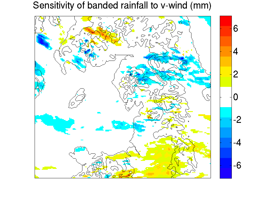 |
Figure 4: Sensitivity to humidity | |
| This figure shows the ensemble sensitivity to low level moisture (in the lowest model level). There is little sensitivity over most of the domain, although models with greater precipitation in the area of the observed bands show a small sensitivity to the moisture content to the North of the Lake District. Although not shown here, the moisture in the valley region, strongly affects the CAPE there, and it is thought that a reduction in the stability of the air due to increased q allows the air to continue flowing Westerly, up and over the ridge, rather than along the valley. There is a strong relationship between the rainfall at the top of the ridge with q in the valley (not shown), however, there is little relationship to the rainfall in the area of observed bands. | 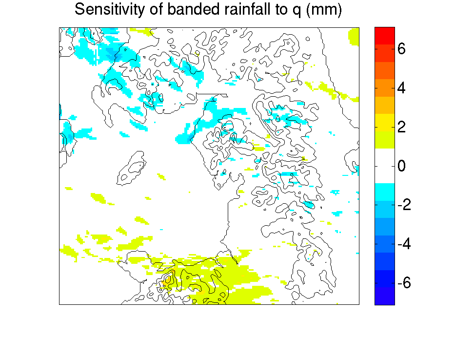 |
Figure 5: Sensitivity to temperature | |
| This figure shows the sensitivity to temperature (in the lowest model level) before the band forms. A strong signal is seen, with a preference for colder temperatures over the ocean and upwind of the Lake District. In addition there is a strong preference for warmer temperature over land, directly adjacent to the preference for cold over the ocean. This can be explained with the aid of Figure 6, where the liquid cloud cover is plotted. Please read on... | 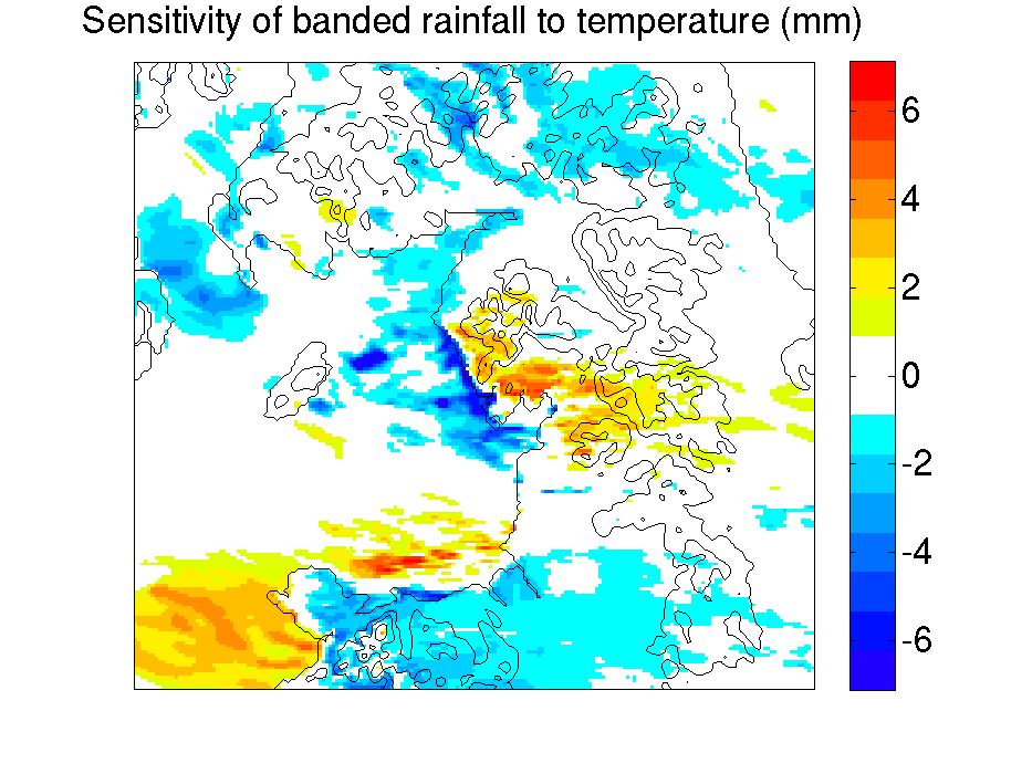 |
Figure 6: Sensitivity to liquid (low) cloud amount | |
| The sensitivity to liquid cloud fraction (in the lowest 15 model levels, i.e. the whole boundary layer) is shown. A sensitivity to low cloud amounts is shown over the region where high temperatures were favoured in the above figure. It appears cooler (most stable) air upstream is less able to produce cloud once it encounters land, and hence the land warms more. There are two possible explainations: 1) The cooler, more stable air is deflected around, rather than over, the orography or 2) The cooler air results in a shallower convective boundary layer and air is unable to reach its lifting condensation level. | 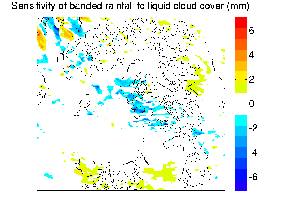 |
Figure 7: Sensitivity to magnitude of wind speed | |
| This plot shows the sensitivity of the rainfall to the upstream wind speed (in the lowest model level) and shows a strong sensitivity, favouring weaker upstream winds. Weaker winds can be deflected more by the terrain and therefore result in stronger convergence in the lee. There is a good correlation between the upstream wind speed and upstream temperature in the ensemble members, so determining which (if either) effect is most significant is a little tricky. | 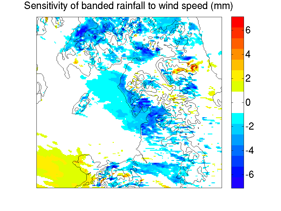 |
Figure 8: Sensitivity to pressure | |
| The sensitivity to pressure tells the same story as the wind speed. A preference for lower pressure in the shown location results in a weaker pressure gradient force and thus weaker winds flowing towards the Lake District. When looking at the whole model domain, there is not a large sensitivity to the low pressure centre location or intensity (although there is some), but most of the sensitivity is to the pressure in the location shown in this figure. | 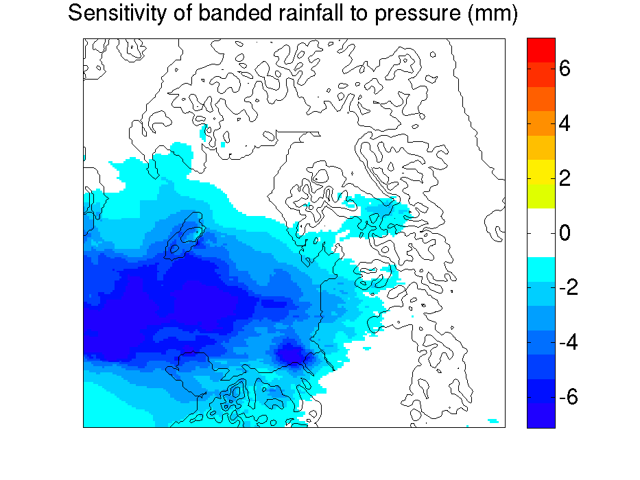 |