Monday 04/01/2016
Indices time series
To check if there is any link between the global mean surface temperature (Ts) and various indices (MEI, AO, PDO, AMO).
Plots
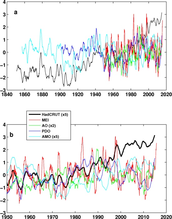
Fig. 1: Time series of HadCRUT anomaly (base 1961-1990), MEI index, AO, PDO and AMO.
- All lines are 24 month running mean.
- This plot is messy, please see following plots for details.
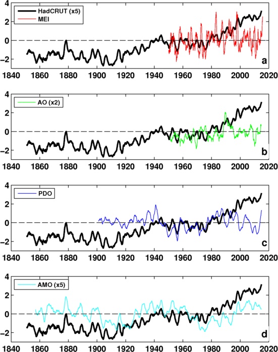
Fig. 2: As Fig. 1a, but in separate panels for clarity.
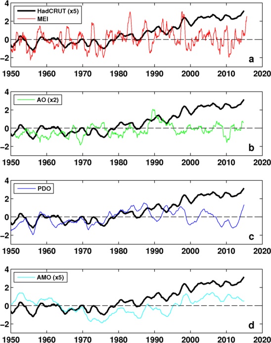
Fig. 3: As Fig. 1b, but in separate panels for clarity.
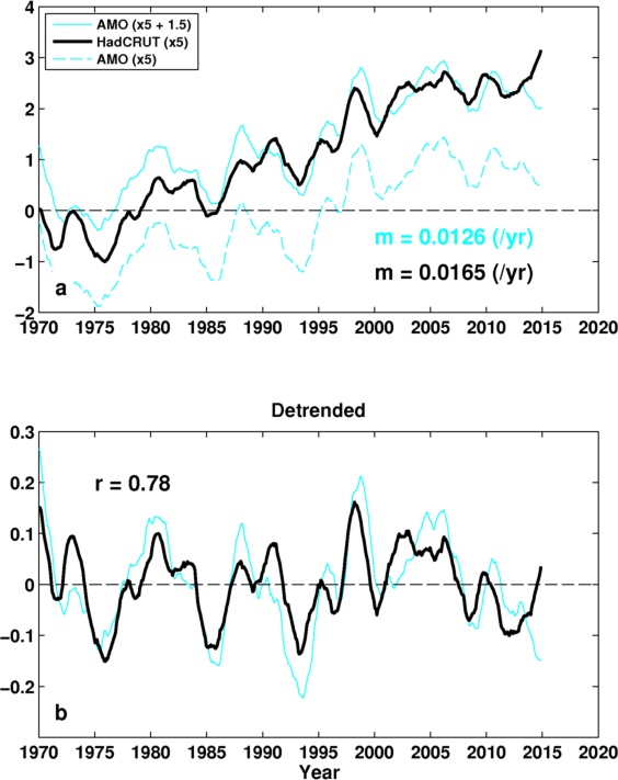
Fig. 4: (a) Comparison of AMO and Ts; (b) detrended.
- The AMO is shifted up (solid) for easy comparison.
- Have consistent variability in general, but there is discrepancy at the end of the data.
- Gradient (m) is similar, though Ts gradient is bigger.
- This AMO is from http://www.esrl.noaa.gov/psd/data/timeseries/AMO/. It looks like the ENSO and greenhouse forcing is not removed.
- But it means the north Atlantic SST is the important proxy of the global mean Ts.