PHYS 1.3: Graphs and measurements |
PPLATO @ | |||||
PPLATO / FLAP (Flexible Learning Approach To Physics) |
||||||
|
1 Opening items
1.1 Module introduction
Plotting a graph is a very useful way of showing the relationship between two measured variables; this module explains how this is done, using two simple experiments as examples. It gives some general guidelines for preparing graphs and then goes on to examine linear relationships and the straight–line graphs that represent them. It also explains how to estimate the gradient and intercept that characterize such graphs.
Some commonly encountered non–linear relationships are dealt with in Subsection 4.3, and the use of logarithms to transform certain non–linear relationships into linear ones is discussed in Subsection 4.4.
Section 5 deals with the question of experimental errors on graphs: how these can be plotted, and how they can be used to estimate the error in the gradient and intercept of a straight–line graph.
Finally, in Section 6, formulae are given that can be used to calculate directly the values of the gradient and intercept of the straight–line graph that best fits a given set of numerical data.
Study comment Having read the introduction you may feel that you are already familiar with the material covered by this module and that you do not need to study it. If so, try the following Fast track questions. If not, proceed directly to the Subsection 1.3Ready to study? Subsection.
1.2 Fast track questions
Study comment Can you answer the following Fast track questions? If you answer the questions successfully you need only glance through the module before looking at the Subsection 7.1Module summary and the Subsection 7.2Achievements. If you are sure that you can meet each of these achievements, try the Subsection 7.3Exit test. If you have difficulty with only one or two of the questions you should follow the guidance given in the answers and read the relevant parts of the module. However, if you have difficulty with more than two of the Exit questions you are strongly advised to study the whole module. i
| Mass of the flask and its contents M/g |
Volume of the liquid V/cm3 |
|---|---|
| 330 ± 20 | 200 ± 20 |
| 480 ± 20 | 400 ± 20 |
| 660 ±20 | 600 ± 20 |
| 850 ± 20 | 800 ± 20 |
| 1010 ± 20 | 1000 ± 20 |
Question F1
The mass M of a flask and its contents, is measured as a function of the volume V of liquid in the flask, and the results are given in Table 1.
Plot a graph of M against V.
Assuming that M and V are related by the equation M = M0 + ρV, use your graph to estimate the values of M0 and ρ. Take care to include error estimates in your answer.
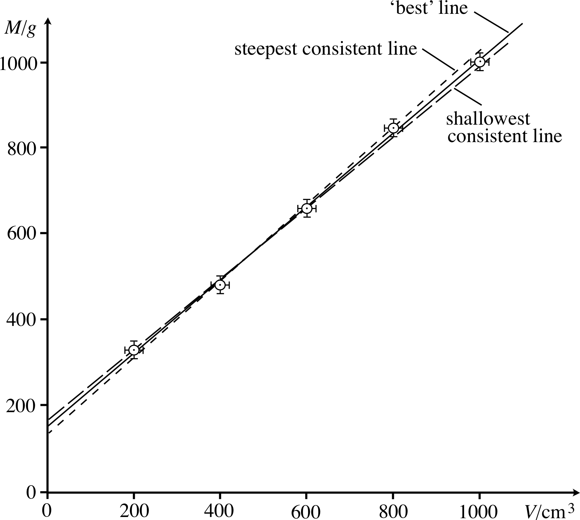
Figure 24 See Answer F1.
Answer F1
The graph is shown in Figure 24, and the values of M0 and ρ, together with their errors, are found from the gradient and intercept of the line that goes most centrally through the points, together with the steepest and shallowest lines that are still consistent with the data.
M0 = (150 ± 20) g, ρ = (0.86 ± 0.04) g cm−3
| x | y |
|---|---|
| 2 | 63 |
| 6 | 91 |
| 10 | 107 |
| 25 | 146 |
| 62 | 198 |
Question F2
Show that the data in Table 2 can be sensibly represented by an equation of the form y = kx α, and find approximate values for k and α.
Answer F2
If y = kx α
then
log10 y = log10 (kx α) = log10 k + log10 x α (since log10 AB = log10 A + log10 B)
therefore
log10 y = log10 k + α log10 x (since log10 An = n log10 A)
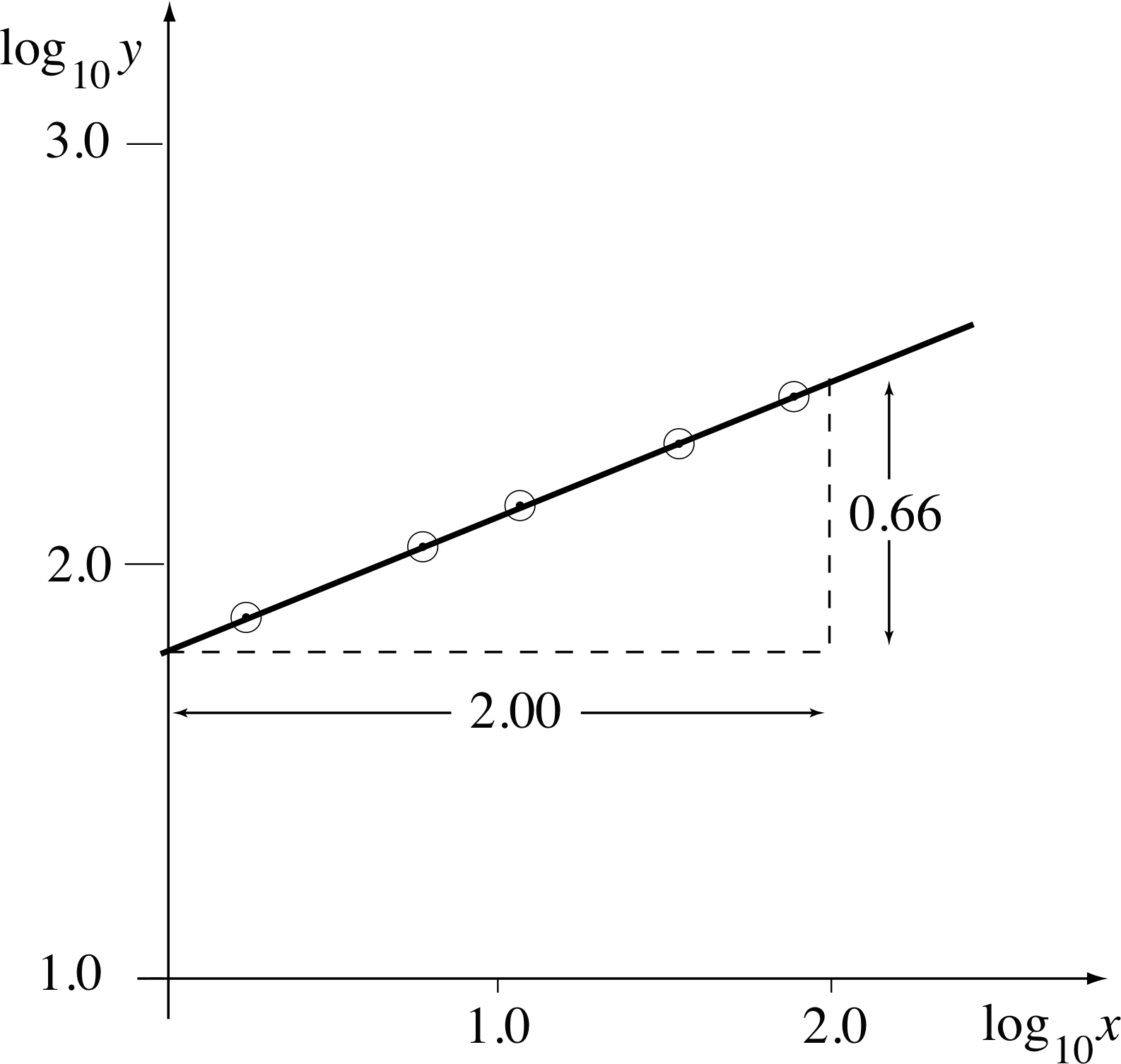
Figure 25 See Answer F2.
| x | y | log10 x | log10 y |
|---|---|---|---|
| 2 | 63 | 0.30 | 1.80 |
| 6 | 91 | 0.78 | 1.96 |
| 10 | 107 | 1.00 | 2.03 |
| 25 | 146 | 1.40 | 2.16 |
| 62 | 198 | 1.79 | 2.30 |
So, if y = kxα is a good fit to the given data, a graph of log10 y against log10 x should be a straight line, and its gradient will be α. (Here we have used logarithms to base 10. Logarithms to any other base would do equally well.) We will now test this relationship. Values of log10 x and log10 y are given in Table 19.
The graph of log10 y against log10 x is shown in Figure 25. The data points lie (approximately) on a straight line, and therefore an equation of the original form can sensibly be used to represent the data.
The straight line drawn through the points has a gradient $\alpha = \dfrac{0.66}{2.00} \approx \dfrac13$ and an intercept on the vertical axis at ≈1.70.
Therefore it follows that
$\log_{10}y \approx 1.70 + \dfrac13 \log_{10}x \approx \log_{10}(50.1) + \dfrac13 \log_{10}x$
and so y ≈ 50.1x1/3
Thereforek = 50.1 and α = 1/3.
1.3 Ready to study?
Study comment In order to study this module you will need to be familiar with the following terms: error (in a measurement), mean (i.e. average), random error, systematic error, table of values and uncertainty (a synonym for error). You should be able to use a calculator to perform arithmetical operations, and to work in scientific_notationscientific (powers_of_ten_notationpowers–of–ten or standard_formstandard) scientific_notationnotation. The module also makes use of logarithms; so you will need to know what the log of a number is, and how to obtain it using your calculator. (Most aspects of this topic, including the use of natural logarithms (loge), are reviewed within the module.) If you are uncertain of any of these terms, you can review them by referring to the Glossary which will indicate where in FLAP they are developed. The following questions will allow you to establish whether you need to review some of the topics before embarking on this module.
Question R1
Draw up and complete a table of values for each of the following equations:
(a) 2y = 3x − 1 and (b) y = x2 + 3, where x is between −3 and +3 in both cases.
| x | y |
|---|---|
| −3 | 12 |
| −2 | 7 |
| −1 | 4 |
| 0 | 3 |
| 1 | 4 |
| 2 | 7 |
| 3 | 12 |
| x | y |
|---|---|
| −3 | −5 |
| −2 | −7/2 |
| −1 | −2 |
| 0 | −1/2 |
| 1 | 1 |
| 2 | 5/2 |
| 3 | 4 |
Answer R1
(a) If 2y = 3x − 1, then y = (3x − 1)/2. The table of values for this equation is given in Table 20.
(b) The table of values for the equation y = x2 + 3 is given in Table 21.
(For further information consult table of values in the Glossary.)
Question R2
Evaluate the following in scientific notation:
(a) $\dfrac{(10^6)^{2/3}\times (4 \times 10^4)}{0.001 \times 10^2} $
(b) $\dfrac{(65 \times 10^{-4}) \times (10^8)^{9/2})} {(1.3 \times 10^4) \times (200)} $
(c) $\dfrac{900 \times 0.0002 \times (12 \times 10^2)^2} {30 \times 0.1} $
(d) $\left[\dfrac{0.0025 \times 10^4 \times 400 \times (10^2)^4}{500000 \times (100)^{1/2}}\right]^3$
Answer R2
(a) 4 × 10⁹ (b) 2.5 × 1027 (c) 8.64 × 10⁴ (d) 8 × 10¹⁵
(For further information consult scientific notation in the Glossary.)
Question R3
Evaluate the following logarithms (without using your calculator): i
(a) log10 (10), (b) log10 (1 000), (c) log10 (1 000 000), (d) log10 (0.0001), (e) log10 (0.000 0001), (f) log10 (1).
Answer R3
(a) 1 (b) 3 (c) 6 (d) −14 (e) −7 (f) 0
(If you had difficulty with Question R3 consult logarithm in the Glossary.)
Question R4
Given that log10 2 = 0.301, evaluate the following logarithms (without using your calculator): i
(a) log10 (200), (b) log10 (20 000), (c) log10 (0.2), (d) log10 (0.000 02),
(e) log10 (4), (f) log10 (32), (g) log10 (40), (h) log10 (64).
Answer R4
(a) 2.301, because log10 (2 × 100) = log10 (2) + log10 (100) = 0.301 + 2 = 2.301.
(b) 4.301.
(c) −0.699, because log10 (2 × 0.1) = log10 (2 × 10⁻¹) = log10 (2) + log10 (10−1) = 0.301 − 1 = −0.699.
(d) −4.699.
(e) 0.602, because log10 (14) = log10 (2 × 2) = log10 (2) + log10 (2) = 0.602.
(f) 1.505, because log10 (32) = log10 (25) = 5 log10 2 = 1.505.
(g) 1.602, because log10 (40) = log10 (2 × 2 × 10) = 2 log10 2 + log10 (101) = 1.602.
(h) 1.806.
(If you had difficulty with Question R4 consult logarithm in the Glossary.)
Question R5
A spring is suspended vertically and is stretched by a mass hung from its free end. This is repeated several times with equal masses, and the extension of the spring measured on each occasion. The values obtained (in mm) are:
77, 74, 74, 71, 73, 75, 72, 75
Calculate the mean value, and estimate the size of the random error.
What sources of systematic error might there be?
Answer R5
The mean value of a set of N values $x_1,\,x_2,x\,_3,\,...\,x_N$, is given by $\displaystyle\langle x \rangle = \frac{1}{N}(x_1,\,x_2,\,x_3,\,...x_N)$, which may also be written $\displaystyle\langle x \rangle = \frac{1}{N}\sum_{i=1}^N x_i$. In this case the mean of the given values is 74 mm (to two significant figures), with a spread of ±3 mm. The total spread tends to overestimate the error; a rough rule of thumb is to take 2/3 of the spread, giving a random error of ±2 mm. A more rigorous method is to calculate the standard deviation, which is about 1.9 mm in this case.
Possible sources of systematic error are the ruler being incorrectly positioned or incorrectly calibrated.
(Consult the Glossary if you are unclear about any of the italicized terms.)
2 Axes and coordinates
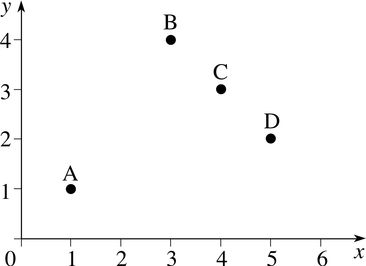
Figure 1 A simple graph.
In this module we will use the term graph to mean a plot of two 4 quantities (or variables) on two perpendicular lines called the axes, as in Figure 1. In the case of Figure 1 the horizontal and vertical axes represent the variables x and y, respectively, so they are labelled accordingly, and may be referred to as the x–axis and the y–axis. If we were to use the axes to represent two different variables, say m and t, then they would be known as the m–axis and the t–axis. The arrow on each axis indicates the direction in which the corresponding variable x increases. The axes of this particular graph intersect at a point called the origin which corresponds to the zero value for each variable. Sometimes it is convenient to draw a graph so that the axes intersect at values other than zero.
We can now describe the position of a point on the graph by specifying the corresponding value of each variable. For example the point B in Figure 1 is specified by x = 3 and y = 4. These values are called the coordinates of point B. Coordinate values are often given in the form of an ordered pair, such as (3, 4) in which case the first value, 3, corresponds to a value on the horizontal axis, while the second value, 4, corresponds to a value on the vertical axis. If we wish to refer to a point by a letter as well as by its coordinates we may, for example, refer to it as the point B(3, 4).
Question T1
Determine the x–coordinate and the y–coordinate of each of the points A, C and D shown in Figure 1.
Answer T1
The coordinates are A(1, 1), C(4, 3), D(5, 2).
Question T2
On the axes given in Figure 1 plot the points: P(2, 4), Q(1, 4), R(0, 2), S(3, 0).
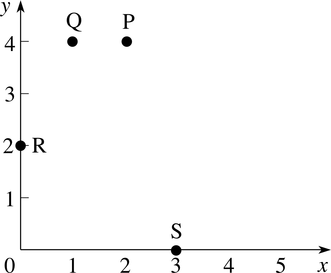
Figure 26 See Answer T2.
Answer T2
The points are plotted in Figure 26.
3 Plotting a graph
3.1 A simple experiment
| Mass m/kg | Extension e/mm |
|---|---|
| 0 | 0 |
| 1 | 13 |
| 2 | 28 |
| 3 | 44 |
| 4 | 58 |
| 5 | 74 |
| 6 | 89 |
| 7 | 105 |
| 8 | 120 |
Graphs are very useful for displaying the results of experiments, and are particularly good at revealing any systematic relationship between the variables that have been measured. We will illustrate this by analysing a very simple experiment – the stretching of a rubber band. This may seem a trivial experiment, but it serves our purpose quite well. The rubber band that we will examine is the sort used in a vacuum cleaner. It needs to be sufficiently flexible to be drawn easily over the pulleys, but not so flexible that it slips when the motor runs. To fit the band on the pulleys, it has to be stretched by about 5 cm, but it has to be able to sustain at least twice that extension without breaking or suffering any permanent distortion.
In a preliminary trial experiment we cut the rubber band and suspend it vertically, then attach various masses to the free end. We find that the band stretches by 12 cm when loaded with a mass of 8 kg. We then use a ruler to measure the extension of the band as we increase the load from 0 to 8 kg, in equal increments of 1 kg.
The results of this experiment are shown in Table 3. There will of course be an uncertainty, or error, in the measurements of extension and mass – we will return to this point later.
Is there a way of expressing the relationship between extension and load, and how can this relationship be found?
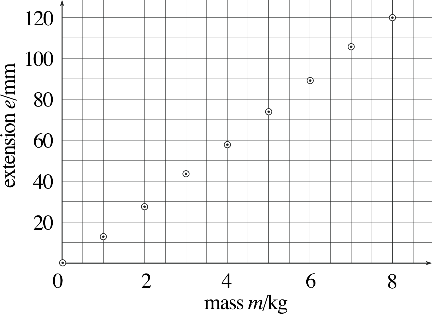
Figure 2 Experimental results for the extension of a loaded rubber band.
This is where a graph comes in useful. Figure 2 shows the data of Table 3 plotted as a graph.
Extension is plotted along the vertical axis and the mass along the horizontal axis. This is because the graph is meant to show how the extension changed as the mass of the load varied.
In this experiment both the extension and mass vary, both are variables; but the mass m is independently chosen by the experimenter and may be varied at will, so we call it the independent variable. The experimenter has no such direct control over the extension e, which is determined by the load. The extension is therefore called the dependent variable.
It is customary to plot all graphs with the independent variable along the horizontal axis and the dependent variable along the vertical axis; this convention has been followed in Figure 2. Notice that the axes in Figure 2 are labelled in a similar way to the headings in Table 3. i In each case the variable quantity is divided by the appropriate unit of measurement. This allows us to write dimensionless numbers along the axes and saves the bother of writing units each time.
Each of the data points is represented by a point within a circle, which allows some precision in the placing of the point, while at the same time making its location obvious at a glance.
Table 3 contains the same information as Figure 2, but the relationship is much easier to understand when it is displayed as a graph.
It looks very much like a linear relation – a straight line can be drawn through the points. So how should the ‘best’ straight line be drawn? The simplest method – which is perfectly satisfactory for most purposes – is to do it ‘by eye’. Choose a line that goes as nearly as possible through all the points, with the points scattered as equally as possible on both sides of the line.
In this particular case we would be justified in assuming that zero load will cause zero extension (so that the point (0, 0) really should be on the ‘best’ straight line).
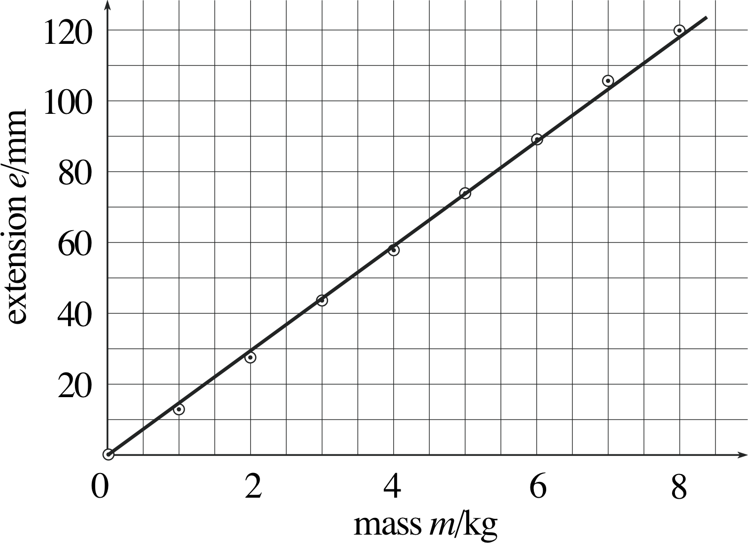
Figure 3 The best straight line drawn through the points.
Figure 3 shows the straight line through the origin that ‘best’ fits the data. Having drawn the straight line, we can readily estimate what the extension of the rubber band might be for any given load; for example, if the load is 2.5 kg, we can see from the graph that the extension will be about 37 mm.
Obtaining the estimated value of the dependent variable for any given value of the independent variable within the range of the measurements made is called interpolation.
Sometimes we want to estimate the value of the dependent variable (e in this instance) outside the range of the data; for example, we might want to know the value of the extension for a mass of 10 kg. This procedure is referred to as extrapolation and is generally a riskier business than interpolation because it relies on an assumption that a trend can be continued, as the example described in the next subsection illustrates.
3.2 A slightly more complicated experiment
| Mass m/kg |
Extension e/mm |
Mass m/kg |
Extension e/mm |
|
|---|---|---|---|---|
| 5.0 | 0.2 | 32.5 | 1.7 | |
| 10.0 | 0.5 | 35.0 | 1.8 | |
| 15.0 | 0.8 | 37.5 | 1.9 | |
| 20.0 | 1.0 | 40.0 | 2.0 | |
| 22.5 | 1.5 | 42.5 | 2.3 | |
| 25.0 | 1.3 | 45.0 | 2.5 | |
| 27.5 | 1.4 | 47.5 | 2.8 | |
| 30.0 | 1.5 | 50.0 | 3.2 |
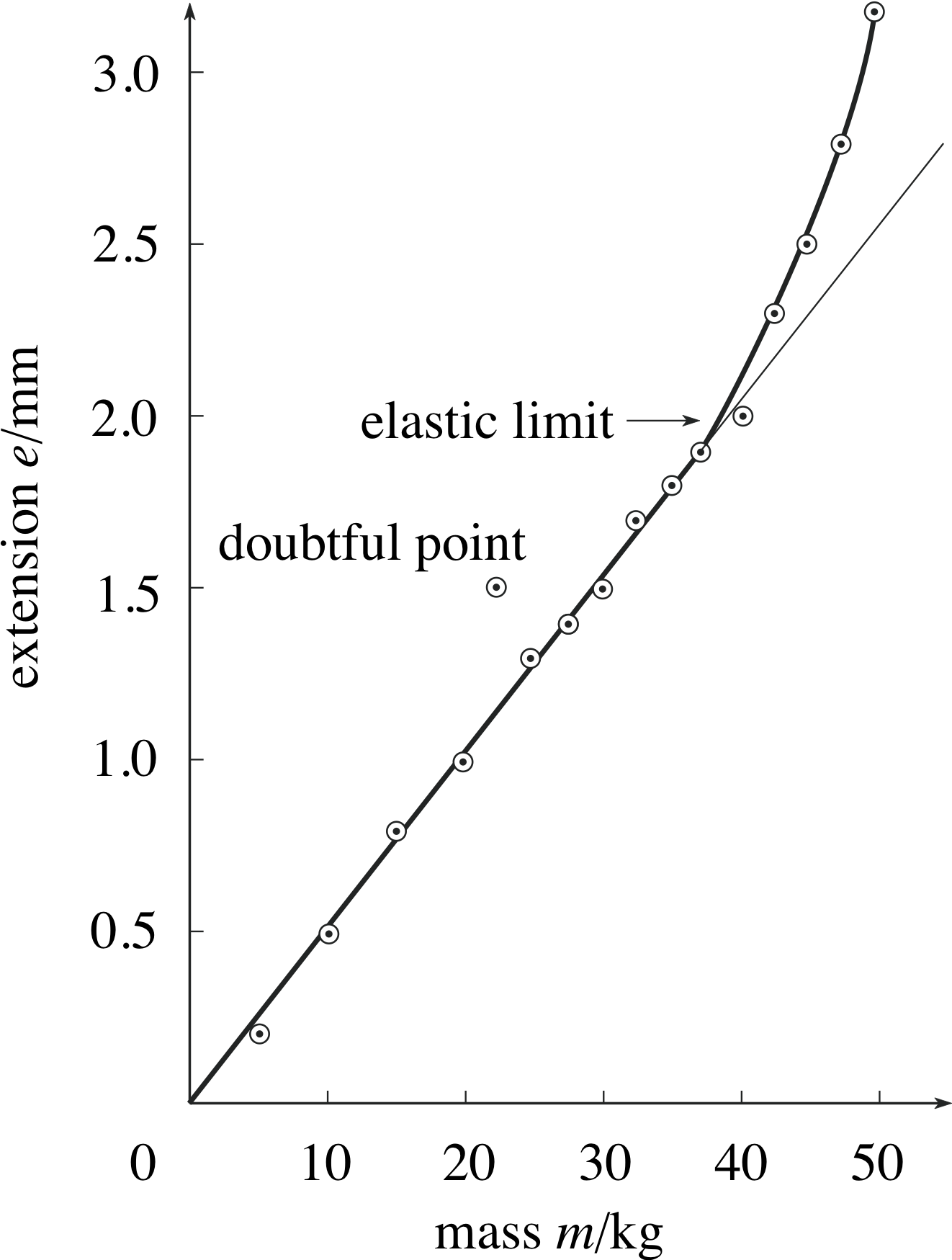
Figure 4 Extension of a loaded copper wire.
Suppose we now perform an experiment similar to the one we described in the previous subsection, but this time using a piece of copper wire in place of the rubber band. Table 4 and Figure 4 summarize the results obtained.
After glancing at the graph you can see immediately that there is something odd about the point (22.5, 1.5), so we will leave that to one side for the moment. From the best curve through the remaining points you can see that:
- For extensions up to about 2.0 mm, the points on Figure 4 lie fairly close to the straight line so the extension is proportional to the mass, i.e. doubling the mass produces twice the extension.
- For extensions greater than about 2.0 mm, the wire extends more easily, and extension is no longer proportional to mass. (In fact, if the wire is extended more than 2.0 mm, it will be found that it does not return to its original length when the load is removed. This critical extension is called the elastic limit.) i
- The point plotted as extension = 1.5 mm, mass = 22.5 kg is anomalous – it is much farther from the line than any other point, in fact it is higher than the points from the next two larger masses; this point ought to be checked.
- The extension that you would expect for a mass of 22.5 kg is 1.1 mm. In this case the straight line on the graph is used to interpolate between measured values.
- Some of the other measurements correspond to points that lie a little off the line, but this is to be expected since the straight line averages out random experimental errors in individual measurements.
All of the above statements could be made by examining the data in Table 4 – after all, the graph was plotted using only the information in the table. However, it would take a long time to arrive at points (a) to (e) from the tabulated information, whereas they can all be very rapidly deduced from the graph. This is the great advantage of graphs as visual aids. The form of the relationship between measured quantities becomes clear, and the presence of anomalous measurements is readily apparent. In addition, graphs allow straightforward averaging of random errors from experimental measurements, interpolation between measurements, and extrapolation beyond the measurements.
In some cases we can use the graph to determine the equation of the straight line that best fits the data, and, as we will see later in the module, we can sometimes do something similar when the data points lie on a curve.
3.3 Guidelines for plotting graphs
Figure 5 (a) Sensible choice of scale. (b) Poor choice of scale.
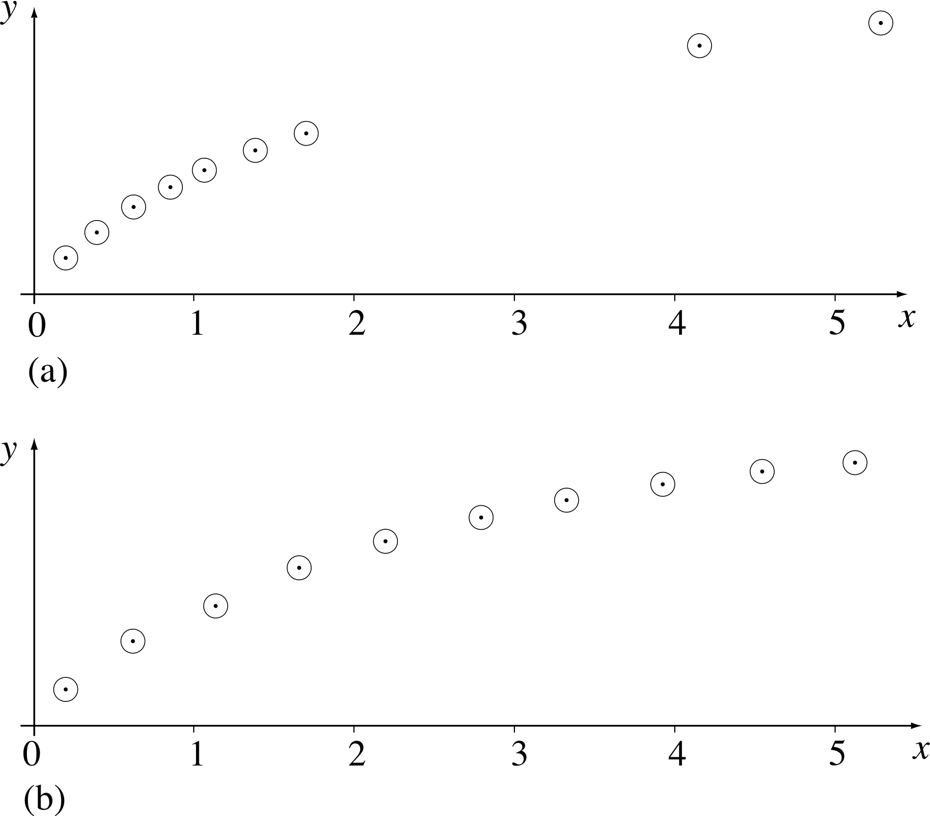
Figure 6 (a) Readings unevenly spread. (b) Readings evenly spread.
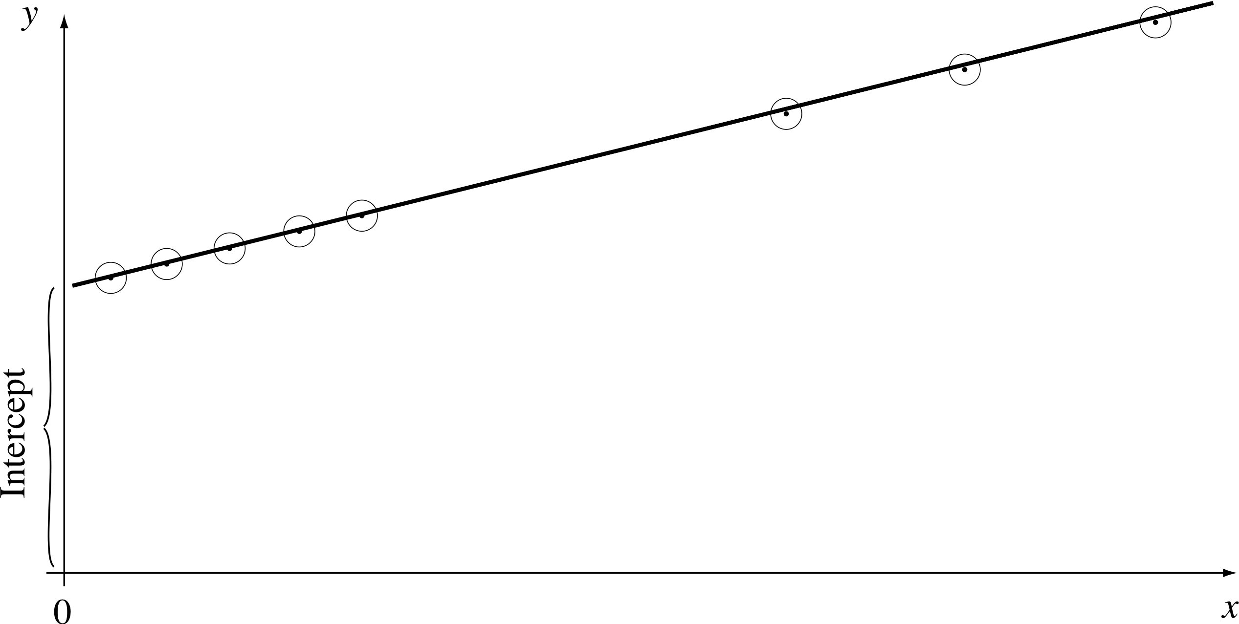
Figure 7 Extra points near to the y–axis.
The last two subsections illustrate how graphs can be useful for exploring the relationship between two variables. This subsection summarizes some important guidelines for plotting graphs of experimental measurements.
1 Plot the independent variable along the horizontal axis and the dependent variable along the vertical axis. For example, to obtain the results shown in Figure 4, various masses were hung from the wire and the resulting extension was measured. The mass is the independent variable and is plotted horizontally, the extension is the dependent variable and is plotted vertically. Figure 4 shows how the extension of the wire depends on the mass hung from it.
2 Label both axes to show what quantity is plotted, and don’t forget to include the units. Since only pure numbers can be plotted, the quantity measured must be divided by its units before plotting, which means that the axis should be labelled quantity/units. Thus, in Figure 4, the axes are labelled extension e/mm, and mass m/kg.
3 Choose the scales on the axes to make plotting simple. Generally this means letting 10 small divisions on the graph paper equal 1, 2, 5, or some multiple of 10 of these numbers. Don’t make your life difficult by making 10 small divisions equal 3 or 7, for example; you would take much longer to plot the graph, and the chances of misplacing points (in a literal sense) would be very much higher.
4 Choose the range of the scales on the axes so that the points are suitably spread out on the graph paper and not all cramped into one corner. In some cases this may mean excluding zero from the axis: for example, if lengths measured in an experiment varied between 5.2 m and 7.7 m, it would be better to allow the scale to run from 5 m to 8 m as in Figure 5a rather than from zero to 8 m as in Figure 5b.
5 Plot results clearly. Tiny dots may be confused with dirt on the graph paper, and big dots give loss of precision. Some authors indicate data points with crosses, but dots within circles are more common. i
6 When taking readings, generally spread them out evenly over the range of values of the quantity measured. Figure 6a is poor, Figure 6b is better.
Exceptions to this rule arise when you want to find where the line meets the y–axis – then it is desirable to have a few extra points close to the axis (as shown in Figure 7), or when you suspect that the graph is changing shape, i or near some other point of interest.
7 Plot a graph as your experiment proceeds. In this way you can check immediately if a point is so widely off that it needs to be measured again. You will also be able to check whether the points are reasonably evenly spaced or whether more points are needed.
8 Draw a straight line or smooth curve through points plotted on the graph, rather than joining up successive points by short straight lines. The graphs that you will draw generally represent some smooth variation of one quantity with another, so a smooth curve is usually appropriate.
4 Graphs of some common relationships
4.1 Linear relationships
In this subsection, we will follow the convention that we introduced earlier – the independent variable will be denoted by x (on the horizontal axis) and the dependent variable by y (on the vertical axis).
As noted earlier, a linear relationship between y and x implies that the graph of y against x is a straight line. Any such straight line can be completely characterized by two constants; the gradient (or slope) i of the line, and the intercept (the value of y at which the line crosses the y–axis). We will examine these two characteristics in turn, starting with the gradient.
The gradient of a straight line
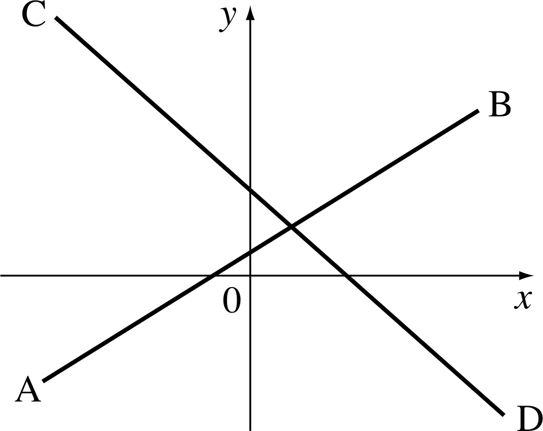
Figure 8 An illustration of gradient.
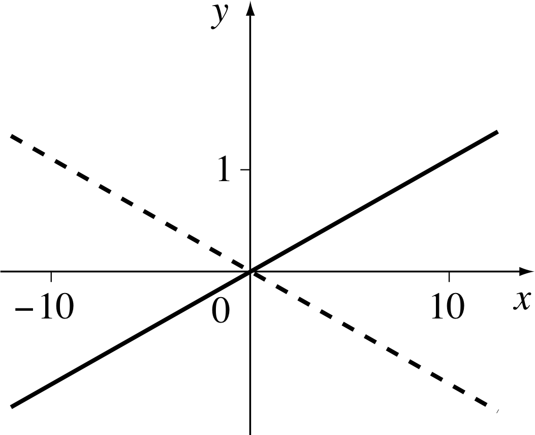
Figure 9 Positive and negative gradients.
You will have come across the terms gradient or slope many times before in such expressions as ‘the gradient of a hill’, or ‘the slope of a roof’. Look at Figure 8, which shows two straight lines with quite different gradients.
In moving from A to B we move from left to right across the page, so that the value of x increases, and we appear to move uphill because the value of y also increases as we move. Such a line is said to have a positive gradient.
In contrast, when we move from C to D, we still move from left to right across the page and x still increases, but now we appear to move downhill because the value of y decreases as we move. Such a line is said to have negative gradient.
The value of the gradient tells us more about the line than whether it goes uphill or downhill; it also tells us how steeply the line rises or falls.
You have probably seen something like ‘gradient 1 in 10’, as a warning sign to motorists approaching steep hills. In mathematics a line with a gradient of 1 in 10 or 1/10 is a line such that for every 10 units crossed horizontally (from left to right) the line rises 1 unit; so, for every 10 units increase in the quantity plotted along the x–axis, there is a corresponding increase of 1 unit in the quantity plotted along the y–axis (see Figure 9). A line with a gradient of −1/10 would be just as steep, but it slopes downhill (as illustrated by the dashed line in Figure 9).
In general, we use the term rise to describe the vertical separation between any two points on a line (measured in the upwards direction, the direction of increasing y) and we use the term run to describe the corresponding horizontal separation between the same two points (measured from left to right, in the direction of increasing x). Given the rise and run between two different points on a line, we can assign a numerical value to the gradient of that line by using the formula
$\rm{gradient} = \dfrac{\rm rise}{\rm run}$
The gradient found above is dimensionless since the graph (in Figure 9) was dimensionless.
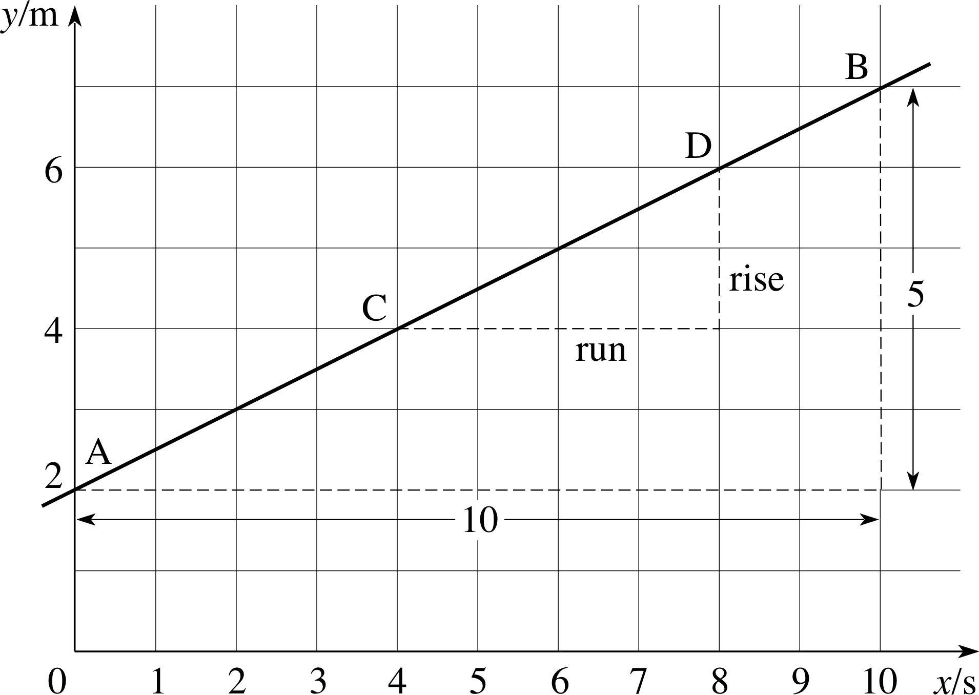
Figure 10 Gradient of a straight line.
This is not usually so in examples from physics. For example, if we were to plot the position of a car (the dependent variable) with time then the gradient of the graph would probably be measured in $\dfrac{\rm{metres}}{\rm{second}}$ with units m s−1, it would not be a pure number. In physics examples you must remember the units, as indicated on the axes of the graph, when finding gradients.
Thus, for the straight line shown in Figure 10, between the points A and B,
rise = 5 m and run = 10 s
so, $\rm{gradient} = \dfrac{\rm{rise}}{\rm{run}} = \dfrac{5\,\rm m}{10\,\rm s} = 0.5\,\rm{m\,s^{-1}}$
Similarly, for the same line, but using the points C and D
rise = 2 m and run = 4 s
so, ${\rm gradient} = \dfrac{\rm rise}{\rm run} = \rm \dfrac{2\,m}{4\,s} = 0.5\,m\,s^{-1}$
Because the gradient of the line is constant, it does not depend on which pair of points on the line is used to calculate it. However, we can read off the coordinates of the points only with limited accuracy, and so, in practice, different pairs of points may produce slightly different values of the gradient. It is good practice to choose two points that are as widely separated as possible, since then the errors in reading the coordinates will be a much smaller fraction of the difference between the coordinates than if the points were close together.
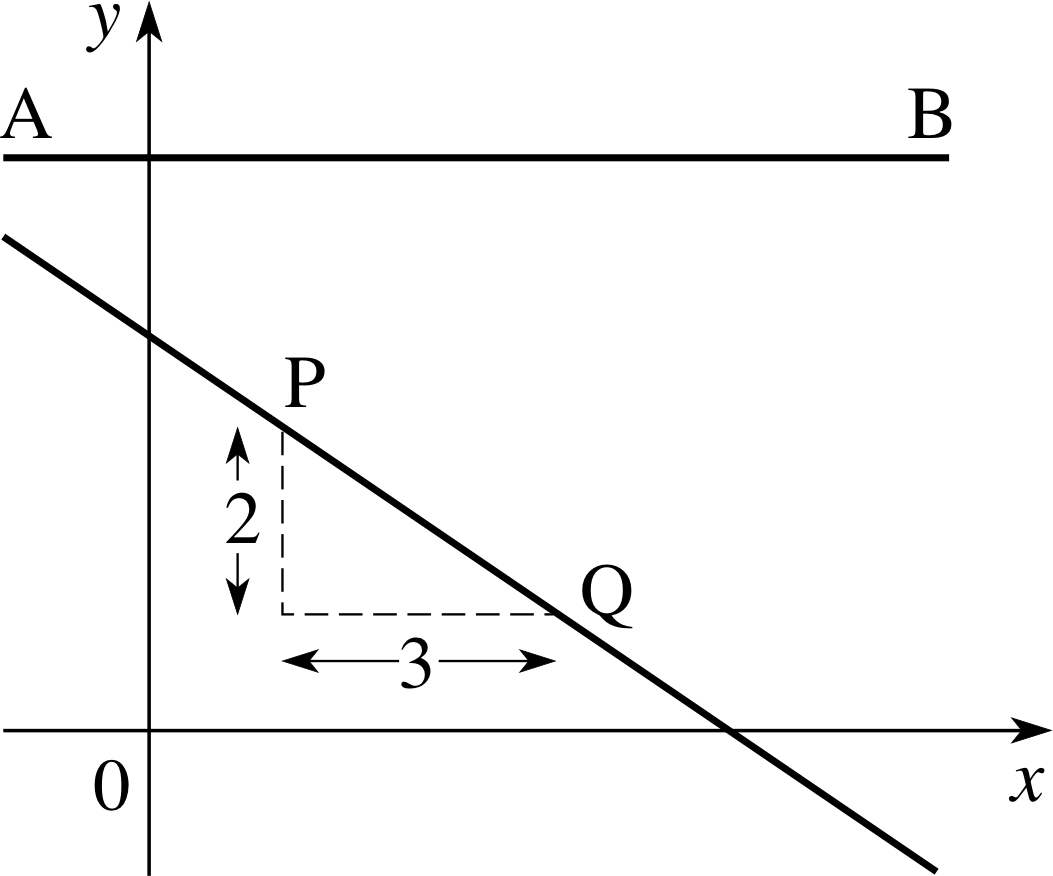
Figure 11 A line with a negative gradient and a line with zero gradient.
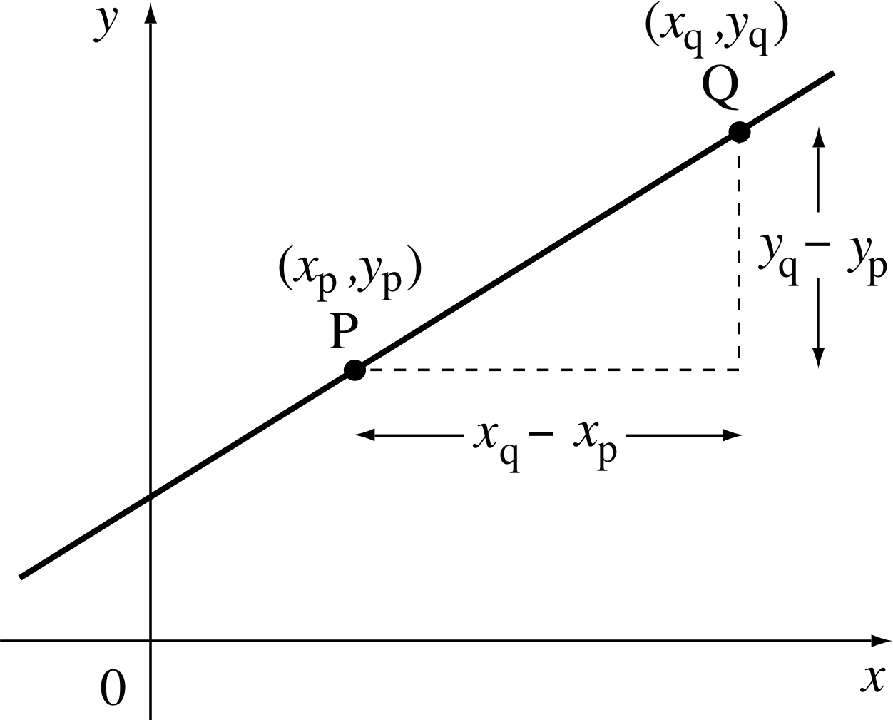
Figure 12 Determining the gradient.
Using this rise/run definition of gradient, it is easy to see how the gradient of a line can be negative. In Figure 11, moving from P to Q, the run is just 3, but the ‘rise’ is in this case a ‘fall’, and we write:
rise = −2 and run = 3 so gradient = −2/3
The gradient of a straight line can therefore be positive or negative, but what about lines with gradient 0?
From the definition, ${\rm gradient} = \dfrac{\rm rise}{\rm run} = 0$ implies that the rise is zero whatever run we choose, and the line must therefore be horizontal (like the line AB in Figure 11).
Given any straight line, and two different points on the line, we can also determine the gradient from the coordinates of the points. In Figure 12 we suppose that the points are P and Q. We can use subscripts to indicate the coordinates (xp, yp) of P, and similarly (xq, yq) for the coordinates of point Q, where xp, xq, yp and yq simply represent numbers. The rise is the y–coordinate of Q minus the y–coordinate of P (expressed in the appropriate units):
rise = yq − yp
The run is the x–coordinate of Q minus the x–coordinate of P expressed
in the appropriate units):
run = xq − xp
So the gradient is $\dfrac{\rm rise}{\rm run} = \dfrac{y_q-y_p}{x_q-x_p}$
Notice that if y decreases as x increases, then yq will be less than yp and the rise will be negative, giving a negative gradient.
Figure 1 A simple graph.
✦ Calculate the gradient of the line joining the points A(1, 1) and B(3, 4) in Figure 1.
✧ $\rm{gradient} = \dfrac{y_A-y_B}{x_A-x_B} = \dfrac{1-4}{1-3} = \dfrac{-3}{-2}=1.5$
✦ Calculate the gradient from B(3, 4) to C(4, 3), then the gradient from C to D(5, 2) in Figure 1.
✧ $\text{gradient from B to C} = \dfrac{y_B-y_C}{x_B-x_C} = \dfrac{4-3}{3-4} = -1$
$\text{gradient from C to C} = \dfrac{y_C-y_C}{x_C-x_D} = \dfrac{3-2}{4-5} = -1$
Question T3
Plot the graphs and find the gradients for the following equations:
(a) y = 15x, (b) y = 5x, (c) y = 5x + 10, (d) y = 5x + 30.
(Choose values of x from −14 up to +4). i
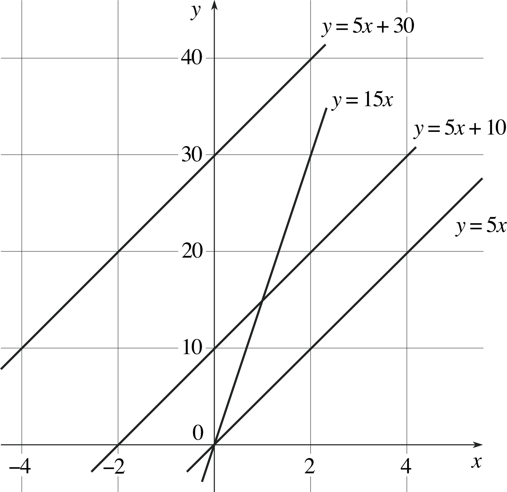
Figure 27 See Answer T3.
Answer T3
A portion of the four graphs are plotted in Figure 27.
- (a)
-
Considering the points (0, 0) and (2, 30), the gradient is 30/2 = 15.
- (b)
-
Considering the points (0, 0) and (4, 20), the gradient is 20/4 = 5.
- (c)
-
Considering the points (0, 10) and (4, 30), the gradient is 20/4 = 5.
- (d)
-
Considering the points (−4, 10) and (0, 30), the gradient is (−20)/(−4) = 5.
Note that the lines corresponding to equations (b), (c) and (d) all have the same gradient or ‘steepness’, i.e. they are parallel.
You will have found that the gradient of the straight line y = 15x is 15. The gradient of the second equation is 5, and the third and fourth lines also have gradients of 5. You will probably have noticed that the gradient is the same as the coefficient of x in the given equation. So, for example, the gradient of the line y = −3x + 1 is −3; and the gradient of the line y = x − 4 is 1, because the coefficient of x is 1. This appears straightforward, but you still need to exercise a little care, as the following examples illustrate.
✦ Write down the gradients of the following lines:
(a) y = 3 + 5x, (b) y + 2x = 3, (c) 5x − 2 = 1 − 2y, (d) $3 = \dfrac{5x}{2y}$.
✧ (a) The equation can be rewritten as y = 5x + 3, the gradient is therefore 5 (the coefficient of x).
(b) The equation can be rewritten as y = −2x + 3, so the gradient is −2.
(c) The equation can be rewritten as $y = \dfrac{-5x}{2} + \dfrac 32$, so the gradient is −5/2.
(d) The equation can be rewritten as $y = \dfrac{5x}{6}$, so the gradient is 5/6. i
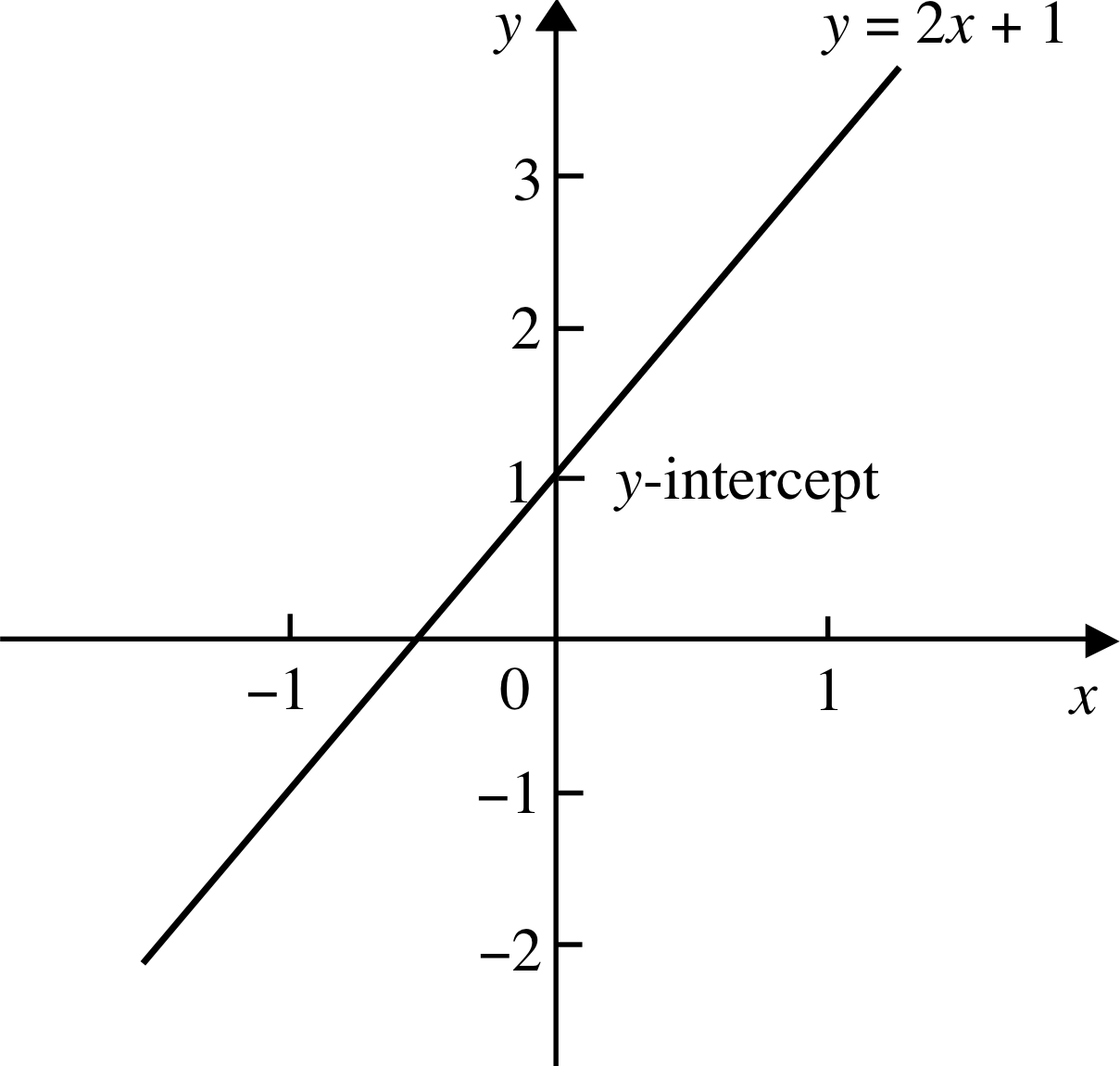
Figure 13 The graph of y = 2x + 1.
The intercept of a straight line
Figure 13 shows the graph of y = 2x + 1. The graph cuts the y–axis at the point y = 1. In other words, when x = 0 the corresponding value of y is 1. The point where the graph cuts the y–axis is called the y–intercept, though 2 this is usually abbreviated to intercept.
✦ Find the y–intercepts of the lines from the previous question:
(a) y = 3 + 5x (b) y + 2x = 3 (c) 5x − 2 = 1 − 2y (d) $3 = \dfrac{5x}{2y}$
✧ The first step is to rewrite the equation in the appropriate form (as we did in the previous question).
(a) The equation can be rewritten as y = 5x + 3, so y–intercept = 3.
(b) The equation can be rewritten as y = −2x + 3, so y–intercept = 3.
(c) The equation can be rewritten as $\displaystyle y = \frac{-5x}{2} + \frac{3}{2}$, so y–intercept = 3/2.
(d) The equation can be rewritten as $\displaystyle y = \frac{5x}{6}$, so y–intercept = 0.
Question T4
What are the y–intercepts of the graphs you plotted in Question T3?
[(a) y = 15x, (b) y = 5x, (c) y = 5x + 10, (d) y = 5x + 30].
Do you notice any connection between these values and the equations?
Figure 27 See Answer T4.
Answer T4
From Figure 27, the y–intercepts are as follows:
(a) 0, (b) 0, (c) 10, (d) 30.
These values correspond to the constants in the equations for the straight lines.
Questions T3 and T4 show that the equations can be written:
y = (gradient)x + (y–intercept)
So the gradient and the y–intercept tell us all the characteristics of a straight line, how steep it is and where it lies on the (x, y) plane in relation to the y–axis. i
We can now refer to a general equation of a straight line:
y = ax + b where a and b are constants(1)
in which the gradient is a and the y–intercept is b. i
✦ Find the gradients and intercepts of the straight lines that represent the following linear relationships:
(a) 2y + 3 = 2x (b) 2y + x = 6 − y (c) 4y + 2 (x − 1) = 6
✧ (a) The relation may be rewritten as y = x − 3/2 which is the equation of a straight line of gradient 1 and intercept −3/2.
(b) The relation may be rewritten as y = −x/3 + 2 which is the equation of a straight line with gradient −1/3 and intercept 2.
(c) The relation may be rewritten as y = −x/2 + 2 which is the equation of a straight line with gradient −1/2 and intercept 2.
4.2 Determining the gradient and intercept of a linear graph
Figure 3 The best straight line drawn through the points.
Figure 4 Extension of a loaded copper wire.
We now return to our rubber band experiment described in Subsection 3.1 and illustrated in Figure 3. Our y–variable here is the extension (e), and our x–variable is the mass (m). The line goes through the origin of the graph, so the y–intercept is equal to 0. The relationship implied by such a graph is therefore a simple equation relating length and mass:
length = constant × mass
Using symbols to represent the quantities, the equation is more conveniently written as:
e = km
where k represents the constant, usually referred to as the constant of proportionality between e and m.
This is a special case of our general straight line equation, y = ax + b with y = e, x = m, a = k and b = 0.
It is certainly true that we could use the data provided in Table 3 in order to estimate the value of k, but, since we have already plotted this data and fitted a straight line to it in Figure 3, there is a far easier way. The constant k is just the gradient (i.e. the slope) of the line. To determine the gradient we choose two well separated points on the graph, such as the origin and the point (7 kg, 105 mm), and we use gradient = rise/run, thus
gradient = 105 mm/7 kg = 15 mm kg−1
Note that k is expressed in the correct units – the units of extension (mm) divided by the units of mass (kg).
Having evaluated the constant k we now have an expression relating the two columns of data in Table 3:
e ≈ (15 mm kg−1) × m
This is a much more convenient way to express the relationship than either the data in Table 3, or the graph in Figure 3.
Question T5
Calculate the gradient of the straight line in Figure 4 (derived from the extension up to the elastic limit in our second experiment, as described in Subsection 3.2) and write down the equation for the relationship between e and m where it is linear.
Answer T5
The gradient of the line relating extension e to mass m is 2.0 mm/40 kg = 0.050 mm kg−1 and the intercept is zero. The equation describing the relationship between e and m is:
e = (0.050 mm kg−1) × m
Figure 10 Gradient of a straight line.
✦ Write down the equation of the straight line shown in Figure 10.
✧ The gradient is (5/10) m s−1 = 0.5 m s−1 and the y–intercept is 2 m, therefore the equation of the line is y = 0.5x + 2.
✦ Find the equation of the line joining B to D in Figure 1. Does the point E(37, −32) lie on this line?
✧ The gradient of the line is −1, but how are we to find the intercept? The axes do not extend sufficiently for us to see where the line meets the y–axis. However, we do know that the gradient is −1, so we know that the line must be of the form y = −x + b; we also know that the line passes through the point B(3, 4) so that 4 = −3 + b which means that b = 7. The equation of the line is therefore
y = −x + 7
(Notice that we can put x = 5 and y = 2 into this equation, corresponding to the point D, in order to check the result.)
The point E(37, −32) does not lie on this line because −32 ≠ −37 + 7, i and notice that we do not have to extend the graph in order to see that this is the case.
✦ What is the gradient, and what is the intercept on the vertical axis, of the line 3V + 2U = 5, when U and V are measured on the horizontal and vertical axes, respectively?
✧ The equation can be rewritten in the form $V = -\dfrac23U + \dfrac53$, so that the gradient is −2/3 and the intercept on the vertical axis is 5/3.
4.3 Non–linear graphs and their linearization
Figure 1 A simple graph.
Equations such as y = 2x −1 are said to be linear because they correspond to straight–line graphs. More formally, we say in such a case that y is a linear function of x. i You will notice that such equations generally involve only the first power of x (i.e. x1 = x), for example
$y = 3 - 2x,~ 2x + 3y = 1,~ \dfrac x2 + \dfrac y3 = 5 \quad\text{and}\quad\dfrac1y = \dfrac{2}{3x+1}$
are all linear because they can all be rearranged into the form y = ax + b, and they all give straight–line graphs when y is plotted against x. (Only straight lines parallel to the y–axis, such as x = 4, cannot be written in this form.)
However, many, if not most, relationships that you will encounter in physics will not be linear. Modern graphical calculators, and algebraic computing programs, certainly reduce the effort required to produce the graph of a given non–linear function, but they do not remove the need for some fundamental understanding of non–linear graphs. For example, if you try to produce the graph of y = 5000x2 on a calculator you may well have problems with the scale, and you may find that nothing appears on the screen. In order to produce a sensible output you need to have a rough idea of the shape of the graph before you try to plot it. i
In this subsection we consider some commonly encountered non–linear relationships, and the corresponding graphs. We start by considering the equations that give rise to two useful geometrical shapes – the parabola and the hyperbola. i
Parabolas
The equation y = 3x2 + 5 includes a term in x2, where the power of x is not 1 but 2, and the associated graph is not a straight line, but a special kind of curve known as a parabola. Any equation of the form
y = ax2 + bx + c
where a, b and c are constants and a ≠ 0, will provide a parabolic graph when y is plotted against x.
Question T6
Construct a table of values for y corresponding to x ranging from −3 to +3 for both of the following equations, and plot their graphs:
(a) y = x2 + 1 (b) y = x2 − 1
Answer T6
(a) The table of values for y = x2 + 1 is given in Table 22.
(b) The table of values for y = x2 − 1 is given in Table 23.
Both graphs are plotted in Figure 28.
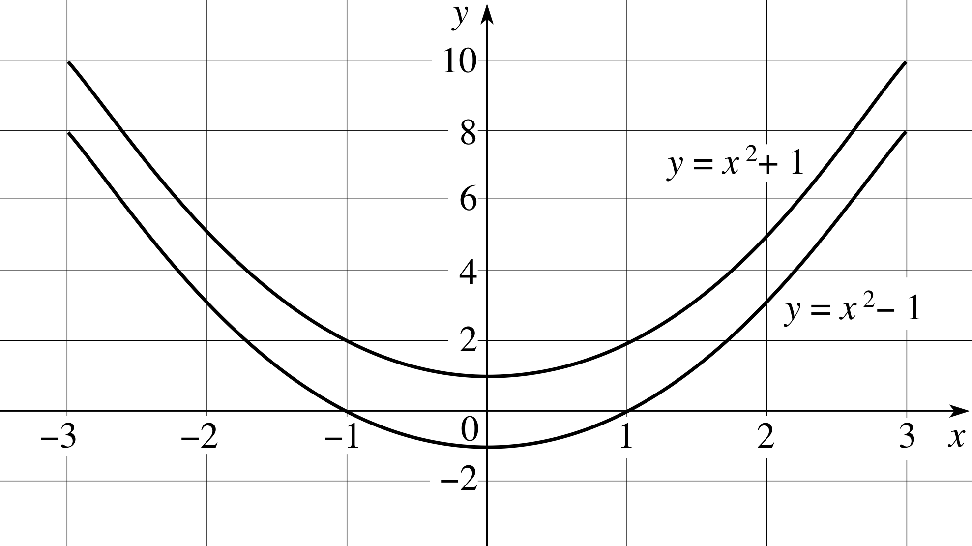
Figure 28 See Answer T6.
| x | x2 | y = x2 − 1 |
|---|---|---|
| −3 | 9 | 8 |
| −2 | 4 | 3 |
| −1 | 1 | 0 |
| 0 | 0 | −1 |
| 1 | 1 | 0 |
| 2 | 4 | 3 |
| 3 | 9 | 8 |
| x | x2 | y = x2 + 1 |
|---|---|---|
| −3 | 9 | 10 |
| −2 | 4 | 5 |
| −1 | 1 | 2 |
| 0 | 0 | 1 |
| 1 | 1 | 2 |
| 2 | 4 | 5 |
| 3 | 9 | 10 |
Hyperbolas
| x | y = 1/x |
|---|---|
| 1/5 | 5 |
| 1/3 | 3 |
| 1/2 | 2 |
| 1 | 1 |
| 2 | 1/2 |
| 3 | 1/3 |
| 5 | 1/5 |
We now consider the equation y = 1/x. Table 5 shows values of y = 1/x corresponding to values of x for x = 1/5 to 5.
For very large positive values of x the value of 1/x is very small and positive. On the other hand, when x is very small and positive the value of 1/x is very large and positive. But what happens when x = 0?
Try calculating 1/0 on your calculator and it will probably produce an error message; this is because division by zero is not defined. i However, if you try evaluating 1/0.001 and then 1/0.000 0001 on your calculator, you will see that 1/x can be made as large as you please by choosing x sufficiently close to zero.
The graph of any equation of the form
$y = \dfrac ax + b$
where a and b are constants and a ≠ 0 will be similar to the graph corresponding to Table 5; all such equations describe a kind of curve known as a hyperbola.
Question T7
Tabulate the values of the following equations for values of x between 0.2 and 5 (as in Table 5), and plot their graphs:
(a) y = 2/x, (b) y = 2/x + 5.
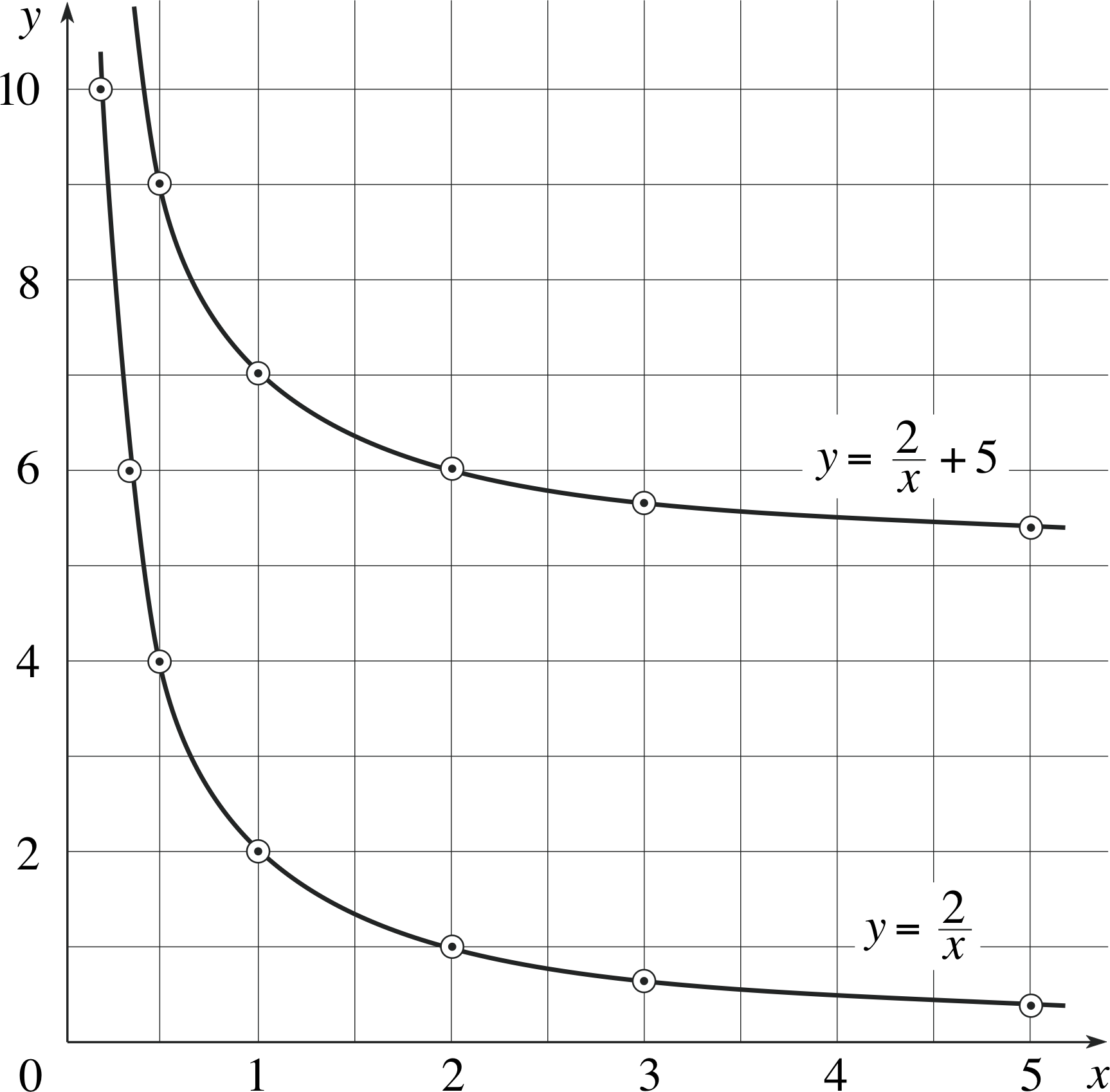
Figure 29 See Answer T7.
| x | y = 2/x | y = 2/x + 5 |
|---|---|---|
| 1/5 | 10 | 15 |
| 1/3 | 6.7 | 11.7 |
| 1/2 | 4 | 9 |
| 1 | 2 | 7 |
| 2 | 1 | 6 |
| 3 | 0.67 | 5.7 |
| 5 | 0.4 | 5.4 |
Answer T7
The values are given in Table 24 and the graphs are plotted in Figure 29.
Curve fitting and linearization
| x | y |
|---|---|
| 1.000 | 13 |
| 0.500 | 28 |
| 0.333 | 44 |
| 0.250 | 58 |
| 0.200 | 74 |
| 0.167 | 89 |
| 0.143 | 105 |
| 0.125 | 120 |
Our intuition helps us to see how to fit a straight line to a set of data, but it is not so easy to fit a parabola, or a hyperbola, to a set of data lying on a curve.
In general, non–linear relationships are much more difficult to deal with than linear relationships. For example, suppose that x and y are related in such a way that when we vary the value of x and measure the value of y we obtain the results given in Table 6.
If you were to plot these values on a graph you would find that the shape is very similar to that of Figure 29; so you might suspect that a hyperbola, corresponding to an equation of the form $y = \dfrac ax + b$, would prove a good fit to the data. But how would you determine the appropriate values of a and b?
The task is certainly harder than that of fitting a straight line to a set of linearly related data. First we have the problem of drawing a neat hyperbola (for a straight line we just use a ruler and judge by eye) and then we need to actually determine a and b (for a straight line these are just the gradient and y–intercept, for the hyperbola a and b have no simple geometric interpretation). Clearly determining a and b directly is a difficult undertaking, but fortunately there is a better way.
During our experiment it may have been convenient to measure the values of x and y, but they need not be the variables that appear in our graph. For example, if we suspect that an equation of the form $y = \dfrac ax + b$ is a good fit to the above data list then if we replace 1/x by X say, we would have an equation of the form y = aX + b, which is the equation of a straight line when y is plotted against X. Such a change of variable is said to convert the original equation into linear form, or to linearize the equation.
We now adapt our data list so that it shows the values of this new variable, X, as in Table 7.
| x | y | 15/x |
|---|---|---|
| 1.000 | 13 | 15 |
| 0.500 | 28 | 30 |
| 0.333 | 44 | 45 |
| 0.250 | 58 | 50 |
| 0.200 | 74 | 75 |
| 0.167 | 89 | 90 |
| 0.143 | 105 | 105 |
| 0.125 | 120 | 120 |
| x | X = 1/x | y |
|---|---|---|
| 1.000 | 1.00 | 13 |
| 0.500 | 2.00 | 28 |
| 0.333 | 3.00 | 44 |
| 0.250 | 4.00 | 58 |
| 0.200 | 5.00 | 74 |
| 0.167 | 5.99 | 89 |
| 0.143 | 6.99 | 105 |
| 0.125 | 8.00 | 120 |
You may well suspect that the original values were cunningly chosen (as indeed they were) since the X values here are precisely the same as the x values in Table 3, so we know from Figure 3 that the straight line y = 15X is a good fit to this data. In other words, a = 15 and b = 0.
Now that we have determined the constants a and b from a linear graph we can return to our original variable x, knowing that the hyperbola
$y = \dfrac{15}{x}$
should be a good fit to the original data.
The measured values of x and y, together with the values of 15/x are shown in Table 8 and, as you can see, the values of 15/x agree quite well with the measured values of y.
✦ You suspect that an equation of the form y = ax2 + b will provide a good fit to a set of data provided in a table of values of x and y. What change of variables would you choose in order to produce a straight–line graph?
✧ If we put X = x2 then y = aX + b, the equation of a straight line.
✦ You complete an experiment in optics, varying the value of a length u (in metres) and measuring the value of a length v (in metres). You suspect that an equation of the form $\dfrac 1u + \dfrac 1v = \dfrac 1f$, where f is a constant, will provide a good fit to the data, and you wish to find a value for f. What change of variables would you choose in order to produce a straight–line graph, and what will be the units on each axis? How would you use your graph to measure f?
✧ Making a change of variables U = 1/u and V = 1/v the equation becomes U + V = 1/f or V = −U + 1/f. This is the equation of a straight line with gradient −1 (so that when we come to fit the line to the data the task is easier than normal since we know the gradient). The units on each axis are m−1. The intercept on the y–axis represents an estimate for the value of 1/f.
Question T8
You complete an experiment in which you vary the value of a length L (in metres) and measure the value of a time T (in seconds). You suspect that an equation of the form $T = 2\pi \sqrt{L/g}$, where g is a constant, will provide a good fit to the data, and you wish to find a value for g. What change of variables would you choose in order to produce a straight–line graph, and what will be the units on each axis? How would you use your graph to measure g?
Answer T8
If we let $x = \sqrt{L\os}$ then the equation $T = 2\pi\sqrt{L/g\os}$ becomes $T = kx$ where $k = \left.2\pi\middle/\sqrt{g\os}\right.$. We now plot x on the horizontal axis as usual, and T on the vertical axis, then fit a straight line through the origin to the data points. The units on the T–axis are seconds (s) while the units on the x–axis are m1/2. The gradient of the line is k, and then g can be found from g = (2π/k)2.
4.4 Linearizing with logarithms
In this subsection we consider two important cases where equations can be converted into a linear form (linearized) using logarithms, and so it is worth spending a few moments recalling the general properties of logarithms:
-
The logarithm of a number x to the base a is the power to which a must be raised in order to give the value x. i In other words, if y = logax then x = a y; so that, for example,
$\log_{10}3 \approx 0.4771\quad\text{because}\quad10^{0.4771} \approx 3$ -
loga x + loga y = loga (xy); so that, for example,
$\log_{10}2 + \log_{10}3 = \log_{10}6$ -
loga (x k) = k loga x; so that, for example,
$\log_{10}x = \log_{10}(x^{1/2}) = 1/2\log_{10}x$ - loga (1/x) = −loga x
- loga 1 = 0
- loga a = 1
In the work that follows it would be possible to use logarithms to any base, however in practice it is usually best to use either base 10 or base e, since these are provided on most calculators. i
✦ Solve the equation 3x = 72x + 1
✧ Taking logarithms to base 10 of both sides, we obtain
x log10 3 = (2x + 1) log10 7
so thatx (2 log10 7 − log10 3) = − log10 7
i.e.x [log10 (49/3)] = −log10 7
and therefore $x = -\dfrac{\log_{10}7}{\log_{10}(49/3)} \approx -0.6967$ i
Power law relationships
Suppose we suspect that two variables x and y are related by a power law, that is, a relationship of the form
y = ax n(2) i
where a and n are constants (but we do not, as yet, know their values). If we take logarithms to base 10 of both sides of the equation, we obtain:
log10 y = log10 (ax n) = log10 a + log10 (x n) = log10 a + n log10 x
If we now rearrange this equation
log10 y = n (log10 x) + log10 a
we have once again something that looks like our standard straight–line equation. The dependent (vertical axis) variable will now be log10 y, and the independent (horizontal axis) variable will be log10 x. The gradient will be n, and the intercept on the vertical axis log10 a.
✦ Linearize the equation $s = \dfrac12gt^2$ (where g is a constant) using logarithms.
✧ Taking logarithms to base 10 of both sides of the equation, we obtain
log10 s = − log10 2 + log10 g + 2 log10 t
If we now put y = log10 s, x = log10 t and C = − log10 2 + log10 g, we obtain the equation of a straight line y = 2x + C (with gradient 2).
Question T9
Linearize the equation in Question T8 [$T = 2\pi \sqrt{L/g}$] using logarithms.
Answer T9
$T = 2\pi\sqrt{L/g\os} = \left(2\pi\middle/\sqrt{g\os}\right) \times \sqrt{L\os}$
Therefore, taking logarithms to base 10 of both sides, we obtain
$\log_{10}T = \log_{10}\sqrt{L\os} + \log_{10}\left(2\pi\middle/\sqrt{g\os}\right) = \frac12\log_{10}L +\log_{10}\left(2\pi\middle/\sqrt{g\os}\right)$
So if we put x = log10 L and y = log10 T we should get a straight line with gradient 1/2 and y–intercept of $\log_{10}(\left.2\pi\middle/\sqrt{g\os}\right.)$.
Exponential relationships
The previous subsection concerned a relationship of the form
y = ax n(Eqn 2)
where a and n are constants. In this subsection we discuss the situation in which two variables x and y are related by an exponential law, that is an equation of the form
y = ka x(3)
where k and a are constants.
A good example of an exponential law is the equation used to model the spontaneous decay of radioactive nuclei; the radioactive decay equation i
N = N0(1/2) t/T(4) i
where
- N0 (a constant) is the number of radioactive nuclei present at time t = 0;
- N is the number of radioactive nuclei present after a time t has elapsed;
- T (a constant) is the half-life of the radioactive material concerned, (i.e. the time after which half of the material has decayed).
After one half-life, t = T, and N = N0/2; after two half-lives, t = 2T and N = N0(1/2)2 = N0/4, and so on. Relationships of this kind are called exponential; they too can be easily linearized if we take logarithms. Once again we could use logarithms to any base, but, to add variety, this time we will use logarithms to base e.
$\loge N = \loge N_0 + \loge[(1/2)^{t/T}] = \loge N_0 + (t/T)\loge(1/2)$
$\phantom{\loge N} = \loge N_0 + (t/T)(\loge 11 - \loge 12) = \loge N_0 - (\loge 12)(t/T) = -\dfrac{\loge 2t}{T} + \loge N_0$
If we put y = loge N and x = t we obtain the equation of a straight line with gradient $-\dfrac{\loge 2}{T}$ and y–intercept loge N0.
| Time t /hours |
Number of radioactive nuclei N/108 |
|---|---|
| 1.00 | 1500 |
| 2.00 | 1000 |
✦ The amount of a radioactive material present at two different times in a sample obeying Equation 4,
N = N0(1/2) t/T (Eqn 4)
is shown in Table 9. What is the half–life of the radioactive material, and what is the number of radioactive nuclei present in the sample at time t = 0?
✧ Since N = N0(1/2) t/T, we know that: i $\displaystyle \log_e N = - \frac{\log_2e 2}{T} + \log_e N_0$
If we now let y = loge N and x = t, then we can extend Table 9 by two further columns to obtain Table 10.
| Time t/hours | Number of radioactive nuclei N/108 |
x/h = t/h | y = loge (N/108) |
|---|---|---|---|
| 1.00 | 1500 | 1.00 | 7.313 |
| 2.00 | 1000 | 2.00 | 6.908 |
The graph of y against x is a straight line. Using the information in Table 10, its gradient is
$\dfrac{6.908 - 7.313}{(2.0 - 1.0)\rm{\,h}} = -0.405\rm{\,h^{-1}}$
so that the equation of the line is
y = −(0.405 h−1)x + C
and, since the line passes through the point (1.00 h, 7.313), we have 7.313 = −0.405 + C so that C = 7.718.
The equation of the line is therefore
y = −(0.405 h−1)x + 7.718
Since $\displaystyle -\frac{\log_e 2}{T} = -0.405\rm{\,h^{-1}}$ it follows that $\displaystyle T = \frac{\log_e 2}{0.405}\rm{\,h} \approx 1.7\rm{\,h}$, and since loge N0 = 7.718 it follows that
N0 = e7.718 ≈ 2 250 × 108 nuclei. i
| Time t /hours |
Number of radioactive nuclei N/108 |
|---|---|
| 0.00 | 2150 |
| 1.00 | 1600 |
| 2.75 | 1020 |
| 4.00 | 700 |
| 5.50 | 490 |
| 6.50 | 390 |
| 7.25 | 300 |
Question T10
The measured amount of a radioactive material present at various times in a sample that obeys Equation 4,
N = N0(1/2) t/T(Eqn 4)
is shown in Table 11. What is the half–life of the radioactive material?
| Time t/hours | Number of radioactive nuclei N/108 | loge (N/108) |
|---|---|---|
| 0.00 | 2150 | 7.67 |
| 1.00 | 1600 | 7.38 |
| 2.75 | 1020 | 6.93 |
| 4.00 | 700 | 6.55 |
| 5.50 | 490 | 6.19 |
| 6.50 | 390 | 5.97 |
| 7.25 | 300 | 5.70 |
Answer T10
Again N = N0(1/2)t/T
so$\loge N = -\dfrac{\loge 2}{T}t + \loge N_0$
We now let y = loge N, then add a further column to Table 11, as in Table 25.
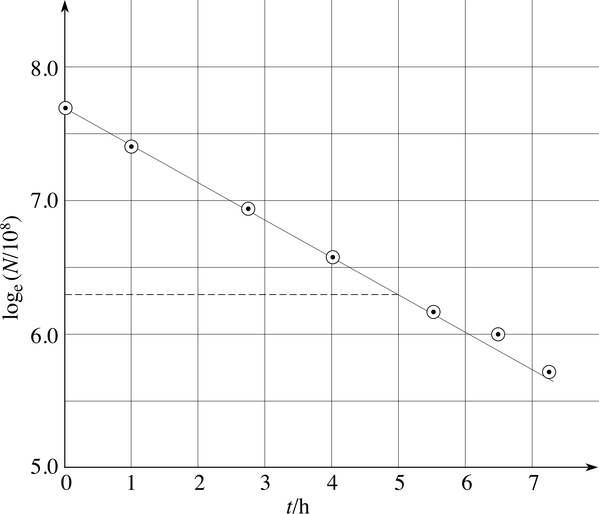
Figure 30 See Answer T10.
These values are plotted in Figure 30.
From Figure 30 the gradient of the line is
approximately $\rm \dfrac{6.3 - 7.7}{5}\,h = -0.28\,h$ and it follows that
$T = \rm \dfrac{\loge 2}{0.28}\,h \approx 2.5\,h$.
5 Incorporation of data errors on a graph
5.1 Showing the likely data errors on the graph
| Mass m/kg | Extension e/mm | Mass m/kg | Extension e/mm | |
|---|---|---|---|---|
| 5.0 | 0.2 | 32.5 | 1.7 | |
| 10.0 | 0.5 | 35.0 | 1.8 | |
| 15.0 | 0.8 | 37.5 | 1.9 | |
| 20.0 | 1.0 | 40.0 | 2.0 | |
| 22.5 | 1.5 | 42.5 | 2.3 | |
| 25.0 | 1.3 | 45.0 | 2.5 | |
| 27.5 | 1.4 | 47.5 | 2.8 | |
| 30.0 | 1.5 | 50.0 | 3.2 |
When reporting experimental results, it is important to indicate the likely errors, or confidence limits, in any measured quantity. The most difficult part of this procedure is to assess how large the error in a measurement could be, and this is dealt with elsewhere in FLAP. However, once an error has been estimated, it is straightforward to represent it on a graph. Consider again the copper wire experiment that was described in Subsection 3.2. Table 4 shows that a 5.0 kg mass produces an extension of 0.2 mm, and 10.0 kg produces an extension of 0.5 mm.
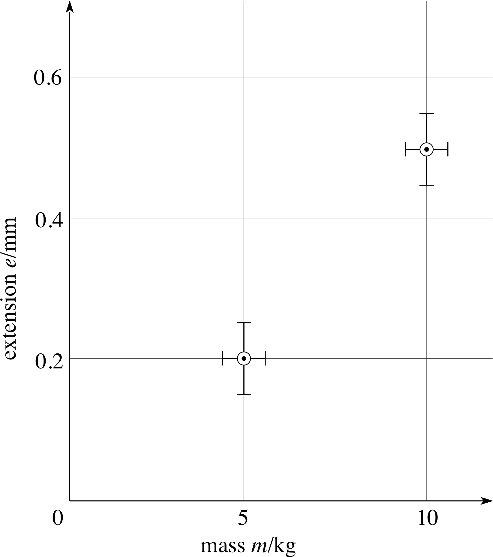
Figure 14 The first two points from the data of Table 4, plotted with vertical and horizontal error bars.
Suppose you have estimated that the uncertainty in measuring the extension (e) is ± 0.05 mm and the uncertainty in the mass (m) is ± 0.6 kg. (We may often write these errors as ∆e = 0.05 mm and ∆m = 0.6 kg.)
The correct way to plot these results is shown in Figure 14. The circled points indicate the measured values.
The uncertainty in each extension is indicated by a vertical error bar which extends 0.05 mm above and below the circled point, whereas the mass uncertainty is indicated by horizontal error bars which extend 0.6 kg on either side of the plotted mass value. Generally, both horizontal and vertical error bars should be shown, and they should only be omitted if the associated uncertainty is too small to show up on the graph. Plotting error bars is slightly more complicated if you are not plotting a measured quantity x directly, but are plotting x2, x3, sin x, etc. because in suchcases we need to estimate the error in x2 say, in terms of the known error in x.
We will illustrate the procedure by taking as an example an experiment in which the speed υ of a falling ball is measured after it has dropped through various distances s. The results of the experiment are tabulated in the first two columns of Table 12, and we will assume that the possible error in the measured speeds is ± 0.5 m s−1, while the possible error in the measured distances is ± 0.2 m.
| A | B | C | D | E | F | G |
|---|---|---|---|---|---|---|
| distance s /m |
speed υ /m s−1 |
υ2 /(m s−1)2 |
s + ∆s /m |
s − ∆s /m |
(υ + ∆υ)2 /(m s−1)2 |
(υ − ∆υ)2 /(m s−1)2 |
| 1.0 | 4.4 | 19.4 | 1.2 | 0.8 | 24.0 | 15.2 |
| 2.0 | 6.0 | 36.0 | 2.2 | 1.8 | 42.3 | 30.3 |
| 3.0 | 7.9 | 62.4 | 3.2 | 2.8 | 70.6 | 54.8 |
| 4.0 | 8.7 | 75.7 | 4.2 | 3.8 | 84.6 | 67.2 |
| 5.0 | 9.7 | 94.1 | 5.2 | 4.8 | 104.0 | 84.6 |
| 6.0 | 11.1 | 123.2 | 6.2 | 5.8 | 134.6 | 112.4 |
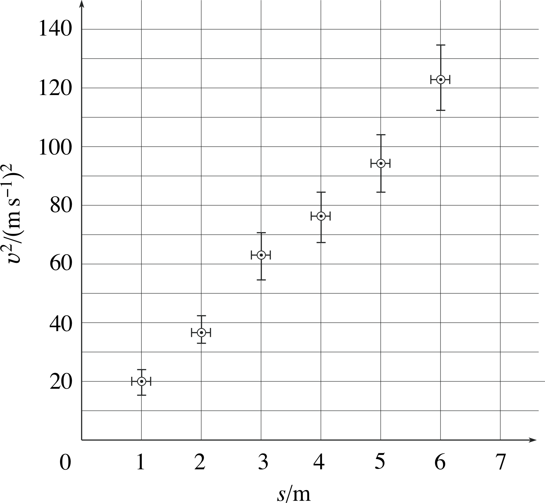
Figure 15 A graph of the results in Table 12, showing the error bars for υ2 and for s.
Suppose now that we have reason to believe that υ2 is proportional to s (perhaps from the physics), so that we choose to plot s on the horizontal axis and υ2 on the vertical axis. Using the data in columns A and C of Table 12 we get the plot shown by the circled points in Figure 15.
Working out the error bars on s is straightforward – we simply work out s + ∆s and s − ∆s (columns D and E in Table 12), plot both against υ2, and draw the error bar between these extremes.
To produce the error bars on υ2, we work out (υ + ∆υ)2 and (υ − ∆υ)2 (as shown in columns F and G of Table 12), plot them against s, and draw the error bar between these extremes, as shown in Figure 15.
The important point to note here is that if we estimate that there is a possible error of ±∆υ in the measured value of υ, then we mean that we are reasonably confident that υ lies within the range υ − ∆υ to υ + ∆υ.
It therefore follows that the υ2 should lie within the range (υ − ∆υ)2 to (υ + ∆υ)2, and so we use these values to determine the error bars. Note that even though the size of the error in υ is the same for all values of υ, the errors in υ2 become larger as υ becomes larger.
✦ Show that the error in υ2 is approximately 2υ∆υ.
✧ The error in υ2 is (υ + ∆υ)2 − υ2 = 2υ∆υ + (∆υ)2 ≈ 2υ∆υ if ∆υ is small (so that the term (∆υ)2 is very small).
Figure 4 Extension of a loaded copper wire.
The presence of error bars on a graph serves a number of useful purposes, such as finding the best line choice, spotting false points or estimating the error on the slope or gradient, as we will see shortly.
Overestimation and underestimation of errors
We may expect that the graph is a smooth curve, in which case we would also expect the data points to be scattered around that curve by amounts ranging up to the size of the error bar. For example, in the experiment with the copper wire (Subsection 3.2, Figure 4) we can deduce that the errors, or uncertainties, in the experimental measurements must be about ±0.05 mm in the extension, and/or ±0.6 kg in the mass.
Should the results deviate from a smooth curve by much more than the error bars, as shown in Figure 16, then, either we have underestimated the errors, or the assumption that a smooth curve should describe the results is not valid.
On the other hand, if all the results deviate from the expected curve by much less than the error bars, as in Figure 17, then we might well have overestimated the likely errors.
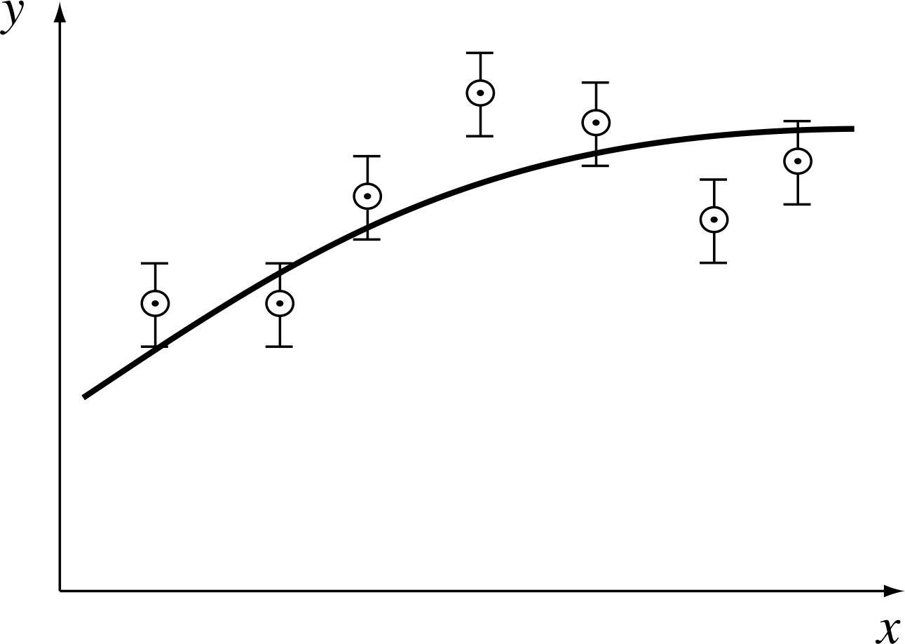
Figure 16 Have the error bars been underestimated?
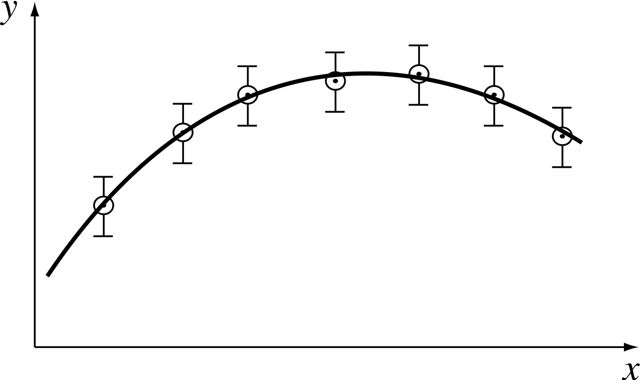
Figure 17 Have the error bars been overestimated?
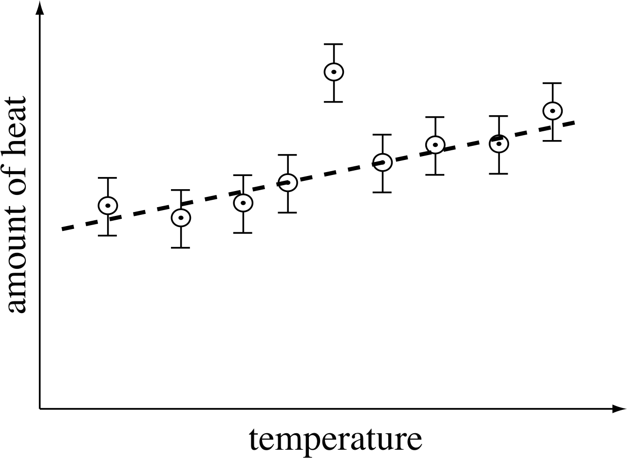
Figure 18 An apparently odd point when gadolinium is heated.
Identifying errors
Error bars are also very helpful in identifying mistakes in measurements or the plotting of points. For example, Figure 18 shows measurements of the amount of heat needed to raise the temperature of 1 kg of a rare metal known as gadolinium by 1°C at various temperatures. All results lie on the broken line except for one, which deviates from the straight line by about three times the magnitude of the error bar. This immediately suggests a mistake or something interesting about gadolinium!
In cases like this, you should first check that you have plotted the points correctly; then check any calculations made to obtain the plotted values. If these do not show up a mistake, then the measurements that gave rise to the suspect point should be repeated. In some cases, of course, repeating the measurements is just not possible, and one is left with the difficult decision about whether to ignore the point or not. No fixed rule can be made about this, but you should always be aware that what appears to be an anomalous measurement may indicate a real (and possibly as yet undiscovered) effect.
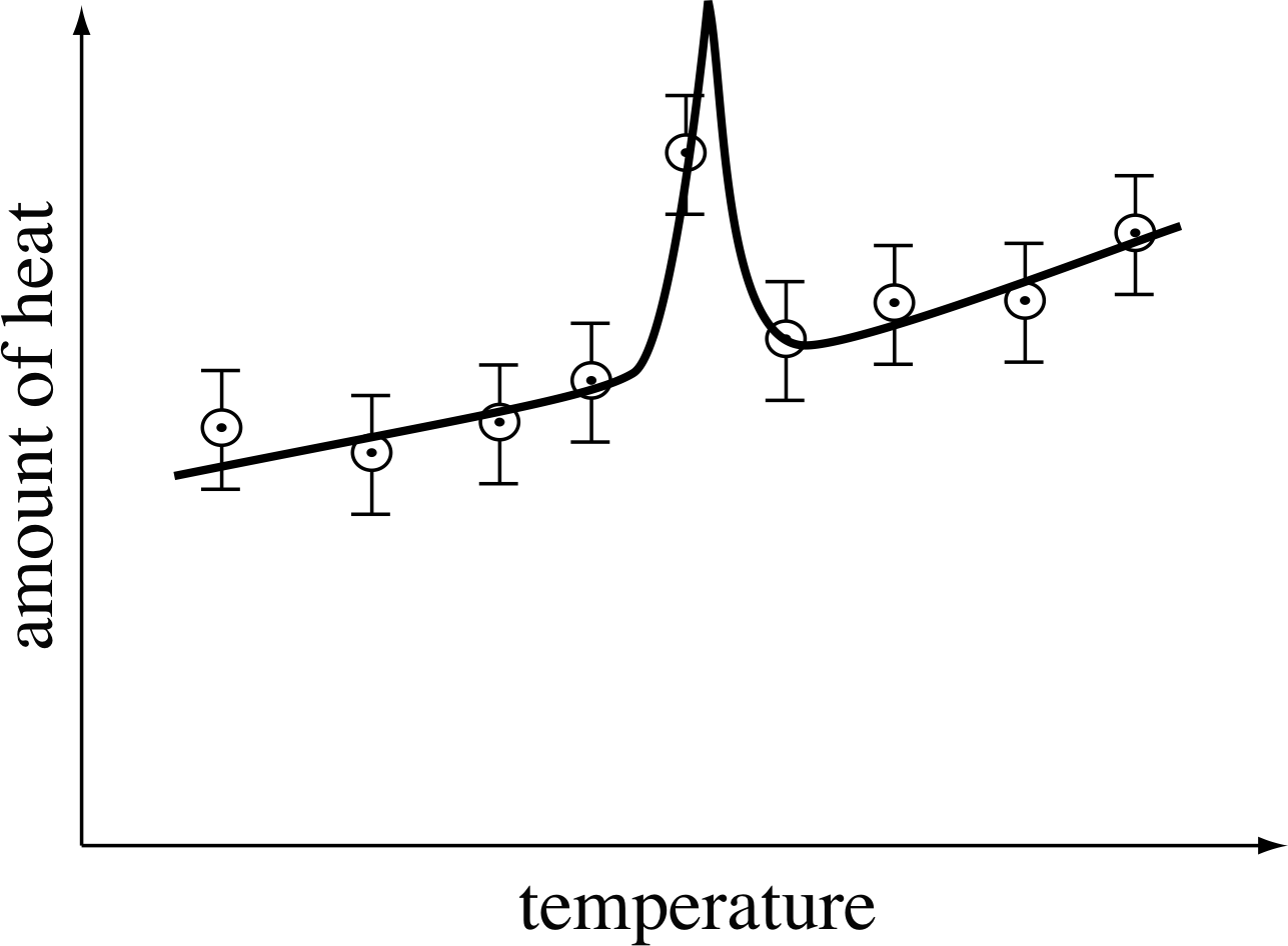
Figure 19 An anomaly in the specific heat of gadolinium, which could have been overlooked if one point had been discarded.
In the case of gadolinium, more detailed measurements show that the real behaviour is as shown by the solid line in Figure 19. By ignoring the apparently anomalous result, we would have overlooked a real anomaly (which is, in fact, caused by the magnetic properties of gadolinium). It is an interesting property of gadolinium after all!
An important piece of advice follows from this: if at all possible, plot a graph while you are taking measurements. If you do this, you can immediately check for errors and investigate any anomalies that appear.
Plotting as you go along also helps to ensure that the results are reasonably distributed on the graphs, and this usually means having them equally spaced except where there are interesting features, such as in Figure 19.
5.2 Estimating the errors in the gradient and the intercept
One particularly useful and important feature of plotting error bars on graphs is that it enables us to estimate the errors in the gradient and intercept. The next example shows how.
The gradient
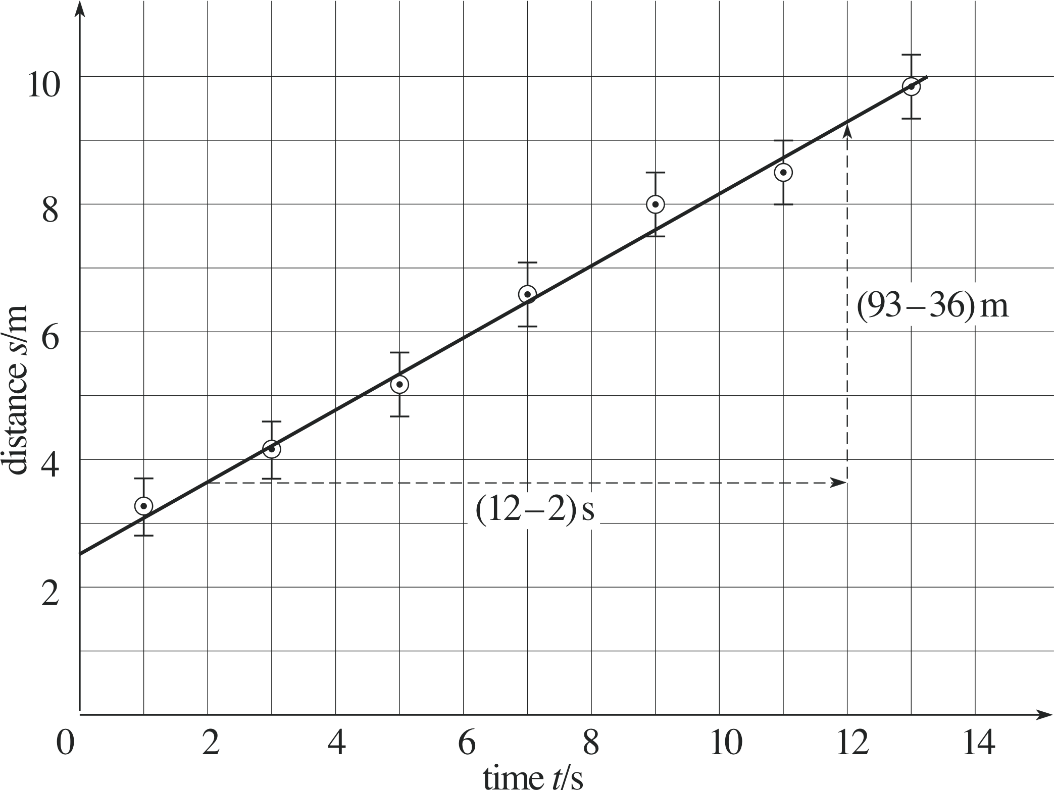
Figure 20 How to measure the gradient of the ‘best’ straight line through the points.
Figure 20 shows a graph of the distance travelled by an object over a period of 13 s. But how are we to estimate the uncertainty in the gradient of the straight line?
The gradient of the straight–line graph drawn in Figure 20 is given by
$\rm{gradient = \dfrac{rise}{run}}$ i
$\rm{\phantom{gradient} = \dfrac{(93 - 36)\,m}{(12 - 2)\,s} = 5.7\,m\,s^{-1}}$
The straight line drawn in Figure 20 is the one we think is best fitted to the results plotted. Some points above the line are balanced by other points below the line. However, the error bars indicate the uncertainty in the experimental results, and other lines with different gradients could be drawn to pass through all of the error bars.
So, in order to estimate the uncertainty in the gradient, we draw lines that pass through all of the error bars with the maximum and minimum possible gradients. i These lines are shown in Figure 21, and their gradients are 6.1 m s−1 and 4.8 m s−1, respectively. These values differ from the gradient of the ‘best’ straight line by 0.4 m s−1 and by 0.9 m s−1 an average difference of (0.4 + 0.9) m s−1/2 = 0.65 m s−1 ≈ 0.7 m s−1. We therefore quote the value of the gradient as (5.7 ± 0.7) m s−1.
The intercept on the vertical axis
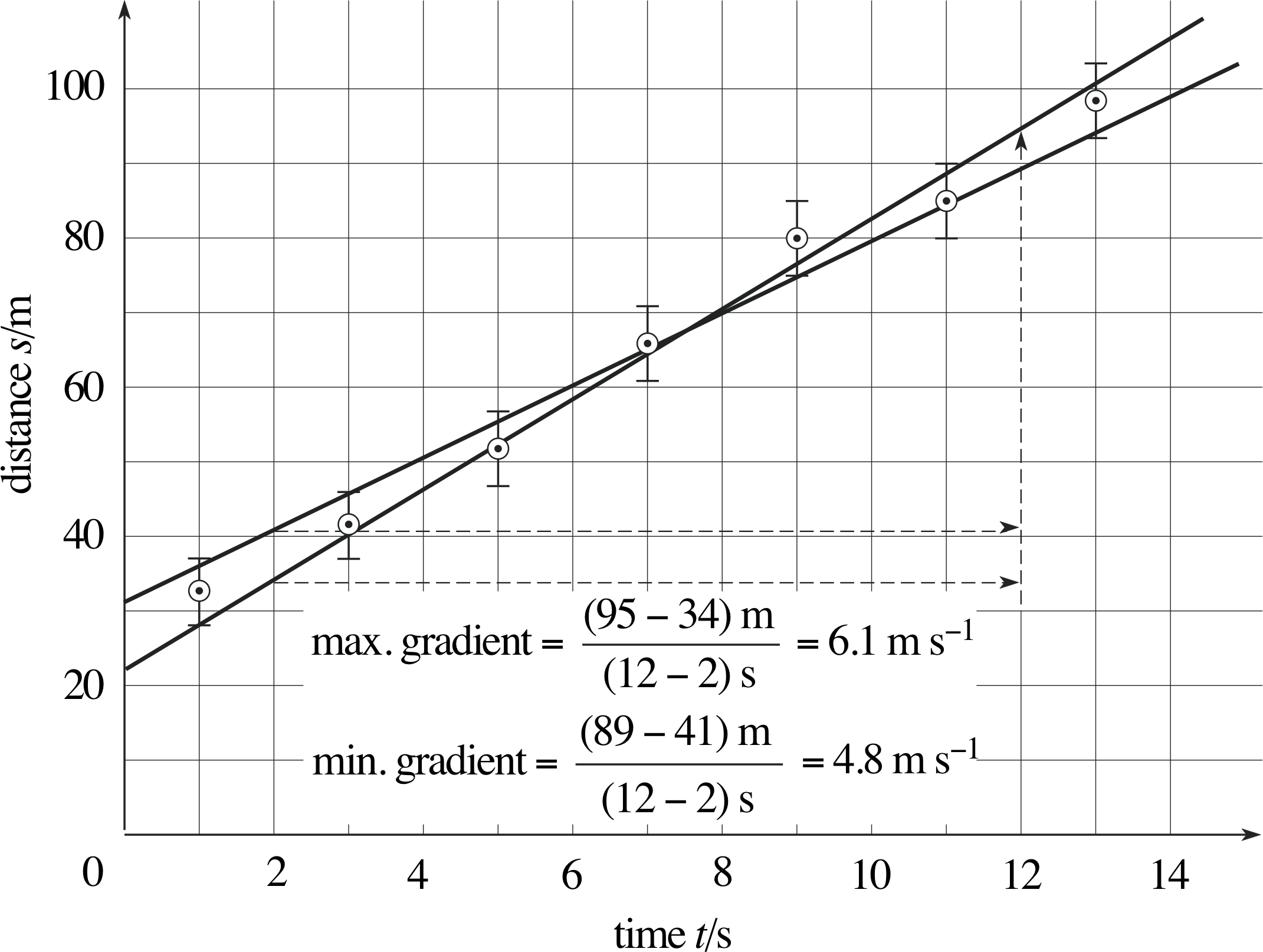
Figure 21 How to estimate the uncertainty in the gradient.
The other quantity that is normally used to specify the position of a straight line on a graph is its intercept with the vertical axis. We have seen earlier in this module that the equation of a straight line can be written in the form:
y = ax + b
where a is the gradient of the line and b is the intercept with the y–axis – that is, the value of y when x = 0.
In the case of the results shown in Figure 20, the intercept is at y = 25 m and, since this is determined from the ‘best’ straight line, we regard it as the best estimate of the intercept.
(Note that again we must quote the appropriate units.)
The maximum and minimum likely values of the intercepts are found by drawing other lines through the error bars, in this case the lines with maximum and minimum slopes shown in Figure 21. The intercepts of these lines are 31 m and 22 m respectively, and the mean difference between these values and the best intercept is
$\rm{\dfrac{(31 - 25)\,m + (25 - 22)\,m}{2} = \dfrac{(6 + 3 )\,m}{2}\approx 5.0\,m}$
We can, therefore, quote the experimentally determined intercept as (25 ± 5) m.
Having now determined both gradient and intercept and the possible errors in each we can summarize the experimental results in Figure 20 very succinctly in the form of an equation, namely:
s = (5.7 ± 0.7) m s−1 × t + (25 ± 5) m
Question T11
If the errors in the extensions measured in our rubber band experiment (Subsection 3.1) are each ±2 mm, what is the error in the value of the proportionality constant k?
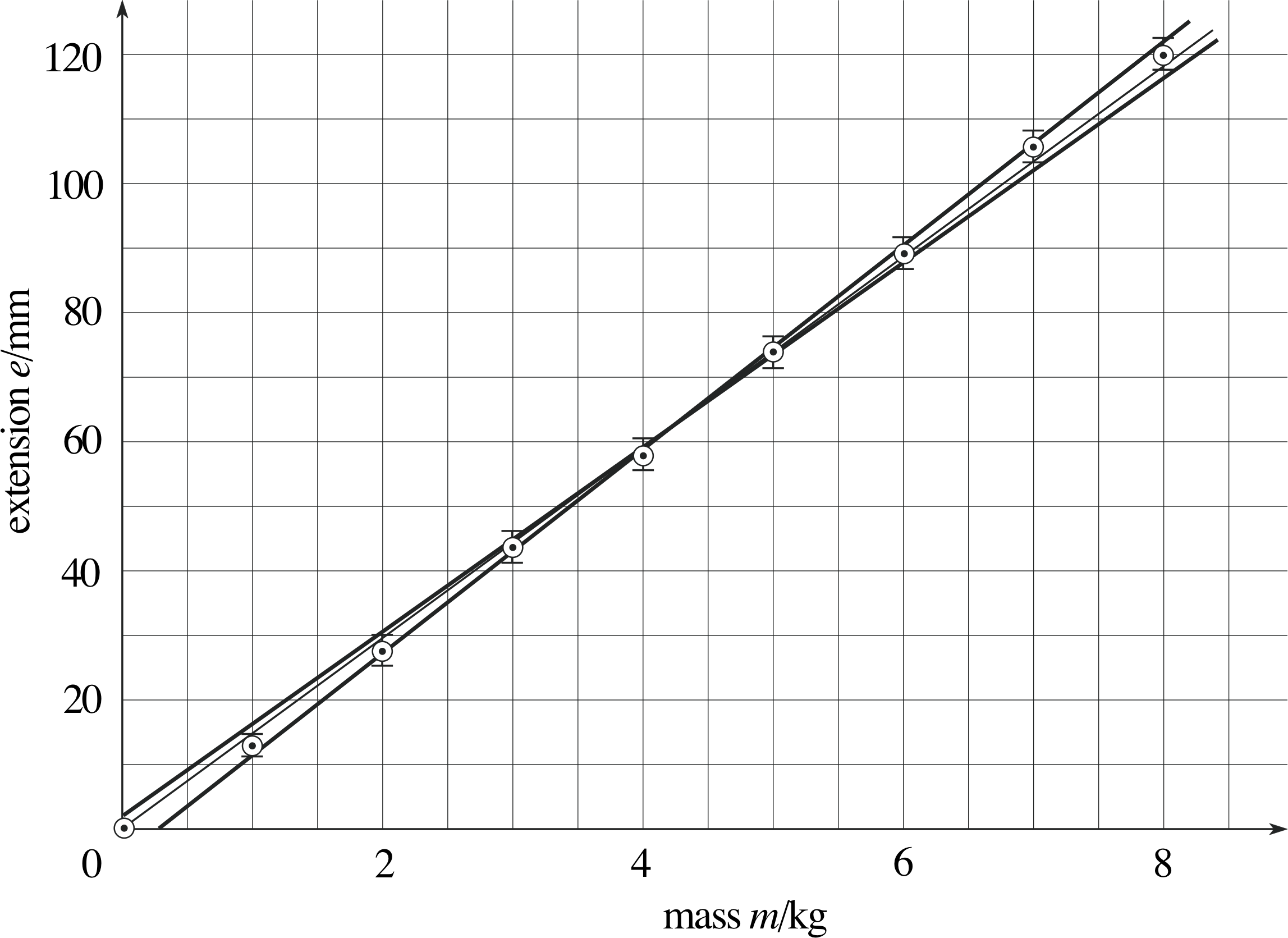
Figure 31 See Answer T11.
Answer T11
See Figure 31. (This is the same plot as Figure 2 with the error bars marked. Note that there is always an element of judgement in drawing the best fit line.)
Maximum gradient = [(122 − 11)/7] mm kg−1
Maximum gradient = 15.9 mm kg−1
Minimum gradient = [(118 − 15)/7] mm kg−1
Minimum gradient = 14.7 mm kg−1
The difference between these is 1.2 mm kg−1. In Subsection 4.2 we found that the gradient of the best line was 15 mm kg−2.
Thereforek ≈ (15.0 ± 0.6) mm kg−1.
6 Numerical analysis of gradients and intercepts
6.1 Choice of the ‘best’ line by numerical means – the method of least squares
Although it is often quite satisfactory to draw a ‘best line’ by eye, sometimes it is useful to have a numerical method of estimating the gradient and intercept of the ‘best’ line. Suppose we have a set of N readings
(x1, y1), (x2, y2), (x3, y3) and so on, up to (xN, yN)
We first find the mean of all the x values, $\langle x \rangle$, and then the mean of all the y values, $\langle y \rangle$. i
It can be shown that the best estimates of the gradient and intercept of the ‘best’ line are then given by:
$a = \dfrac{\sum_{i=1}^N (x_iy_i) - N\langle x \rangle\langle y \rangle}{\sum_{i=1}^N (x_i^2) - N\langle x \rangle^2}$(5) i
and$b = \langle y \rangle - a \langle x \rangle$(6)
This ‘best’ line will go through the point ($\langle x \rangle,\,\langle y \rangle$) – effectively the ‘centre of gravity’ of the points. It is drawn so as to minimize the sum of the squares of the deviations of the points from the line. For that reason, this method of estimating a and b is called the method of least squares.
✦ Find the ‘best’ straight line fit to the following data points (1.1, 2.5), (1.9, 3.2), (3.1, 3.9)
✧ We start by constructing a table such as in Table 13. i
In this case N = 3, so from Equation 5,
$\displaystyle a = \dfrac{\sum_{i=1}^3 (x_i y_i) - N \langle x \rangle \langle y \rangle}{\sum_{i=1}^3 (x_i^2) - N \langle x \rangle^2} = \dfrac{20.92-3\times 2.033\times 3.2}{14.43 - 3 \times (2.033)^2} = 0.691$
and from Equation 6,
b = $\langle y \rangle = 3.2 - a\langle x \rangle = 3.2 - 0.691 \times 2.033 \approx 1.795$
| i | Mass xi /kg | Extension yi /mm | xi yi | xi2 |
|---|---|---|---|---|
| 1 | 1.1 | 2.5 | 2.75 | 1.21 |
| 2 | 1.9 | 3.2 | 6.08 | 3.61 |
| 3 | 3.1 | 3.9 | 12.09 | 9.61 |
| $\displaystyle \sum_{i=1}^N x_i = 6.1$ | $\displaystyle \sum_{i=1}^N y_i = 9.6$ | $\displaystyle \sum_{i=1}^N (x_iy_i) = 20.92$ | $\displaystyle \sum_{i=1}^N (x_i)^2 = 14.43$ | |
| $\langle x \rangle = 2.033$ | $\langle y \rangle = 3.2$ |
Therefore the ‘best’ straight line will have the equation y = 0.691x + 1.795.
| i | Mass xi /kg | Extension yi /mm | xi yi | xi2 |
|---|---|---|---|---|
| 1 | 0 | 0 | ||
| 2 | 1 | 13 | ||
| 3 | 2 | 28 | ||
| 4 | 3 | 44 | ||
| 5 | 4 | 58 | ||
| 6 | 5 | 74 | ||
| 7 | 6 | 89 | ||
| 8 | 7 | 105 | ||
| 9 | 8 | 120 | ||
| $\displaystyle \sum_{i=1}^N x_i =$ | $\displaystyle \sum_{i=1}^N y_i =$ | $\displaystyle \sum_{i=1}^N (x_iy_i) =$ | $\displaystyle \sum_{i=1}^N (x_i)^2 =$ | |
| $\langle x \rangle = $ | $\langle y \rangle = $ |
Question T12
Use the above method to calculate a line of best fit to the data in Table 14 (see the rubber band experiment in Subsection 3.1, i.e. Table 3).
[Hint: Start by completing Table 14 then use Equation 5,
$\displaystyle a = \dfrac{\sum_{i=1}^9 (x_iy_i) - N\langle x \rangle \langle y \rangle}{\sum_{i=1}^9 (x_i^2) - N\langle x \rangle^2}$
and Equation 6,
$b = \langle y \rangle - a\langle x \rangle$
to find the equation of the line.]
| Mass xi/kg | Extension yi/mm | xiyi | xi2 |
|---|---|---|---|
| 0 | 0 | 0 | 0 |
| 1 | 13 | 13 | 1 |
| 2 | 28 | 56 | 4 |
| 3 | 44 | 132 | 9 |
| 4 | 58 | 232 | 16 |
| 5 | 74 | 370 | 25 |
| 6 | 89 | 534 | 36 |
| 7 | 105 | 735 | 49 |
| 8 | 120 | 960 | 64 |
| $\displaystyle \sum_{i=1}^9 x_i = 36$ | $\displaystyle \sum_{i=1}^9 y_i = 531$ | $\displaystyle \sum_{i=1}^9 (x_iy_i) = 3032$ | $\displaystyle \sum_{i=1}^9 (x_i^2) = 204$ |
| $\langle x \rangle = 4$ | $\langle y \rangle = 59$ |
Answer T12
The completed Table 14 is given in Table 26.
In this case N = 9, so that
$\displaystyle a = \dfrac{\sum_{i=1}^9 (x_iy_i) - N\langle x \rangle \langle y \rangle}{\sum_{i=1}^9 (x_i^2) - N\langle x \rangle^2}$
$\phantom{a }= \rm \dfrac{3032 - 9 \times 4 \times 59}{204 - 9 \times 4^2}\,mm\,kg^{-1}$
$\phantom{a }= \rm 15.133\,mm\,kg^{-1} \approx 15.1\,mm\,kg^{-1}$
and$b = \langle y \rangle - a\langle x \rangle = (59 - 15.133 \times 4)\rm{\,mm}$
$\phantom{b }= \rm -1.533\,mm \approx -1.5\,mm$
In Subsection 4.2 we used the best fit line in Figure 3 to estimate the value of a (there called k) to be 15 mm kg−1.
Comment Notice that we must include the point (0, 0) in the calculation since this is a valid data point.
6.2 A cautionary note
The above calculation may be tedious, but it is quite easy, and we are helped by the fact that many modern calculators have a program to do it. However, the method should always be used with caution, and definitely not used without having a good look at the data first!
There is no substitute for plotting the data to see what it looks like. It may be that a straight line is not appropriate; on the other hand, a straight line may give a good fit, but there may be one (or more) anomalous points that need to be looked at very carefully and perhaps not used in the calculation.
The formulae given in Subsection 6.1 make two very important assumptions: (i) the errors in the x (independent) variable are negligible; and (ii) the errors in y are the same size for each point. If these conditions do not apply, you must resort to more sophisticated ways of dealing with the problem that are beyond the scope of this module.
7 Closing items
7.1 Module summary
- 1
-
Graphs are drawn on two axes, the horizontal axis (often called the x–axis) for the independent variable; the vertical axis (often called the y–axis) for the dependent variable.
- 2
-
When plotting graphs:
- suitable scales should be chosen, to take full advantage of the graph paper and to make plotting as easy as possible;
- arrows should be used on the axes to indicate the directions in which the variables increase;
- variables and units of measurements should be indicated on each axis;
- data points should be indicated clearly (preferably with a dot within a circle);
- points should generally be evenly spread.
- 3
-
Data points should be plotted as the experiment proceeds.
- 4
-
A straight line, or smooth curve, should be drawn through the data points in most cases.
- 5
-
The standard equation of a straight line is y = ax + b where a is the gradient of the line and b is the intercept on the vertical or y–axis.
- 6
-
To estimate the gradient of a linear (i.e. straight-line) graph, determine the coordinates of any two points on the graph (xp, yp) and (xq, yq), and then use the formula
$\rm{gradient} = \dfrac{\rm{rise}}{\rm{run}} = \dfrac{y_q-y_p}{x_q-x_p}$
- 7
-
The graph corresponding to the equation
y = ax2 + bx + c is a parabola;
and the graph corresponding to
$y = \dfrac ax + b$ is an hyperbola.
- 8
-
A change of variables can sometimes be used to convert a non–linear relationship into linear form. This process is called linearization.
- 9
-
Power laws and exponential laws of the form y = ax n and y = ka x can be linearized by the use of logarithms.
- 10
-
The error in the gradient and the intercept of a straight–line graph can be estimated using error bars.
- 11
-
The method of least squares provides a numerical technique of estimating the gradient and intercept of the straight line that best fits a set of data points. According to this method
$\displaystyle {\rm gradient} = a = \dfrac{\sum_{i=1}^N (x_iy_i) - N\langle x \rangle \langle y \rangle}{\sum_{i=1}^N (x_i^2) - N\langle x \rangle^2}$(Eqn 5)
and${\rm intercept} = b = \langle y \rangle - a\langle x \rangle$(Eqn 6)
7.2 Achievements
Having completed this module, you should be able to:
- A1
-
Define the terms that are emboldened and flagged in the margins of the module.
- A2
-
Plot a graph from a set of data.
- A3
-
Draw the ‘best’ line through a set of data points, if this is appropriate, and estimate the gradient and intercept of this line.
- A4
-
Obtain the equation of a straight–line graph, and rearrange the equation of a line into the standard form y = ax + b.
- A5
-
Sketch the graphs of any linear function and the functions discussed in this module.
- A6
-
Convert non–linear equations into linear form by a change of variable in simple cases.
- A7
-
Use logarithms to linearize power laws and exponential laws.
- A8
-
Plot error bars on graphs, and find the error bars under a change of variables.
- A9
-
Estimate the error in the slope and intercept of a straight–line graph when the error bars have been plotted.
- A10
-
Calculate the ‘best’ estimates of intercept and slope using a numerical method (the method of least squares).
Study comment You may now wish to take the following Exit test for this module which tests these Achievements. If you prefer to study the module further before taking this test then return to the topModule contents to review some of the topics.
7.3 Exit test
Study comment Having completed this module, you should be able to answer the following questions, each of which tests one or more of the Achievements.
Question E1 (A4)
This question refers to Figure 22.
(a) Find the gradient of each graph shown in (i) to (iv).
(b) Find the equation represented by each graph (i) to (iv).
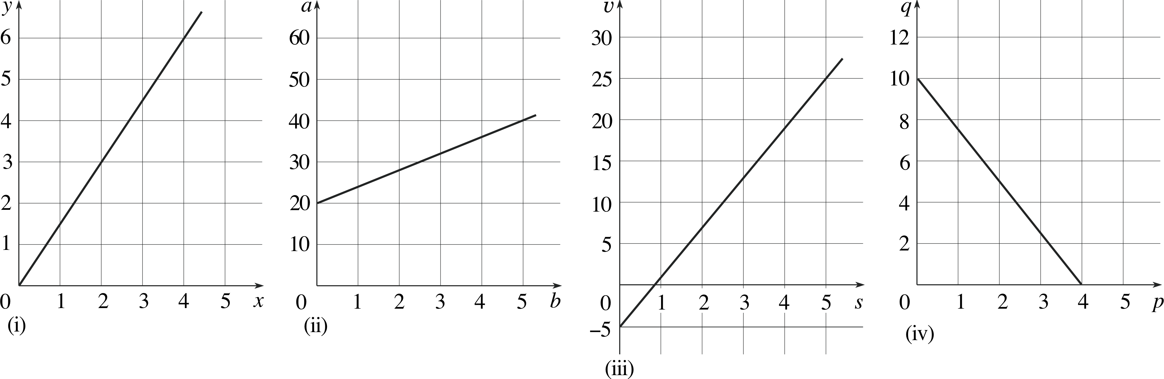
Figure 22 See Question E1.
Answer E1
(a)
(i)${\rm gradient} = \dfrac{6-0}{4-0} = 1.5$
(ii)${\rm gradient} = \dfrac{40-20}{5-0} = 4$
(iii)${\rm gradient} = \dfrac{25-(-5)}{10-0} = 3$
(iv)${\rm gradient} = \dfrac{10-0}{0-4} = -2.5$
(b)
(i)y = 1.5x (ii) a = 4b + 20 (iii) υ = 3s − 5 (iv) q = −2.5p + 10
(Reread Subsections 4.1 and 4.2 if you had difficulty with this question.)
Question E2 (A5)
Sketch graphs to represent the following equations:
(a) y = 4x, (b) e = 2f + 1, (c) g = (h/3) − 1, (d) k = −2m + 3.
Answer E2
The graphs are given in Figure 32.
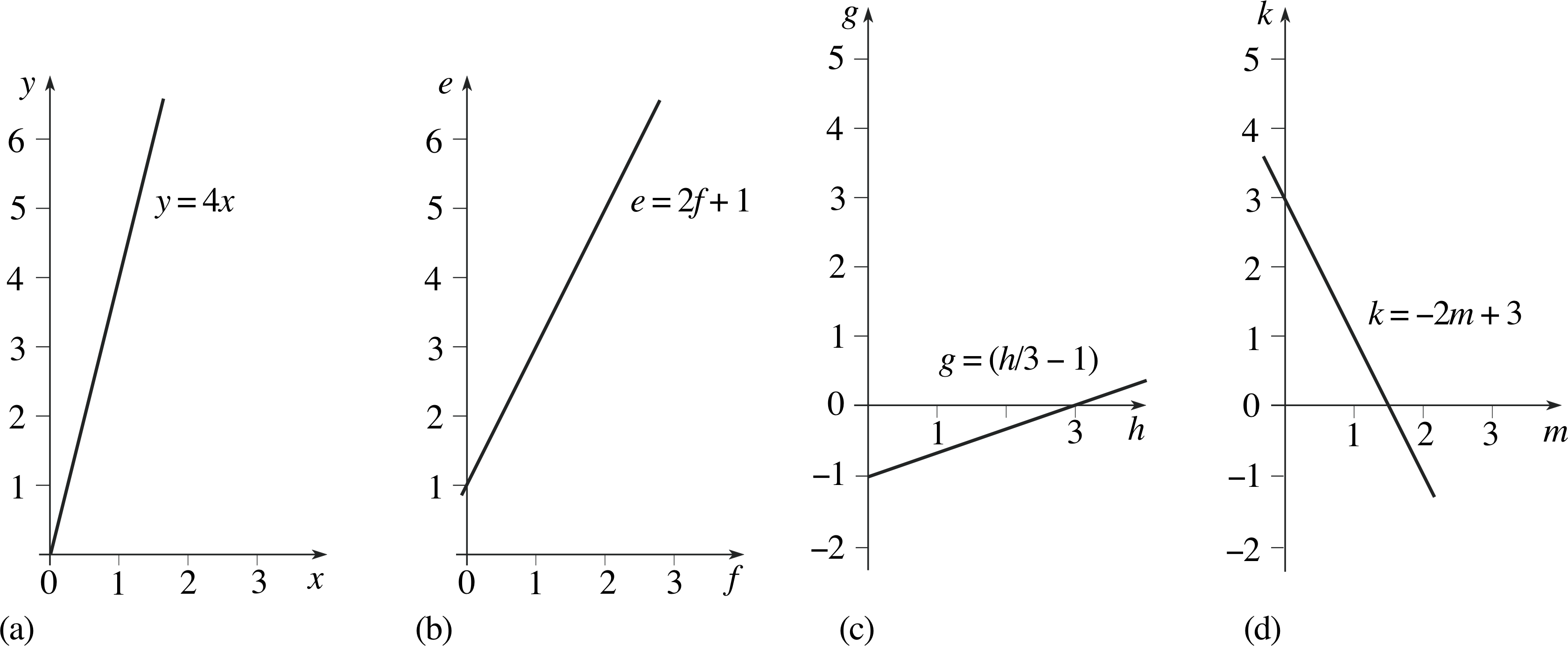
Figure 32 See Answer E2.
(Reread Subsections 4.1 and 4.2 if you had difficulty with this question.)
| Age/years | Percentage surviving/% |
|---|---|
| 51 | 89.3 |
| 57 | 83.5 |
| 63 | 73.1 |
| 69 | 58.2 |
| 75 | 40.3 |
| 81 | 20.6 |
Question E3 (A2 and A5)
Table 15 shows the percentage of men surviving until various ages (figures relate to data current in 1990). Plot the results in graphical form.
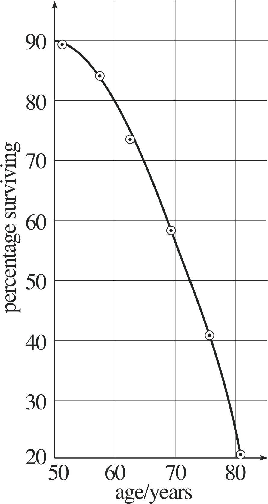
Figure 33 See Answer E3.
Answer E3
The graph is shown in Figure 33. Notice how the axes are chosen – the independent variable is age. Notice too that the axes are labelled so that the numbers written on them are dimensionless. The choice of scale makes best use of the paper available. The points are plotted as dots within circles and they are joined by a smooth curve.
(Reread Section 3 if you had difficulty with this question.)
Question E4 (A2)
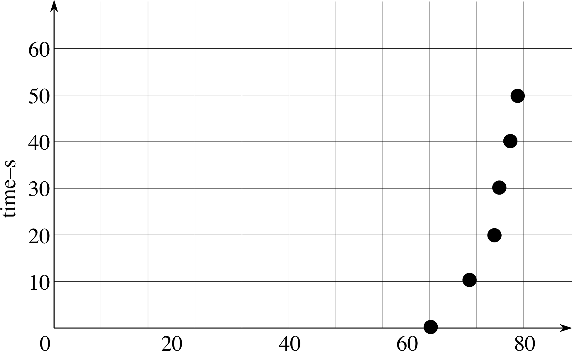
Figure 23 See Question E4.
| Time/s | Speed/miles h−1 |
|---|---|
| 0 | 64 |
| 10 | 69 |
| 20 | 73 |
| 30 | 76 |
| 40 | 78 |
| 50 | 79 |
Having noted the speed of his car at various times (Table 16), a naive graph–plotter presents his measurements in the way shown in Figure 23. His graph can be criticised on at least five counts. Point out the short-comings, and correct them by re–plotting the results given in Table 16.
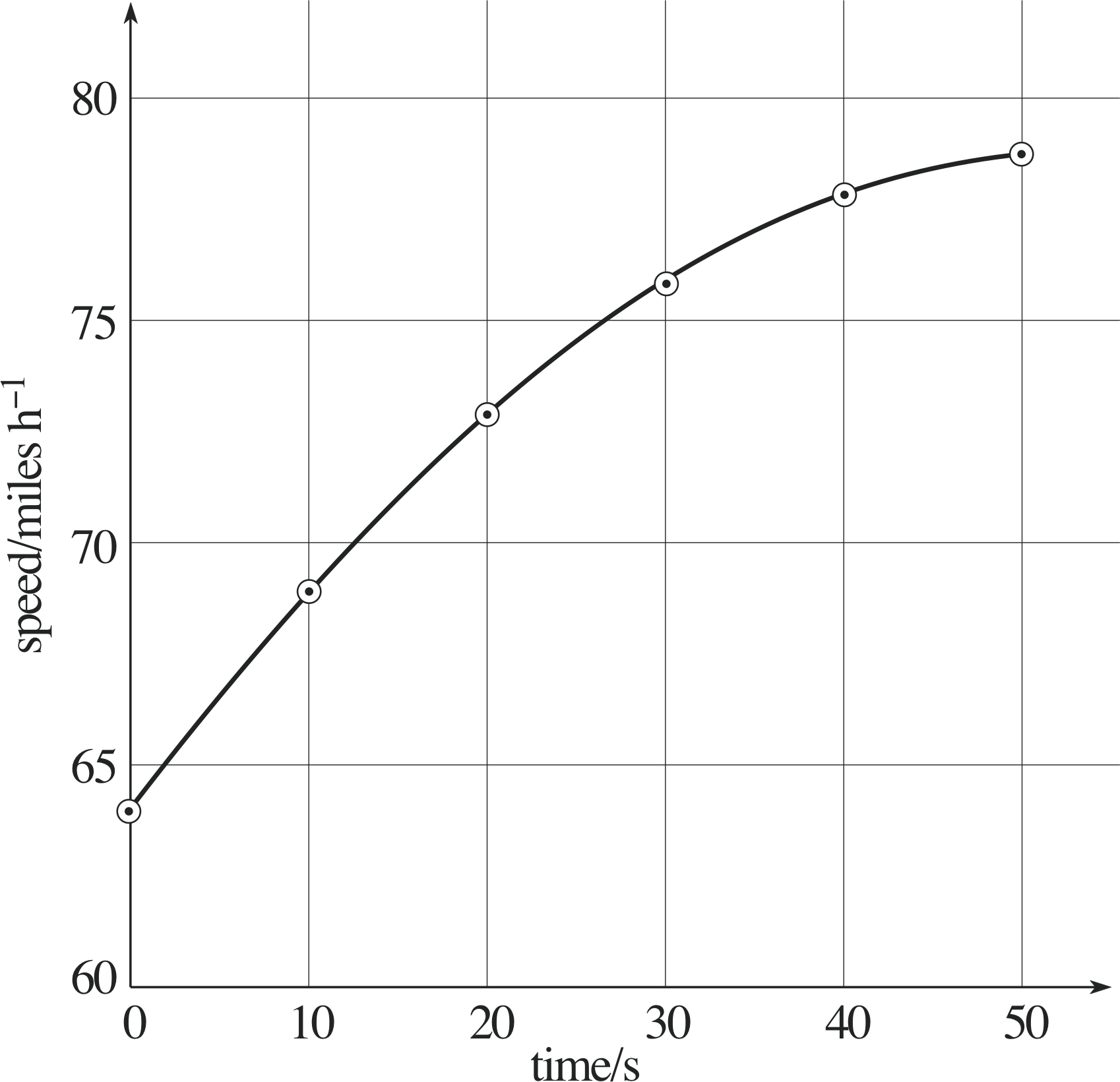
Figure 34 See Answer E4.
Answer E4
The faults in the graph are as follows:
- the axes are chosen wrongly – the independent variable is time and it should be plotted on the horizontal axis;
- the horizontal axis has no label;
- the vertical axis should have the label time/s;
- the choice of scale is poor on the horizontal axis – the range of values is inappropriate and the scale of 10 small squares to 80 mph is a poor choice;
- the points should be small (or crosses), not large;
- the point at t = 0 s, υ = 64 mph is incorrectly plotted.
A better plot of the data is shown in Figure 34.
(Reread Subsection 3.3 if you had difficulty with this question.)
Question E5 (A2, A3, A8 and A9)
| Time/s | Speed/m s−1 |
|---|---|
| 1.0 ± 0.2 | 33 ± 5 |
| 4.6 ± 0.2 | 156 ± 10 |
| 6.4 ± 0.2 | 210 ± 15 |
| 7.2 ± 0.2 | 240 ± 20 |
A ball moves in a straight line with its speed increasing linearly with time (constant acceleration). Table 17 gives the speed of a ball at six different times (with the associated errors).
(a) Plot the data given in Table 17 on a graph.
(b) Use your graph to find the gradient of the graph (the magnitude of the acceleration of the ball), and its associated uncertainty. (The magnitude of the acceleration is given by the gradient of the graph.)
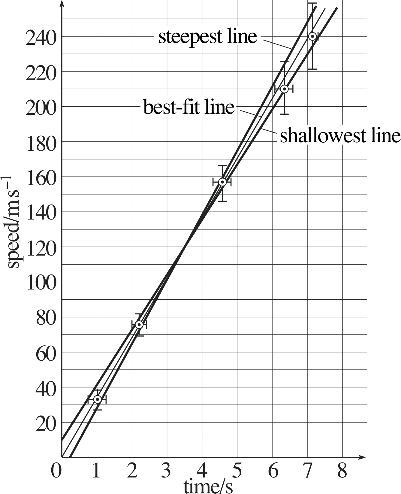
Figure 35 See Answer E5.
Answer E5
(a) The data from Table 17 are plotted in Figure 35.
(b) The gradient of the graph is equal to the magnitude of the acceleration. Therefore, the magnitude of the acceleration = (33.6 ± 3.6) m s−2.
(Reread Subsections 5.1 and 5.2 if you had difficulty with this question.)
Question E6 (A2, A3 and A6)
| Length l/cm | Frequency f /Hz |
|---|---|
| 5 | 79 |
| 10 | 19 |
| 15 | 9 |
| 20 | 4.7 |
Table 18 shows results of a series of experiments in which the frequency f of vibration of a plastic ruler is measured for various values of the length l of the ruler overhanging the edge of a table. Plot a graph of log10 (f /Hz) against log10 (l/cm) and decide whether the frequency and length are related by a power law, of the form f = kl α for some constant k; if they are, determine the value of α.
| Length l/cm/Hz | Log10 (l/cm) | Frequency f /Hz | Log10 (f /Hz) |
|---|---|---|---|
| 5 | 0.70 | 79 | 1.90 |
| 10 | 1.00 | 19 | 1.28 |
| 15 | 1.18 | 9 | 0.95 |
| 20 | 1.30 | 4.7 | 0.67 |
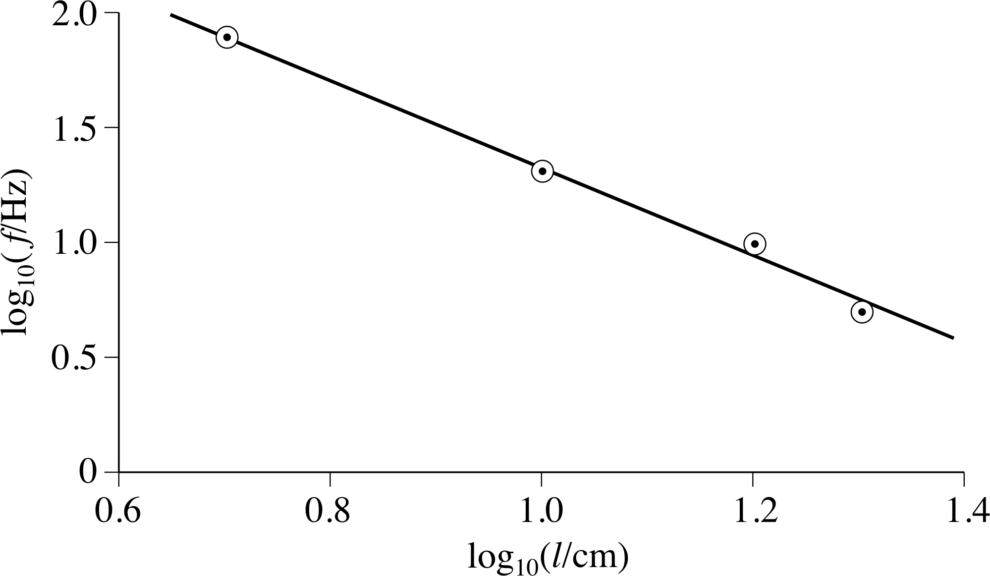
Figure 36 See Answer E6.
Answer E6
The values of log10 (l/cm) and log10 (f /Hz) are given in Table 27; the values are plotted in Figure 36.
A straight line provides a good fit to the data points which supports the proposition that the 1.5 frequency and length are related by a power law. From the graph, fitting the line ‘by eye’, the gradient is −2, and so
log10 f = −2 log10 l + constant
This means that f is proportional to l−2, i.e. the frequency of vibration of the ruler is inversely length.
(Reread Subsection 4.4 if you had difficulty with this question.)
Question E7 (A10)
Use the method of least squares to estimate the gradient and intercept of the straight line you produced in Question E6.
Answer E7
Using the data in Table 27 (Answer E6) and the formulae in Subsection 6.1,
$\displaystyle {\rm gradient} = a = \dfrac{\sum_{i=1}^N (x_iy_i) - N\langle x \rangle \langle y \rangle}{\sum_{i=1}^N (x_i^2) - N\langle x \rangle^2}$(Eqn 5)
and${\rm intercept} = b = \langle y \rangle - a\langle x \rangle$(Eqn 6)
the gradient and intercept can be calculated to be as follows:
gradient ≈ −2.03, intercept ≈ 3.32.
(Reread Section 6 if you had difficulty with this question.)
Study comment This is the final Exit test question. When you have completed the Exit test go back and try the Subsection 1.2Fast track questions if you have not already done so.
If you have completed both the Fast track questions and the Exit test, then you have finished the module and may leave it here.
Study comment Having seen the Fast track questions you may feel that it would be wiser to follow the normal route through the module and to proceed directly to the following Ready to study? Subsection.
Alternatively, you may still be sufficiently comfortable with the material covered by the module to proceed directly to the Section 7Closing items.